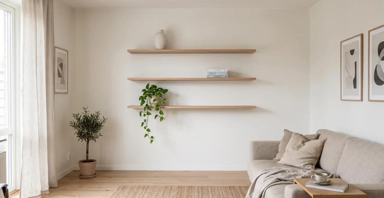
Floating display shelves give books, artwork and everyday objects a place to live without occupying the floor. In a compact living room, bedroom or home office, that distinction matters: storage can extend upward while the space beneath remains open, preserving clear sightlines and making furniture easier to arrange.
The benefit is not automatic, however. A wall covered with thick shelves and closely packed objects can feel just as crowded as one dominated by a freestanding bookcase. The way shelves are positioned, the amount of wall left visible and the number of items displayed all influence the result.
The most effective approach is to treat floating shelves as selective storage rather than unlimited storage. Choose a layout that suits the wall, secure it properly and give the displayed objects enough breathing room. The objective is not simply to fit more belongings into a small room, but to create useful surfaces without making the room feel fuller.
Floating shelves in small rooms: the essentials
- Keep the floor and generous areas of wall visible to reduce the visual weight of storage.
- Choose shelf length, depth and arrangement according to the room’s proportions and the wall’s structural capacity.
- Display fewer, more intentional groups of objects, and keep excess belongings in closed storage.
- Why Do Floating Shelves Make Small Rooms Feel Visually Lighter?
- How Can You Arrange Floating Shelves Without Making the Wall Look Busy?
- One Long Floating Shelf or Several Small Ones: Which Looks Better?
- Which Floating-Shelf Mistakes Make a Wall Look Cluttered?
- When Should You Remove Display Items Instead of Adding Another Shelf?
- How Can You Style Decorative Accessories Without Filling Every Surface?
- Open Shelves or Tall Cabinets: Which Makes Better Use of Vertical Space?
- How Can the Rule of Three Make Decorative Displays Look More Natural?
Why Do Floating Shelves Make Small Rooms Feel Visually Lighter?
Floating shelves can make a small room feel visually lighter because they provide storage without adding furniture legs, side panels or a large enclosed structure at floor level. By leaving more flooring and wall surface visible, they reduce the apparent bulk of storage. The effect is strongest when the shelves themselves remain slim, restrained and appropriately positioned.
Consider a narrow living room with a freestanding bookcase beside the sofa. Even if the bookcase is relatively shallow, its frame extends from the floor upward, interrupting the visible boundary between the wall and the flooring. Replace it with a pair of floating shelves above the sofa, and the floor remains exposed beneath them.
An uninterrupted floor line can contribute to a more open-looking layout because it reduces visual interruptions near the room’s perimeter. This is a practical design principle, not a scientifically established guarantee that the room will appear larger to every observer.
Storage capacity and visual weight are different questions. A properly supported floating shelf may hold a useful collection of books or objects, but unlike a full-height cabinet, it does not require visible side panels or a continuous furniture frame. The exposed wall around the shelf can make the installation appear less dominant.
Environmental psychology supports considering perceived space separately from physical dimensions. Historical Environment and Behavior research on crowding perception examined model rooms and found that characteristics including color and visual complexity influenced judgments of spaciousness and crowding. It did not directly compare floating shelves with bookcases.
The shelf design still matters. Thick, dark shelves against a pale wall introduce strong horizontal blocks. Several deep shelves covering much of the wall may visually resemble a fragmented bookcase rather than an airy arrangement.
Mounting height also changes the effect. Shelves placed close above a sofa or desk can create a compressed zone, while shelves positioned with comfortable clearance around existing furniture tend to look more deliberate. No universal mounting height works for every combination of furniture and room dimensions.
Lighting adds another consideration. A subtle shadow beneath a shelf can reinforce its floating appearance, but a pronounced dark band created by harsh directional lighting may make the shelf look heavier. Before installation, consider how natural and artificial light will fall across the wall.
Once the shelf dimensions and position work with the room, the next challenge is arranging the objects so that the wall stays visually calm.
How Can You Arrange Floating Shelves Without Making the Wall Look Busy?
Arrange floating shelves around open space, consistent alignment and a limited number of visual focal points. Give each shelf one main object or small grouping, leave substantial portions unoccupied and repeat a restrained color palette. These choices make the installation feel intentional rather than like an accumulation of objects competing for attention.
Start with negative space: the empty areas between objects, along the shelf and on the surrounding wall. Instead of filling a shelf from end to end, try placing decorative items across roughly one-third of its length, leaving the rest visibly open.
That proportion is a practical starting point, not an experimentally validated decorating rule. A shelf holding frequently used books may need more coverage, while a shelf devoted to artwork might look best with just one item.
Next, select a visual anchor. A tall ceramic vase, a framed print or a compact group of books can serve as the dominant element. Smaller supporting objects should relate to that anchor rather than each becoming a separate focal point.
Across several shelves, repeat the principle without reproducing identical arrangements. One shelf could feature a vase near its left edge, while the shelf above holds a small stack of books toward the right. The grouping should feel balanced across the overall wall, even when individual shelves are asymmetrical.
Architectural alignment helps establish order. Where practical, align shelf edges with a window casing, desk edge or another existing horizontal or vertical reference. Arbitrary offsets can make an otherwise simple arrangement look unsettled, especially in a room already containing several furniture lines.
Color is another useful organizing tool. Repeating two or three compatible tones across books, ceramics and frames gives separate items a shared visual identity. Objects similar in tone to the wall can appear quieter, while a carefully chosen contrasting piece can create a clear focal point.
These recommendations align with Architectural Digest‘s expert surface-styling tips, which include leaving negative space, varying object heights and coordinating colors across decorative arrangements. They are professional styling recommendations rather than universal perceptual laws.
A useful final check is to stand at the room’s entrance. If the shelves appear as one organized composition before individual objects become noticeable, the overall arrangement is probably working. If every object immediately attracts attention, simplify the display or its palette.
With the styling approach established, the next decision is whether the room would benefit from a single continuous shelf or a more flexible group of shorter ones.
One Long Floating Shelf or Several Small Ones: Which Looks Better?
One long floating shelf generally suits a wall that needs a continuous horizontal surface, such as the space above a desk or entryway console. Several shorter shelves work well for decorative displays and vertical arrangements. The better choice depends on the room’s proportions, how the shelves will be used and what the wall can safely support.
A long shelf creates a strong horizontal line. In a narrow room, this can visually emphasize width and provide a calm, unified backdrop for a few well-spaced objects. It is particularly effective above furniture that already establishes a horizontal reference, such as a sofa, worktop or desk.
Shorter shelves offer more flexibility. A compact vertical grouping can make use of an otherwise empty wall section between architectural features and encourage the eye to travel upward. However, every additional shelf introduces another edge, another shadow and another surface to arrange.
The decision becomes easier when the main trade-offs are compared directly.
| Decision factor | One long shelf | Several shorter shelves |
|---|---|---|
| Main purpose | Continuous storage or display above a work or furniture zone | Separate decorative groupings across vertical space |
| Visual emphasis | Horizontal continuity and apparent width | Vertical rhythm and apparent height |
| Styling | One composition with generous uninterrupted space | Several coordinated, individually restrained compositions |
| Installation | Bracket positioning must suit the shelf span and intended load | Each shelf requires its own suitable fixing arrangement |
| Potential drawback | A heavy or poorly supported span can be unsuitable | Too many separate shelves can fragment the wall |
Wall construction can override an aesthetic preference. A long floating shelf is not necessarily supported by fewer fixings than several shorter ones. Its safe capacity depends on the length, bracket design, number and position of fixings, wall substrate and anticipated weight.
Likewise, multiple short shelves are not automatically safer. Each installation must support its own load, and each bracket must be suitable for the wall material.
Before settling on a layout, identify whether the wall is plasterboard over framing, masonry or another construction type. For framed walls, check stud locations. For masonry or other substrates, establish which fixings are compatible with the material and the shelf’s specified load.
The Home Depot‘s floating-shelf installation instructions describe locating studs, selecting appropriate anchors when studs are unavailable and checking that mounting brackets are level. The product manufacturer’s installation requirements and weight limits should determine the final fixing arrangement.
A hybrid composition can also work: one longer shelf over a desk, with one or two shorter shelves positioned above it. To prevent a scattered appearance, maintain a consistent shelf thickness, repeat an alignment point and leave enough open wall between levels.
Five checks before installing floating shelves
- Define the purpose: write down whether the shelves will primarily hold books, decorative objects or daily essentials. The result is a clear storage brief.
- Measure the available space: record the wall width, usable height and clearance around furniture, doors and circulation routes. The result is a dimensioned wall sketch.
- Mark the proposed layout: use removable tape to outline shelf lengths, depths and positions. The result is a full-scale visual arrangement to assess from the doorway.
- Check structural compatibility: identify the wall material, suitable fixing locations and the manufacturer’s mounting and load requirements. The result is a verified installation plan.
- Test the intended display: choose the objects and estimate the space they will occupy before mounting. The result is an item layout with visible gaps and a load appropriate to the selected shelf system.
A layout that suits the wall structurally and visually is a stronger foundation than adding shelves wherever empty space happens to be available.
Which Floating-Shelf Mistakes Make a Wall Look Cluttered?
The main mistakes are installing too many shelves, placing them at inconsistent heights, choosing excessive depth and mixing unrelated designs on the same wall. These choices create competing lines and unnecessarily bulky displays. Even when individual shelves are attractive, an uncoordinated arrangement can make a small room feel more crowded than the furniture it replaces.
The most common problem is the shelf-count trap. A shelf becomes full, so another is added. That shelf fills as well, eventually turning the wall into a grid of objects. Storage capacity has increased, but the overall display has become harder to read.
Every extra shelf creates a new horizontal line and another area requiring attention. Before expanding, consider whether existing items could be grouped more effectively or moved into closed storage.
Irregular mounting can cause visual disruption even on empty shelves. When shelves intended to form an orderly stack have noticeably inconsistent spacing, the arrangement can look accidental. Matching intervals are not essential for every composition, but deliberate repetition or a clear alignment rule usually makes the result easier to understand.
Shelves mounted too close to furniture introduce a different problem. A deep shelf hovering immediately over a sofa back or desk can make the furniture and shelf look compressed into one crowded area. Allow enough clearance for the furniture’s use, the objects displayed and safe movement beneath the shelf.
Excessive depth is another frequent mismatch. A shallow shelf may be sufficient for picture frames, a few books or small ceramics. A deeper shelf projects farther into the room and invites larger objects, increasing the perceived bulk of the display.
Choose depth by measuring what the shelf must actually support. Books should be properly supported, while frames and ornaments need adequate stable contact with the surface. Avoid choosing a larger shelf simply because it offers additional capacity.
Finally, resist combining too many shelf styles. Thick rustic wood, thin painted metal and glossy contemporary shelves may all work individually, but bringing them together on one compact wall introduces unnecessary contrast in materials, proportions and mounting details.
A consistent shelf system can leave room for variety in the objects displayed. Matching shelf thicknesses or finishes will often create a clearer structure than trying to unify unrelated hardware through decoration alone.
When an existing arrangement already feels overcrowded, the solution may be to remove some of its contents rather than redesign or expand the shelving.
When Should You Remove Display Items Instead of Adding Another Shelf?
Remove display items when shelves are fully occupied, objects overlap or finding something requires moving several other belongings. These are signs that the display contains more than the wall can comfortably accommodate. Adding another shelf may create extra capacity, but it is unlikely to improve the room’s appearance unless the overall quantity on show is also reduced.
Imagine a small home office with two shelves above a desk. At first, they hold a few books, framed artwork and a plant. Over time, souvenirs, paperwork and small accessories fill the remaining space. Eventually, one object partly hides another.
The problem is no longer a lack of display surface. It is a mismatch between the number of visible objects and the visual simplicity the room needs.
A useful distinction is between storage that keeps possessions accessible and display that makes them visually meaningful. Not every useful or valued object needs to remain visible.
Research published in the Journal of Vision in 2026 examined perceived clutter using computer-generated tabletop scenes. The final human sample included human sample size of 72 participants, and the researchers found that item quantity contributed to clutter judgments, while surface complexity and spatial organization also played important roles.
400 tabletop images
The 2026 visual-clutter study used 400 computer-generated tabletop images to investigate how object quantity, spatial organization and surface complexity relate to perceived clutter. It did not test floating-shelf layouts or establish an ideal number of display objects.
Semizer, Gopu and Weiss, Journal of Vision, 2026. 2026 Journal of Vision study on visual clutter.
For an overloaded shelf, try a subtraction test. Remove every item that is not essential to the display or immediately needed. Keep the remaining objects in a simpler arrangement and use the room normally for a few days.
If the space feels calmer and the reduced display remains practical, another shelf was probably unnecessary. A drawer, cabinet or storage box may be more appropriate for the removed items.
Rotation offers another option for people who enjoy collecting books, ceramics, photographs or travel souvenirs. Keep a limited selection on view and store the rest safely, then replace the displayed pieces periodically.
This method allows valued belongings to receive attention without requiring every object to compete for permanent wall space.
Removing an object from display does not mean discarding it. A framed photograph might work better in another room; a small collection could be consolidated on a different surface; seasonal decorations can return when relevant.
Thinking in terms of relocation rather than disposal can make editing a display easier, particularly when belongings carry sentimental value.
Once the quantity is manageable, arranging the remaining accessories becomes a simpler and more satisfying exercise.
How Can You Style Decorative Accessories Without Filling Every Surface?
Style decorative accessories by combining different heights, limiting the number of separate objects and keeping some shelf space intentionally empty. A tall vase, a low stack of books and a framed print can create a complete arrangement without occupying the entire shelf. The goal is visual balance, not filling every available gap.
Begin with the silhouette of a grouping. Instead of placing several similarly sized ornaments in a straight row, select objects that create distinct height levels. One tall element establishes a focal point, a medium element supports it and a lower element adds variation.
For example, a framed print leaning safely against the wall provides height without requiring a large decorative object. A short stack of books adds a low horizontal shape, while a small ceramic piece introduces a different outline.
Fewer, larger elements can often create a clearer composition than numerous small accessories spread across the same length. What matters is the relationship between their scale, the shelf and the empty space around them.
Books can serve two purposes: as objects to access and as structural elements within a display. A modest stack can support an appropriately sized lightweight accessory, provided everything remains stable and safely positioned. There is no need to add decorative pieces to every stack.
Adjust styling according to viewing height. At eye level, small details are easier to appreciate. Higher shelves are usually viewed from farther away or from below, so a single recognizable shape may be more effective than a collection of tiny ornaments.
Low shelves may need equally simple groupings when furniture or everyday activity already competes for attention nearby. This is a useful styling distinction rather than a fixed rule for every room.
Another temptation is to complete every arrangement with matching pairs. Two identical vases, symmetrical book stacks and evenly spaced frames can create a formal display, but repeating that structure on every shelf may make the wall feel rigid.
Try varying the rhythm. One shelf might contain an asymmetrical group near one end, while another has a single central object. A third shelf can remain noticeably emptier than the others.
The resulting variation helps establish hierarchy: some areas attract attention, while others provide a visual pause.
Color can reinforce that hierarchy. Repeat a limited palette of wood, ceramics, book covers or frames across the arrangement, but allow one accent piece to stand out. This creates coherence without requiring every object to match.
A final silhouette check is useful. Stand back until individual details become less noticeable. If the grouping still reads as a few clear shapes rather than an irregular row of small fragments, it is likely to work well at ordinary viewing distance.
That restraint is easier to maintain when the room also has an appropriate place to store belongings that are not meant to be displayed.
Open Shelves or Tall Cabinets: Which Makes Better Use of Vertical Space?
Tall cabinets generally offer more enclosed storage for bulky or numerous belongings, while open floating shelves preserve more visible wall and floor space. Neither is universally better in a small room. The right choice depends on whether the main problem is insufficient storage capacity, excessive visual clutter or a combination of both.
A tall cabinet uses vertical space continuously, often with multiple enclosed compartments. It can conceal paperwork, spare textiles, equipment and objects that would make open shelving look crowded.
Its disadvantage is visual presence. A full-height cabinet introduces a substantial furniture surface and may occupy floor space that a floating shelf would leave clear.
Floating shelves do the opposite. They expose objects to view and preserve much of the surrounding wall, making them suitable for selected books, artwork and frequently used essentials. Their capacity is more limited by the desired openness of the display, safe loading and practical access.
Storage volume and perceived spaciousness therefore need to be assessed separately. A cabinet may be the more efficient solution if many objects must be accommodated, even if the result looks visually heavier.
A hybrid arrangement often resolves the trade-off. Assign bulky, irregular or rarely used belongings to closed storage, and reserve a smaller area of open shelving for useful or meaningful objects.
There is no universal numerical ratio between closed and open storage. The practical balance is determined by how many possessions need hiding, how often they are accessed and how much exposed display the room can accommodate without looking crowded.
Maintenance matters too. Open shelves expose books and decorative objects to dust, and visible everyday items need regular tidying. Enclosed cabinets can conceal mixed contents and reduce dust exposure, although the cabinet surfaces and interiors still require cleaning.
For a busy household, that difference may influence which solution remains practical over time.
Ceiling height adds a further consideration. A tall cabinet that reaches close to the ceiling can emphasize vertical scale and create a clean, continuous line, particularly when its finish blends with the wall.
In a room with a low ceiling, however, the same cabinet may dominate the view. Floating shelves that stop comfortably below the ceiling can leave more upper wall visible, creating a less enclosed appearance.
Before choosing, picture the arrangement from the doorway. Is the cabinet a single orderly volume, or does it visually dominate the room? Would open shelves genuinely provide enough storage, or would they quickly fill with objects better kept behind doors?
After deciding which belongings belong on display, a simple compositional rule can help organize them without bringing back the crowded appearance the storage plan was designed to prevent.
Key takeaways before styling your display
- Choose display objects for their collective effect, not simply because there is room for another item.
- Use variations in shape, height and material to establish a clear focal point.
- Treat common styling formulas as flexible starting points, allowing object scale and shelf length to guide the final arrangement.
How Can the Rule of Three Make Decorative Displays Look More Natural?
The rule of three is a styling approach that groups three different but complementary objects into one visual composition. On floating shelves, it can help create an informal, balanced display without relying on matching pairs. Its greatest practical benefit in a small room is encouraging deliberate object selection rather than filling the shelf indiscriminately.
Odd-numbered arrangements are commonly used in interior styling because they can introduce asymmetry and a clear focal point. Even-numbered groups, especially matching pairs, often suggest a more formal composition.
This is a design convention, not a universal scientific law. A pair of framed prints can work beautifully, and a single sculptural object may be more effective than three smaller pieces.
To apply the method, start with three contrasting roles rather than three random objects.
- One tall element: a slender vase, a safely positioned framed print or another object that establishes height.
- One structured element: a short book stack, compact decorative box or similarly geometric form.
- One organic element: a small plant, irregular ceramic piece or object with a softer outline.
Arrange the pieces at different heights and with deliberate gaps. They should read as one connected grouping rather than three isolated ornaments evenly spaced along the shelf.
For example, on a floating shelf above a home-office desk, a tall neutral vase could sit beside a low stack of books, with a small rounded ceramic object completing the cluster. The remainder of the shelf stays clear.
The arrangement uses contrast in height, shape and material while keeping the total number of visible items limited.
However, repeating an identical trio on every shelf can become predictable. One shelf might use three objects, another a single larger item and a third a small collection arranged as one coherent group. The overall wall benefits from variation.
The rule also needs to respect object scale. Three large pieces may overwhelm a narrow shelf, while three tiny objects might appear insignificant on a long shelf. Adjust the grouping before adding anything else.
Collections are an important exception. Several similar small objects can read as one deliberate display when tightly grouped and clearly separated from other accessories. In that situation, limiting the collection to exactly three pieces may not improve the result.
The useful principle is compositional restraint. Start with a small group, assess its silhouette and add another object only if it serves a specific visual or practical purpose.
For small rooms, the rule of three works best as an editing tool. It gives each displayed item a role and provides a natural point at which to stop arranging.
Choose one floating shelf, remove its accessories and rebuild the display using only the pieces that contribute meaningfully to the composition. Then step back, assess the surrounding wall and leave the remaining space empty unless a genuine storage need justifies filling it.
Can floating shelves safely hold heavy books?
Floating shelves can hold books when the shelf, brackets, fasteners and wall structure are designed for the intended load. Weight capacity varies between products and installation conditions, so check the manufacturer’s specifications and approved fixing methods. Do not assume that a shelf suitable for lightweight decorative objects can safely carry a full row of heavy books.
What is the best depth for decorative floating shelves?
The best depth is the shallowest one that safely accommodates the intended objects. Framed artwork and small decorative pieces may require less depth than books or substantial ceramics. Measure the objects before choosing, allow for stable support and avoid unnecessary projection into walkways or narrow rooms.
Should floating shelves match the wall color?
Matching or closely coordinating shelf color with the wall can create a quieter appearance, particularly when the room already contains several contrasting materials. A contrasting shelf can also work when used deliberately as one consistent design element. Shelf thickness, object density and lighting influence the overall result alongside color.
How can floating shelves work in a rented apartment?
Start by checking the rental agreement and any permissions required for drilling. The wall material and shelf manufacturer’s installation instructions determine whether the proposed setup is suitable. Avoid treating generic adhesive strips or removable hooks as substitutes for structural shelf fixings unless the specific product is explicitly designed and rated for that use.
How often should decorative shelf displays be rearranged?
There is no required schedule. Reconsider the arrangement when new objects accumulate, cleaning becomes inconvenient or the display starts to feel crowded. Rotating selected belongings occasionally can refresh the composition without increasing the number of shelves or permanently displaying every possession.