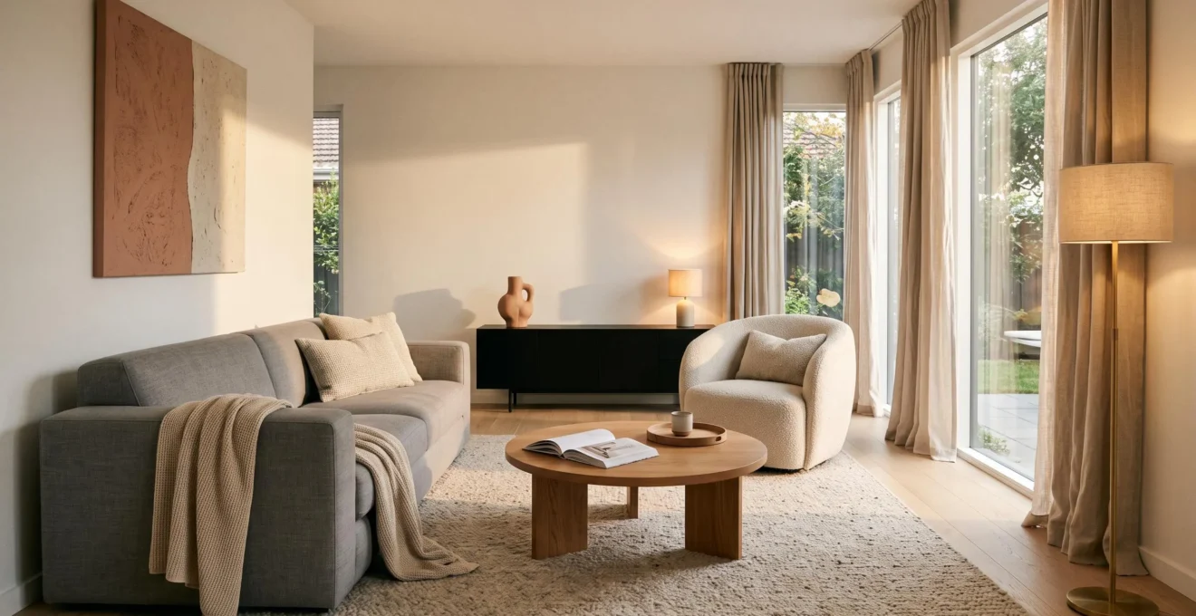
Clean lines can make a room feel peaceful, spacious and carefully considered. Yet when every piece of furniture has sharp corners, every surface is bare and the lighting is flat, that same simplicity can begin to feel cold or severe.
The solution is not to abandon streamlined furniture or fill empty spaces with decoration. It is to balance clear geometry with elements that introduce softness, depth and personality. A rectangular sofa can sit comfortably beside a round coffee table. Smooth cabinetry can contrast with linen curtains, while warm lamps bring dimension to otherwise plain walls.
The key is understanding what makes a room feel visually busy, which furniture shapes support its overall composition and where a small amount of texture or decoration will have the greatest impact.
Whether the starting point is a compact apartment or a generous open-plan living room, a warm minimalist interior relies on intentional choices rather than an abundance of objects.
How to keep clean-lined interiors warm and welcoming
- Establish a clear visual structure with simple furniture silhouettes and a restrained selection of decorative objects.
- Introduce softness through tactile fabrics, warm layered lighting and a few carefully chosen curved forms.
- Preserve personality with meaningful possessions, natural materials and finishing details that make the room feel lived in.
- Why Do Too Many Decorative Details Disrupt a Clean-Lined Interior?
- How Can You Soften Straight-Lined Furniture With Fabric, Lighting and Curves?
- Straight or Curved Furniture: Which Better Suits a Modern Room?
- Which Furniture Shapes Can Break the Clean Lines of a Minimal Room?
- What Should You Simplify First When a Room Feels Visually Too Busy?
- How Can You Make a Minimalist Room Feel Finished Without Adding Clutter?
- How Can You Add Tactile Materials Without Covering Every Surface?
- How Can Minimalist Interior Design Feel Calm Without Becoming Empty or Impersonal?
Why Do Too Many Decorative Details Disrupt a Clean-Lined Interior?
Too many decorative details disrupt a clean-lined room because they compete with the simple geometry that gives the space its sense of order. Small ornaments, contrasting patterns and repeated motifs introduce additional visual information. The result can feel busy even when the room contains relatively few objects. Effective decoration supports the furniture’s shape instead of constantly interrupting it.
Imagine a low rectangular sideboard against a plain wall. Its uninterrupted horizontal outline helps establish a clear composition. Covering it with miniature sculptures, frames, candles and trays introduces numerous smaller edges and competing points of attention.
Visual complexity is not simply a matter of how many objects are present. Research on measuring visual clutter published in the Journal of Vision examines how visual features affect search and recognition, including the contribution of color variation. Although the experiments were not conducted in residential interiors, they help explain why a visually contrasting object can attract more attention than several understated ones.
Supportive decoration reinforces the room’s composition. A single sculptural vase, one large artwork or the natural grain of a wooden cabinet can add interest without significantly multiplying visual distractions.
By contrast, a cluster of small ornaments, multiple competing prints or several unrelated decorative motifs can make the same surfaces feel fragmented.
A useful editing exercise is to remove one accessory temporarily. If the room loses nothing meaningful in appearance, function or personal character, that item may not need to return.
Start with decorations at eye level and on prominent horizontal surfaces. These are often encountered first when entering a room. Architectural elements, substantial furniture and useful objects generally deserve consideration before removal.
However, restraint should not become emptiness. Completely bare surfaces can expose every irregularity and make a space feel austere, particularly when soft furnishings are also missing.
The aim is not the smallest possible number of objects, but a composition in which the pieces that remain contribute something distinctive.
How Can You Soften Straight-Lined Furniture With Fabric, Lighting and Curves?
Straight-lined furniture feels warmer when paired with three complementary elements: soft textiles, layered warm lighting and a limited number of curved accents. Fabrics interrupt rigid outlines, lighting creates depth and softer shadows, and rounded shapes balance angular silhouettes. Together, these additions make a streamlined room more welcoming without changing its fundamental architectural structure.
Textiles are an effective starting point because they introduce irregularity naturally. Linen curtains form gentle folds against square windows, a wool rug softens the edges of a seating arrangement, and upholstered furniture creates a more comfortable transition between hard surfaces and the body.
For example, a straight-backed grey sofa can remain the central anchor of a living room while a generously textured rug, relaxed cushions and full-length curtains introduce warmth around it.
Lighting changes the appearance of these materials. A single cool overhead fixture may flatten the room’s visual hierarchy, whereas smaller light sources positioned at different heights can illuminate selected surfaces and produce gentler contrasts.
The U.S. Department of Energy guidance on light bulb color temperature identifies 2,700 K as warm lighting and 3,000 K as a soft, warm option commonly appropriate for residential settings.
These color temperatures are useful starting points rather than universal requirements. Brightness, glare, daylight and surrounding finishes also influence the result.
The Illuminating Engineering Society article on layered lighting distinguishes ambient, task and accent lighting. Although its discussion focuses on museum settings, the principles can be adapted to homes: general illumination supports movement, task lighting serves activities, and accent lighting highlights selected features.
Curves provide the third layer. A round coffee table, oval mirror or softly arched floor lamp introduces a contrasting shape without challenging the larger furniture pieces.
As an informal guideline, try one noticeable softening element near each dominant hard-lined furniture piece. It is a design starting point, not a prescribed ratio. Too many rounded accessories or competing textures can dilute the streamlined character the room was meant to retain.
Once the furnishings feel comfortable and the lighting has depth, the next decision is whether straight or curved furniture should dominate the room.
Straight or Curved Furniture: Which Better Suits a Modern Room?
Neither straight nor curved furniture is automatically better for a modern room. Straight silhouettes generally suit efficient layouts, modular storage and practical work surfaces, while curved pieces can soften circulation routes and introduce a more relaxed mood. The most versatile approach is to choose one dominant geometry and use the other selectively for contrast.
For a room with limited floor space, a rectangular sofa against a wall may use the available footprint more efficiently than a sweeping curved design. Similarly, straight-edged desks and dining tables often align more easily with walls and adjacent furniture.
Rounded furniture can offer advantages in exposed circulation areas. A circular coffee table removes projecting corners from the path around a sofa, although its diameter and surrounding clearance still need to be checked.
The practical differences become clearer when comparing the two approaches.
| Consideration | Straight-lined furniture | Curved furniture |
|---|---|---|
| Room size | Often fits efficiently against walls and into corners | Can soften compact rooms but may leave unused space around its outline |
| Function | Works well for desks, storage and dining surfaces | Often effective for lounge seating and accent tables |
| Circulation | Requires attention to projecting corners | Rounded edges can be easier to move around in some layouts |
| Visual character | Orderly, structured and architectural | Fluid, sculptural and relaxed |
| Flexibility | Commonly easier to align with modular arrangements | May need more careful positioning and surrounding space |
A useful combination is a rectangular sofa, a round coffee table and an arched floor lamp. The sofa establishes the main geometry; the smaller pieces interrupt it gently without creating a competing furniture arrangement.
Curved forms are prominent in many contemporary interiors partly because they offer a visual alternative to modular, hard-edged furniture. However, popularity alone is not a reason to invest in a large curved sofa.
Keep investment furniture practical and adaptable where possible. Curved side tables, lighting and occasional chairs can introduce a softer character without locking the entire room into a particular trend.
In layouts where storage capacity or precise wall alignment matters most, straight-lined furniture may remain the more useful choice.
Once the dominant geometry is established, it becomes easier to identify which existing furniture shapes reinforce it and which create unnecessary visual conflict.
Which Furniture Shapes Can Break the Clean Lines of a Minimal Room?
Furniture with complicated, conflicting or highly ornamental outlines can interrupt the visual order of a minimal room. Examples include elaborate carved legs, heavily rolled sofa arms, irregular freeform tables and pieces combining several unrelated shapes. The issue is not whether a piece belongs to a particular historical style, but whether its silhouette creates excessive competition with surrounding furniture.
A carved wooden chair can look beautiful in a restrained interior when it serves as a deliberate focal point. Place several ornate chairs alongside a kidney-shaped table, a geometric shelving unit and a bulky rolled-arm sofa, however, and the competing outlines may begin to fragment the composition.
Edge complexity matters more than style labels. Furniture described as contemporary can still have an elaborate silhouette, while an older piece with a straightforward outline may fit naturally into a modern room.
To assess an existing arrangement, photograph the room from its main entrance. Look at the dominant outline of each major furniture piece rather than its upholstery color or material.
As a practical styling exercise, group those outlines into broad families: rectangular, rounded or irregular. If several different shape languages compete for attention, consider simplifying the relationships between the largest pieces.
This is a qualitative design check, not a scientifically established limit on how many furniture shapes a room should contain.
Before replacing an awkward piece, explore whether a different position could improve its relationship with the rest of the room. An ornamental chair may work beautifully in a reading corner but feel distracting in the middle of a coordinated seating arrangement.
Reupholstery or a well-fitted slipcover may also help a visually complicated sofa blend into a restrained palette, although these changes cannot eliminate every structural detail.
A striking freeform piece can remain when the rest of the furnishings provide sufficient simplicity around it. The objective is coherent contrast, not rigid uniformity.
In small spaces, this distinction becomes especially important. Multiple competing silhouettes can make the visible floor area feel divided into smaller zones, even when the actual dimensions remain unchanged.
After establishing which furniture deserves to stay, the next priority is removing visual distractions in the most effective order.
What Should You Simplify First When a Room Feels Visually Too Busy?
When a room feels visually too busy, simplify its most visible surfaces before changing the furniture. Clear tabletops and counters, edit open storage, reduce competing textile patterns and then reassess wall decoration. This sequence helps reveal the underlying composition at relatively little cost, making it easier to see what genuinely needs changing.
Begin with coffee tables, sideboards, windowsills and other surfaces that attract attention from the room’s main entrance. Temporarily relocate decorative objects rather than discarding them immediately. This makes the exercise reversible and prevents rushed decisions.
Next, examine open shelves and glass-front cabinets. Books, containers and displayed possessions may be useful or meaningful, but differences in size, color and arrangement can create a busy overall impression.
Grouping similar objects, leaving intentional gaps and moving less frequently used items into closed storage can help create a more legible visual rhythm.
Then assess rugs, curtains, cushions and other textiles. A combination of several strong patterns may compete with the furniture’s outlines. Retaining one prominent pattern while choosing quieter supporting fabrics often produces a more cohesive result.
Visual weight matters as much as object count. A large dark wall piece or highly contrasting rug may dominate the room more than several smaller accessories. Prioritize what draws the eye most strongly rather than removing objects solely to reach a lower number.
Stand in the doorway and narrow your eyes slightly. This informal squint test makes it easier to identify the main visual masses and focal points. It is a compositional technique, not a clinical measure of visual clutter.
A five-step room simplification checklist
- Remove nonessential objects from the most visible tabletop and photograph the cleared surface. Deliverable: one before-and-after comparison.
- Review open shelving and regroup or store items that compete visually. Deliverable: one edited shelf with clearly defined groups and empty space.
- Identify the room’s strongest textile patterns and select one to remain dominant. Deliverable: a coordinated rug, curtain and cushion combination.
- Check the main view from the entrance and identify the most visually dominant object. Deliverable: one doorway photograph with a clearly recognizable focal point.
- Return only objects that contribute function, warmth or personal meaning. Deliverable: a final room photograph and a short list of retained items.
Stop simplifying when the room feels coherent and functional. An empty table is not necessarily better than a table holding a favorite book, a useful lamp and a carefully chosen object.
Once unnecessary visual competition has been reduced, the room may need finishing touches rather than further subtraction.
How Can You Make a Minimalist Room Feel Finished Without Adding Clutter?
A minimalist room feels finished when its proportions, materials, lighting and details form a coherent whole. A space that looks incomplete often lacks variation in height, texture or illumination rather than decorative objects. The solution is to add depth through larger design decisions, not to fill every empty shelf or surface.
Consider how the room works vertically. Floor-length curtains visually connect windows to the floor, an oversized artwork gives a wall an intentional focal point, and a thoughtfully positioned pendant can add interest above otherwise simple furniture.
Material finishes also contribute to completeness. Natural wood, polished stone, smooth paint and textured upholstery create gentle differences in how surfaces reflect and absorb light.
Instead of introducing several additional objects, a subtly textured wall treatment, restrained architectural paneling or coordinated cabinet hardware can make the existing interior feel more considered.
Repetition creates rhythm. For example, an oak dining table might be complemented by oak shelving and a smaller wooden accent elsewhere in the room. Repeating a finish three times is a useful styling exercise, not a fixed requirement.
The principle is consistency: selected materials or colors should appear connected rather than accidental.
Lighting can strengthen this effect. A general light source, a reading lamp and a small accent light establish distinct functions and create variation across the room after dark.
Design example: A minimalist apartment in Paris
A residential project by architect Clément Lesnoff-Rocard, documented in Architectural Digest’s tour of a minimalist Paris apartment, combines a restrained palette with linen upholstery, herringbone parquet, curved architectural features and contrasting wood finishes.
Its sculptural details, vintage furnishings and selective artworks illustrate how a minimalist interior can incorporate material richness and individuality while retaining a clear architectural composition. This is one documented project rather than a universal design formula.
Finally, consider the less prominent transitions. Window treatments, skirting boards, door handles and flooring edges are part of the overall visual language. Inconsistent finishes in these areas can make an otherwise carefully furnished room appear incomplete.
With the major details coordinated, tactile contrast offers another way to make the room inviting without increasing clutter.
How Can You Add Tactile Materials Without Covering Every Surface?
Add tactile materials where they create a noticeable contrast or improve everyday comfort, rather than distributing texture evenly across the room. A wool rug against a smooth floor, linen upholstery beside polished wood or a textured wall behind simple cabinetry can introduce warmth without extra decoration. The surrounding smooth surfaces give each tactile element room to stand out.
The effect comes from juxtaposition. If every wall, chair, cushion and rug has a pronounced texture, the distinctions between materials become less apparent and the composition may feel busy again.
Start with places where people naturally make contact: seating, rugs, bedding, handles and frequently used furniture. These elements provide a tactile experience as well as a visual one.
For a living room with sleek cabinets and a polished floor, a substantial wool rug may be more useful than adding several textured accessories to shelves and tables.
In a bedroom, relaxed linen bedding can soften a clean-lined bed frame without requiring decorative cushions piled across the mattress.
There are several low-coverage ways to introduce tactile character:
- Wool or woven rugs: add softness underfoot and define a seating area.
- Linen curtains: create natural folds without a strong decorative pattern.
- Ceramic or stone accessories: bring subtle surface variation through one selected object.
- Rattan or woven furniture: introduce an organic texture through a single chair or accent piece.
- Textured plaster or paint: give architectural surfaces depth without adding freestanding objects.
The selection should respond to the materials already present. A room with heavily grained timber may need only smooth upholstery and one nubby rug. A predominantly painted and lacquered room may benefit from more visible natural fibers.
Consider texture within each sightline. A heavily textured wall, patterned rug and bold bouclé sofa can all be appealing separately, but their combined impact may overwhelm a compact seating arrangement.
Choosing one dominant tactile element and allowing the remaining finishes to support it generally preserves a clearer hierarchy.
Practical considerations matter too. Deep-pile fabrics may require more maintenance, woven surfaces may catch on clothing or pets’ claws, and delicate finishes can be less suited to demanding household areas. Warmth should remain compatible with everyday use.
Materials establish comfort, but personal possessions and everyday routines are what ultimately keep a minimalist space from feeling anonymous.
Key takeaways before bringing personality back into the room
- Preserve a recognizable furniture structure, but allow select shapes and materials to create contrast.
- Use lighting, natural textures and repeated finishes to build depth without adding unnecessary objects.
- Make room for meaningful possessions and everyday activities rather than treating every visible item as clutter.
How Can Minimalist Interior Design Feel Calm Without Becoming Empty or Impersonal?
Minimalist interior design feels calm without becoming impersonal when it balances visual order with evidence of everyday life. Clean furniture lines, controlled colors and clear surfaces provide structure, while meaningful objects, comfortable fabrics, natural materials and welcoming lighting introduce personality. The goal is to curate what stays, not to remove everything that makes a home distinctive.
A minimalist room does not need to conceal every book, family photograph or personal collection. It needs a considered way to accommodate them.
Rather than scattering photographs across every surface, arrange a small selection together in one location. Books can remain accessible beside a favorite reading chair, and a treasured object can become a focal point when it has enough surrounding space.
Personal meaning is a legitimate reason to retain an object. An inherited chair, a travel souvenir or an artwork with emotional significance may deserve a place even if its shape does not perfectly match the dominant furniture style.
Such pieces often work best when their surroundings are visually quiet. This makes their individuality apparent without forcing them to compete with numerous other accents.
Natural materials are useful warmth anchors. Wood introduces tonal variation, plants provide organic shapes, and relaxed textiles show that the space is intended for everyday use.
Layered lighting creates another connection between visual simplicity and comfort. A lamp beside an armchair suggests a place to read, while soft illumination near a dining area supports a more intimate evening atmosphere.
Without any of these lived-in qualities, even a beautifully organized room can resemble a showroom.
Comfort is also functional. A throw within reach, a small table for a cup of tea and practical storage for frequently used items can make an uncluttered room more convenient rather than less personal.
There is no need for every accessory to be perfectly aligned or permanently concealed. Small variations in the arrangement can make the room feel natural while the larger furniture establishes visual consistency.
Ultimately, clean lines should provide a calming framework, not dictate an absence of character. Each element can earn its place by helping the room feel more ordered, more useful or more connected to the people who live there.
To put these ideas into practice, choose one room and make two small changes: remove a distracting decorative grouping, then add or reposition something that creates genuine warmth, such as a lamp, textile or meaningful object. Assess the result during daylight and in the evening before making any larger decisions.
Can a minimalist room use dark furniture without feeling cold?
Yes. Dark furniture can create a strong focal point when balanced with warm timber, comfortable upholstery, appropriate lighting and lighter surrounding surfaces. The important consideration is contrast and visual weight rather than avoiding dark colors altogether.
Are white walls necessary for a clean-lined interior?
No. Clean lines come primarily from furniture geometry, architectural details and visual organization. Warm off-white, muted green, earthy beige and deeper neutral colors can all support a streamlined design when the overall palette remains coherent.
What kind of curtains work best with modern straight-lined furniture?
Simple floor-length curtains in linen or another softly draping fabric can complement straight-lined furniture. Their natural folds introduce gentle irregularity, while restrained colors and uncomplicated hanging details preserve the room’s architectural character.
Can different wood tones work together in a minimalist room?
Yes. Different wood tones can add depth when their undertones and distribution are considered. A dominant wood finish combined with one complementary tone is often easier to coordinate than several unrelated finishes competing throughout the space.
How do you maintain a warm minimalist room in a busy household?
Prioritize accessible closed storage, durable upholstery, practical surfaces and designated places for everyday belongings. A room remains welcoming when its design accommodates real routines. Regularly editing unused objects is generally more sustainable than expecting every surface to remain completely empty.