Colors and Materials
Every successful interior begins long before furniture is placed or walls are painted. It begins with two fundamental decisions that work hand in hand: color and material. Together, they form the visual and tactile language of a space, setting the mood, defining its character, and influencing how it feels to live in every single day. Whether you are redecorating a single room or designing a home from scratch, understanding how colors and materials interact is the key to creating spaces that feel intentional, comfortable, and timeless. This pillar page serves as your complete introduction to the subject, breaking down the essential concepts in a clear, accessible way.
Why Colors and Materials Are the Foundation of Interior Design
Think of an interior as a symphony: furniture, lighting, and layout are the instruments, but color and material are the sheet music that tells them how to play together. A poorly chosen palette can make even expensive furniture feel chaotic, while a well-thought-out combination of tones and textures can elevate the simplest room.
Colors affect us psychologically—warm tones like terracotta and amber energize a space, while cool shades like sage green and slate blue promote calm. Materials, on the other hand, engage more than just our eyes. A rough linen cushion, a smooth oak table, or a brushed brass handle all invite touch and contribute to what designers call the tactile dimension of a room. Neglecting this dimension is one of the most common mistakes beginners make: a space can look perfect in photos yet feel cold and lifeless in person.
Understanding Color Theory: The Basics Every Homeowner Should Know
Color theory can seem intimidating, but its core principles are simple and immediately practical.
The Color Wheel and Key Relationships
The color wheel is your roadmap. Three relationships matter most for interiors:
- Monochromatic schemes use variations of a single hue—lighter and darker shades of blue, for example. They create serenity and visual cohesion, ideal for bedrooms.
- Analogous schemes combine neighboring hues, such as green, teal, and blue. The result is harmonious with subtle variety.
- Complementary schemes pair opposite hues, like blue and orange. Used sparingly, they create dynamic, energetic accents.
The 60-30-10 Rule
A classic guideline in interior design: allocate roughly 60% of the room to a dominant color (often walls and large surfaces), 30% to a secondary color (upholstery, rugs, curtains), and 10% to an accent color (cushions, artwork, accessories). Imagine a living room with soft white walls, a warm beige sofa, and deep rust-colored cushions—that simple arithmetic produces balance without effort.
Warm vs. Cool: Setting the Temperature
Beyond hue, every color carries a temperature. Warm colors (reds, oranges, yellows) advance visually and make large rooms feel cozier. Cool colors (blues, greens, violets) recede, making small spaces feel larger and airier. A practical rule of thumb: use warm tones in north-facing rooms that lack natural light, and cool tones in bright, sun-drenched spaces.
The World of Materials: Natural, Synthetic, and Everything Between
If color is what a space says, material is what it confesses. Materials carry history, texture, and even sound-absorbing qualities. They generally fall into three families:
Natural Materials
- Wood: versatile and warm; light oak brightens Scandinavian interiors, while walnut brings depth to contemporary spaces.
- Stone and marble: durable and prestigious, ideal for kitchens and bathrooms, though heavier on the budget.
- Linen, cotton, and wool: textiles that soften acoustics and add comfort.
- Rattan and cane: lightweight woven materials that bring a relaxed, organic touch.
Synthetic and Engineered Materials
- Engineered wood and laminate: affordable and stable alternatives to solid wood.
- Quartz composite: a resilient, low-maintenance worktop material.
- Velvet and performance fabrics: luxurious looks with improved stain resistance.
Neither family is inherently better. Natural materials excel in authenticity and aging gracefully; synthetics often win on durability, maintenance, and price. The best interiors blend both according to how each room is actually used.
Metal, Glass, and Ceramics
These are the punctuation marks of a room. Brass and gold-tone finishes add warmth, matte black provides graphic contrast, glass expands sightlines, and glazed ceramics introduce color and shine in small, affordable doses.
How Color and Material Work Together
Here lies the heart of the subject: color never exists in a vacuum—it behaves differently depending on the surface it sits on. The same paint color looks completely different on plaster, wood, or brick. Matte finishes absorb light and deepen colors; glossy surfaces reflect light and brighten them. This is why designers always test samples in the actual room, under actual lighting conditions, before committing.
Consider a practical example: a navy blue painted wall in a matte finish feels deep and enveloping, almost like velvet. The exact same navy on a lacquered surface becomes sharp and reflective. Neither is wrong—but they produce entirely different rooms. Similarly, a beige palette can feel bland on smooth drywall yet rich and layered when spread across bouclé fabric, jute, and raw wood, because texture compensates for chromatic simplicity.
A useful metaphor: think of color as the melody and texture as the rhythm. A simple melody becomes fascinating with a complex rhythm; a limited palette becomes sophisticated through varied textures.
Choosing Colors and Materials Room by Room
Each room in a home has its own functional demands, and your choices should reflect them.
The Living Room
As the most social space, it tolerates bolder choices. Layered textiles, a statement material like a marble coffee table, and a palette anchored by neutrals with one or two confident accent colors work well. Prioritize durable upholstery if the room sees heavy daily use.
The Kitchen and Bathroom
These are performance spaces. Humidity, heat, grease, and water dictate material choices: sealed stone or composite countertops, ceramic or porcelain tiles, moisture-resistant paints (satin or semi-gloss finishes are easier to wipe clean). Color-wise, lighter tones enlarge compact rooms, while darker cabinetry paired with light worktops creates striking contrast.
The Bedroom
Rest is the priority. Muted, low-saturation colors—dusty rose, soft grey-green, warm neutrals—support relaxation. Materials should lean soft: washed linen bedding, wool throws, upholstered headboards. Avoid high-gloss surfaces here; they feel too energetic for a restful atmosphere.
Entryways and Hallways
These transitional spaces are perfect for experimentation. Since you spend little time in them, you can afford a bolder paint color or an unexpected wallpaper. They also endure heavy traffic, so washable, scuff-resistant finishes are a wise investment.
Practical Checklist: Before You Commit
Before purchasing paint or ordering materials, run through this checklist:
- Assess natural light: observe the room at different times of day; colors shift dramatically from morning to evening.
- Test large samples: paint at least a square meter on the wall, and bring home full material samples rather than judging from small swatches.
- Consider maintenance honestly: matte black fixtures show water spots; light linen stains easily; ask yourself how much upkeep you will genuinely do.
- Think about cohesion: rooms that flow into each other should share at least one color or material to avoid a disjointed feel.
- Factor in longevity: trendy colors are best applied to easily changeable elements (cushions, accessories), while permanent surfaces benefit from timeless choices.
Common Mistakes to Avoid
- Choosing colors under store lighting, which distorts perception; always evaluate under natural or your own home’s lighting.
- Mixing too many materials: limit each room to three or four main materials for a coherent look.
- Ignoring undertones: a « white » paint can lean pink, yellow, or blue, clashing with existing furniture.
- Following trends blindly: a color that dominates social media may not suit your light conditions or daily life.
- Forgetting the ceiling and floor: these large surfaces count toward your palette more than any accent cushion.
Conclusion: Building Confidence with Color and Material
Mastering colors and materials is not about memorizing rules—it is about understanding why certain combinations feel right and developing the confidence to make your own choices. Start small: test a new paint shade on one wall, introduce a new texture through a throw or a rug, and observe how the room responds. Interior design is iterative, and every experiment teaches you something about your own taste. By combining a solid grasp of color theory with an honest assessment of how materials perform in real life, you will be equipped to create spaces that are not only beautiful, but genuinely livable. Let the articles in this category be your companions as you explore each topic in greater depth.
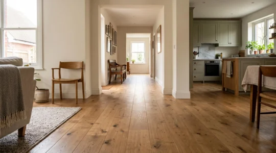
How Can Continuous Flooring Make Connected Rooms Feel Larger and More Cohesive?
Continuous flooring can make several adjoining rooms feel like one larger, more coherent space without changing their walls or layout. By extending the same floor finish through doorways and shared…
Lire la suite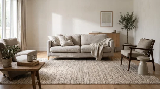
How Can Woven Rugs Add Texture Without Making a Room Feel Too Busy?
A woven rug can make a room feel warmer and more complete without introducing another bold colour, decorative object or competing pattern. Its strength lies in the way the weave…
Lire la suite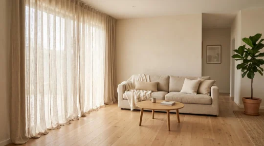
How Can Linen Draperies Soften a Room Without Blocking Too Much Natural Light?
Linen draperies soften a room by filtering direct sunlight, introducing natural texture and framing windows without the visual heaviness of thick curtains. Choosing an appropriate weave and installing the panels…
Lire la suite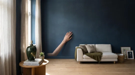
How Can a Matte Finish Make a Room Feel Softer Without Looking Flat?
A matte finish can make a room feel softer by reducing sharp reflections, allowing colour and surface texture to become the focus rather than glare. The challenge is preserving enough…
Lire la suite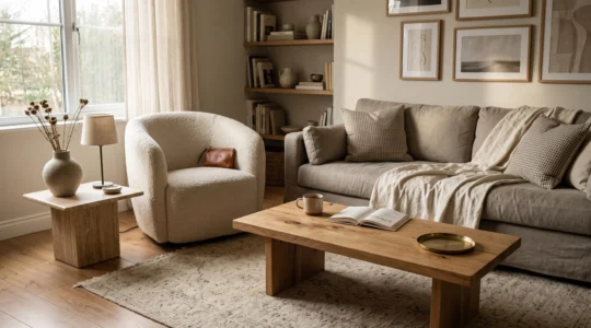
How Can You Mix Material Textures Without Making a Room Feel Visually Busy?
Mixing wood, fabric, stone, metal and glass can make an interior feel richer without making it feel crowded. The key is to give each texture a distinct purpose, establish a…
Lire la suite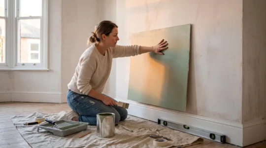
How Can You Choose Wall Paint That Looks Right in Both Daylight and Artificial Light?
A wall paint colour that looks balanced in a shop can appear unexpectedly grey in the morning, yellow beside a lamp or much darker once it covers an entire room….
Lire la suite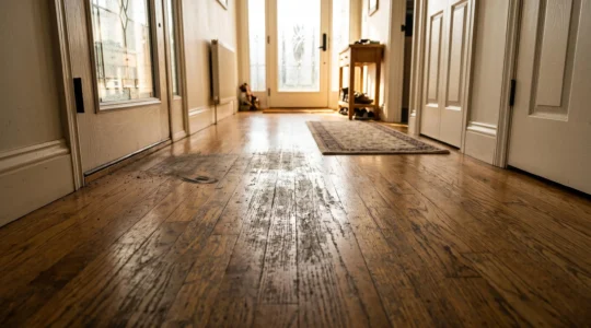
Which Durable Floor Finishes Work Best in High-Traffic Rooms?
The most durable floor finish is not necessarily the hardest, glossiest or most expensive coating. In high-traffic rooms, lasting protection depends on matching the finish to the way the floor…
Lire la suite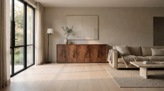
How Can Natural Wood Grain Add Warmth Without Making a Room Feel Rustic?
Natural wood grain can make a contemporary room feel warmer without introducing the heavy, weathered character associated with rustic interiors. The difference lies in how the grain is selected, distributed…
Lire la suite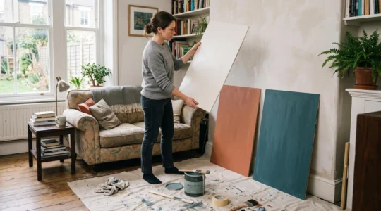
How Can You Choose a Colour Palette That Works Across an Entire Room?
A room can contain beautiful individual colours and still feel strangely unsettled. The walls may complement the sofa, the cushions may look attractive on their own, and the curtains may…
Lire la suite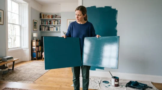
How Can You Choose Surface Finishes That Suit Both the Material and the Room?
The right surface finish depends on more than whether a room looks better with matt or satin paint. Sheen changes how light travels across walls, how readily imperfections become visible…
Lire la suite