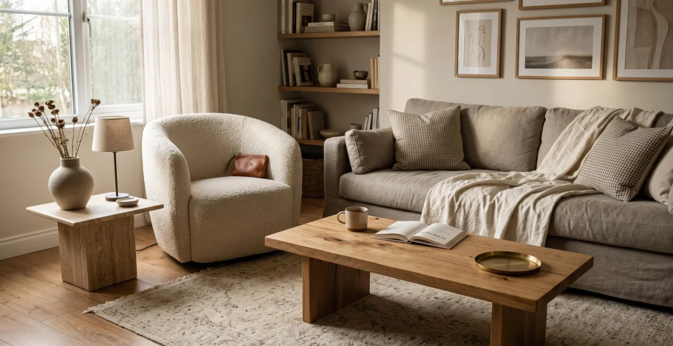
Mixing wood, fabric, stone, metal and glass can make an interior feel richer without making it feel crowded. The key is to give each texture a distinct purpose, establish a visual hierarchy and connect contrasting materials through shared colors, undertones or repeated details.
A room does not become visually busy simply because it contains several materials. Problems arise when too many surfaces demand equal attention, when finishes clash without a connecting element, or when textured objects accumulate without contributing to the overall composition.
A practical approach starts with what already exists: flooring, large furniture, walls and natural light. These elements establish the room’s material character before smaller decorative choices enter the picture. Rather than adding texture everywhere, identify where contrast would create depth and where a quiet surface would provide balance.
The following principles apply whether a room is being designed from scratch or adjusted gradually with existing furniture and finishes.
How to balance mixed textures at a glance
- Choose one dominant material character, then use contrasting textures to support rather than compete with it.
- Connect wood, fabric, stone and metal through compatible undertones, repeated details or a restrained color palette.
- Concentrate tactile interest in selected areas and use lighting to reveal existing textures before adding more objects.
- Why Do Rooms With Mostly Smooth Materials Often Feel Flat and Unfinished?
- How Can You Layer Wood, Fabric and Stone Without Creating Visual Clutter?
- Which Material Should Become the Main Texture in a Mixed-Material Room?
- Which Texture Combinations Can Make a Small Room Feel Overdesigned?
- How Can You Add More Texture to a Finished Room Without Changing Its Surfaces?
- How Can You Add Tactile Materials Without Covering Every Surface?
- How Can You Combine Rough Stone, Smooth Metal and Soft Fabric in One Room?
- How Can You Use Contrasting Textures Without Making an Interior Feel Disconnected?
Why Do Rooms With Mostly Smooth Materials Often Feel Flat and Unfinished?
Rooms dominated by smooth materials can feel flat because their surfaces offer relatively little variation in visible relief, reflected light or shadow. Even when the furniture and colors are carefully coordinated, a combination of polished floors, plain walls and sleek furnishings may lack the subtle contrasts that help an interior feel layered and complete.
Smooth finishes often reflect or diffuse light more evenly than strongly textured surfaces. A polished tabletop, flat cabinet front and uniformly painted wall may therefore contribute similar visual information, especially under broad, even lighting. Without noticeable grain, weave or surface relief, the eye has fewer material differences to explore.
Texture and color, however, perform different functions. Color distinguishes surfaces through hue, saturation and brightness. Texture introduces differences in grain, softness, reflectivity and physical irregularity. A room can contain several strong colors yet remain materially uniform if every finish is equally sleek.
This explains why repainting a room does not necessarily resolve a sense of flatness. Changing the wall color may alter its mood without introducing the material variation that is missing.
A useful diagnostic is a black-and-white photograph. Photograph the room, remove the color and examine whether the larger surfaces still appear distinguishable. This is an informal design exercise rather than a scientifically validated test: tonal contrasts remain visible in grayscale, so the result cannot isolate texture perfectly. Nevertheless, it can help reveal whether material differences are contributing enough to the composition.
Look beyond furniture. Several substantial surfaces are easily overlooked:
- Ceilings: broad, featureless planes can reinforce an otherwise uniform interior.
- Walls: large areas of smooth paint may offer little surface variation, particularly under diffuse lighting.
- Floors: consistently polished or uniformly finished flooring can extend the same material impression across the room.
The first improvement need not involve renovation. A woven rug, visibly grained wooden object or directional light may introduce the missing variation while preserving the existing architecture.
Once those areas are clear, the next decision is not how many additional textures to introduce, but how to assign each one a meaningful role.
How Can You Layer Wood, Fabric and Stone Without Creating Visual Clutter?
Layer wood, fabric and stone by assigning each material a distinct visual or functional role. Wood might provide warmth and structure, fabric might soften contact areas, and stone might introduce a grounded accent. Keep their undertones compatible and vary their visual intensity so the materials contribute to one composition instead of competing for attention.
Consider a living room with oak flooring, a linen sofa and a stone coffee table. Each material serves a recognizable function. The wood establishes the underlying character, the linen creates comfort, and the stone introduces a contrasting surface. Adding another material is worthwhile only if it provides something the existing arrangement lacks.
This approach is more reliable than counting textures because visual intensity matters more than material variety alone. Strongly veined marble, highly figured wood and a bold woven fabric may compete when they occupy prominent positions. The same three material categories can appear quieter when the stone has subtle veining, the wood has restrained grain and the textile has an even weave.
Undertones provide another useful connection. Honey-colored oak, warm beige limestone and natural oatmeal linen may feel related despite having different surface qualities. A cool gray stone can also work beside warm wood, but the temperature contrast becomes an intentional part of the design and may benefit from a bridging detail.
Two different techniques are involved in material layering:
- Physical layering places objects over one another, such as a wool throw on a linen sofa or a rug beneath a table. Keep the number of overlapping layers manageable, particularly where their edges and patterns converge.
- Material juxtaposition places distinct finishes beside one another, such as wood cabinetry against a stone worktop. Assess the transition, scale and undertones where the surfaces meet.
Architectural Digest‘s examples of blending contrasting decorating styles include a residential interior combining warm-toned limestone flooring, leather pillows, a soft throw and textured wallpaper. This illustrates how varied materials can coexist within a coordinated design, although it does not establish a universal material formula.
The point at which layering begins to feel crowded varies with the room. Rather than applying an arbitrary material limit, compare the most expressive surfaces. If several are equally prominent, quieten one through a simpler finish, smaller area or less conspicuous placement.
A balanced palette of materials creates the foundation for the room. The next step is deciding which existing texture deserves to lead the arrangement.
Which Material Should Become the Main Texture in a Mixed-Material Room?
The main texture should usually be selected from the room’s largest or most influential existing surfaces, such as flooring, a substantial sofa or a prominent wall. Its role is to establish a recognizable material character that other finishes can support. The best choice also depends on sightlines, lighting, everyday use and maintenance requirements.
Start with the elements that are expensive or impractical to change. If a room has extensive oak flooring, visible wood grain may already establish its dominant material identity. If it contains a large textured sofa and relatively neutral flooring, upholstery may be the stronger starting point.
Dominance is not always a question of surface area. A relatively small feature can have significant visual impact when it occupies a central sightline or catches distinctive light. A strongly veined stone fireplace, for example, may attract more attention than an expansive but quiet floor.
It helps to distinguish two forms of dominance:
| Criterion | Dominant by area | Dominant by visual impact |
|---|---|---|
| Typical example | Timber flooring across the room | A dramatically veined stone fireplace |
| Primary influence | Establishes the overall material background | Directs attention toward a focal point |
| Supporting strategy | Use smaller textures for contrast | Keep nearby finishes comparatively restrained |
| Main risk | Excessive material uniformity | Competing focal points |
Daily use should influence this decision as much as appearance. A highly textured sofa may be visually appealing but less practical if it is difficult to clean or vulnerable to snagging in the intended household. Fabric construction, cleaning instructions, pilling behavior and suitability for the furniture’s use all deserve consideration.
The Association for Contract Textiles explains in its abrasion testing guidance that laboratory abrasion scores alone cannot predict upholstery service life. Its advice concerns contract textiles, but the broader caution is relevant when considering heavily used seating: assess maintenance and intended use alongside test figures.
Before committing to a prominent material, arrange samples together in the actual room. Examine them in morning light, afternoon light and under the lighting normally used in the evening. Compare both the colors and the way each finish reflects light.
A five-step material selection check
- Photograph the room from its main entrance and seating position. Deliverable: two reference photographs showing the principal sightlines.
- List the three largest fixed or difficult-to-replace surfaces. Deliverable: a short inventory naming their materials and finishes.
- Identify the surface that already attracts the most attention. Deliverable: one nominated dominant texture with a reason for the choice.
- Place potential supporting material samples together in the room and compare them under daytime and evening light. Deliverable: a photograph of the preferred combination under each condition.
- Check care requirements and suitability for daily contact before selecting the final material. Deliverable: a confirmed shortlist with maintenance notes.
A clear material hierarchy becomes particularly valuable in small spaces, where individual surfaces remain visible in closer proximity.
Which Texture Combinations Can Make a Small Room Feel Overdesigned?
Small rooms can feel overdesigned when several highly expressive textures occupy prominent positions at once. Strong stone veining beside dramatic wood grain, multiple glossy finishes or competing rough surfaces may create excessive visual activity. A more restrained arrangement uses one prominent texture and allows nearby materials to provide quieter contrast.
The issue is not that certain combinations are inherently unsuitable for small spaces. Rather, a compact layout often places surfaces closer together within the viewer’s field of vision. There may be fewer uninterrupted areas to separate distinctive finishes.
Two highly reflective materials, for example, can introduce multiple bright highlights and reflected shapes. Conversely, several coarse finishes may make the room feel heavily detailed, particularly when each has a pronounced pattern or strong edge.
Neither effect is inevitable. The scale of the textures, available daylight, color relationships and furniture arrangement all influence the result.
Consider these possible adjustments:
| Potentially busy combination | More restrained alternative | Why it may help |
|---|---|---|
| Strongly veined stone beside boldly grained wood | Keep the stone expressive and choose quieter wood grain | Establishes one principal visual feature |
| Several prominent glossy metal and glass pieces | Use one reflective accent beside matte finishes | Reduces competing reflections |
| Coarse stone across several walls | Concentrate roughness on one architectural feature | Preserves calmer surrounding surfaces |
| Multiple chunky textiles on a small sofa | Choose one substantial weave and simpler companions | Limits overlapping visual detail |
Architectural Digest’s advice on styling statement sofas emphasizes restraint and balance without rejecting prominent furniture in small rooms. A striking sofa can still work when the surrounding materials allow it to remain the focus.
Lighting can change how these combinations appear. Strong directional daylight may make grain and relief more conspicuous, potentially increasing contrast. But abundant natural light can also make a compact room feel more open and help distinct materials remain legible.
In a darker room, broad and relatively uniform lighting may soften some surface differences, while concentrated artificial light can accentuate others. Assess the actual lighting rather than assuming a finish will behave identically in every small space.
Often, reducing competition between materials is more effective than removing texture altogether. The same principle can improve a finished room without replacing any permanent surfaces.
How Can You Add More Texture to a Finished Room Without Changing Its Surfaces?
Add texture to a finished room through removable textiles, tactile accessories, plants and carefully positioned lighting. A woven rug, linen cushion, ceramic vessel or directional lamp can introduce material depth without changing floors, walls or cabinetry. Begin with one addition, assess its effect in everyday lighting and avoid accumulating objects simply to increase variety.
The most substantial reversible additions are often textiles. A rug can interrupt an uninterrupted floor finish, while a throw or cushion can contrast with smooth upholstery. Their effect depends on visible weave, pile, scale and placement rather than merely the number of items introduced.
Smaller objects can add local contrast. A hand-finished ceramic bowl, a woven basket or a wooden tray brings material variation to a shelf or table. Plants introduce irregular forms and leaf surfaces, although their visual contribution depends on species, size and location.
Textured artwork is another option when walls feel too uniform. A relief surface, woven wall hanging or artwork with a visible material quality may create contrast without changing the wall finish itself.
Lighting deserves attention before further purchases. Directional illumination can reveal grain, relief and surface irregularities that are already present but difficult to see under even ambient lighting.
According to Selux‘s wall grazing and wall washing application guide, wall grazing emphasizes texture through shadows, while wall washing aims for more uniform illumination. The document also explains how luminaire position relative to the wall affects shadow visibility.
This distinction is useful for brick, stone and wood surfaces. A suitable grazing light may make existing material relief more apparent, eliminating the need for additional decorative layers. The guide describes architectural lighting techniques rather than a tested method of reducing visual clutter.
Changes should be gradual. Introduce one textured element, live with it for several days and observe the room from its normal seating and circulation points. Then decide whether another addition is necessary.
The initial impression may differ from how the element feels after daily use, but there is no fixed adjustment period. If an addition consistently distracts from the room’s main features, consider moving or removing it.
This approach treats texture as an adjustment to the existing room rather than a reason to redecorate it completely. It also raises a useful question: where does physical texture matter most?
How Can You Add Tactile Materials Without Covering Every Surface?
Add tactile materials selectively where people naturally sit, lean, walk or reach. Textured upholstery, cushions, rugs and hand-contact objects create a noticeable sensory experience without requiring every surface to be covered. Surround these elements with calmer finishes so their physical qualities remain distinct rather than merging into a uniformly textured background.
It is useful to distinguish texture that is primarily seen from texture that is experienced through touch. A rough stone wall or heavily grained wooden cabinet may be visually expressive from across a room. A soft throw, upholstered armrest or woven cushion contributes additional value when someone physically encounters it.
This distinction helps determine placement. A tactile material does not always need to occupy a large area to be meaningful.
Consider the locations where contact happens naturally:
- Seating areas: textured upholstery, cushions or throws provide direct contact.
- Underfoot: a rug introduces a contrasting sensation against timber, tile or stone.
- Hand-contact areas: a wooden handle, tactile tray or carefully selected furniture edge can introduce material character at a smaller scale.
- Occasional-contact surfaces: blankets or accessories placed within easy reach offer tactile variety without dominating the room.
A single pronounced texture can become more noticeable when surrounded by smoother materials. A chunky wool cushion on a closely woven sofa, for example, creates a clear contrast. Covering the entire sofa with similarly chunky textiles can reduce that distinction while increasing visual density.
This makes open space and visual restraint active parts of the composition. An uncovered tabletop, an uninterrupted stretch of upholstery or a simple wall provides a quiet setting for more expressive materials.
Durability is especially important where tactile contact is frequent. A heavily textured fabric may have a surface that behaves differently under abrasion, pulling or repeated cleaning than a flatter alternative. Its suitability should be determined from the specific textile construction and care requirements rather than appearance alone.
For a frequently used sofa, ask the supplier about abrasion performance, pilling, cleaning and practical suitability. A textured wall panel, meanwhile, may receive little physical wear even though it provides a substantial visual effect.
Selective placement makes it possible to introduce stronger material contrasts. Rough stone, smooth metal and soft fabric offer a particularly clear example because their physical characteristics are so different.
How Can You Combine Rough Stone, Smooth Metal and Soft Fabric in One Room?
Combine rough stone, smooth metal and soft fabric by giving each material a clear territory. Stone can provide an architectural anchor, metal can introduce a refined connecting detail, and fabric can soften the places people use. Coordinate their undertones, control their proportions and repeat selected details where necessary to make the combination feel intentional.
The appeal of this combination lies in its contrasting surface qualities. Rough stone creates visible irregularity, smooth metal introduces reflections or a controlled sheen, and fabric offers a softer, more flexible surface. Each material provides a different sensory register without necessarily requiring strong color contrast.
A practical arrangement might use an exposed stone fireplace, a slim metal floor lamp and a wool-upholstered bench. The stone remains fixed and substantial, the lamp contributes a narrow vertical element, and the upholstery concentrates softness in a seating zone.
These are useful design roles rather than restrictions. A stone side table can also work as an accent, while fabric curtains can occupy a large architectural opening. What matters is that the relative scale and prominence of the materials remain deliberate.
Metal finish offers a convenient way to adjust the relationship. Brushed brass or aged copper may visually connect warm-toned stone with cream or oatmeal textiles. Polished steel or chrome can create a sharper contrast, particularly beside warm materials.
Cool metals are not inherently less harmonious. They may work well with cooler stone, gray upholstery or an interior deliberately built around warm-cool contrast. Reflectivity, color and placement all affect the outcome.
Repetition can strengthen the composition without adding much visual weight. A brass lamp may be echoed by a small cabinet pull, while a wool bench can be connected to a similarly toned cushion elsewhere. The repeated elements need not match exactly or occupy equal areas.
The idea that every material must appear twice is best treated as a practical design prompt, not an absolute requirement. A distinctive stone wall can remain coherent as a single feature when the other materials are sufficiently coordinated.
Look at the composition from both nearby and distant viewpoints. Close up, the material differences should be perceptible. From across the room, the eye should still recognize a coherent arrangement rather than several unrelated decorative statements.
Once contrasting textures have distinct roles, the final challenge is ensuring that their differences contribute to a lasting visual relationship.
Key takeaways before combining contrasting finishes
- Choose the intended contrast first: rough against smooth, matte against reflective, or structured against soft.
- Identify at least one unifying detail that can connect materials without making them identical.
- Consider how wear, cleaning and changing finishes may affect the relationship over time.
How Can You Use Contrasting Textures Without Making an Interior Feel Disconnected?
Contrasting textures feel connected when their differences are deliberate and at least one visual relationship runs through the room. Shared colors, compatible undertones or repeated details can link rough, smooth, soft and reflective materials. The goal is not to make every surface match, but to establish enough continuity that each contrast appears intentional.
Contrast and cohesion serve different purposes. Contrast gives an interior variation and character. Cohesion allows its individual elements to be read as parts of one composition. A room needs both, although the preferred balance depends on the intended atmosphere.
Three practical connectors can help coordinate contrasting materials:
- Shared color: a warm gray stone surface and a similarly colored woven cushion can relate through color despite their different textures.
- Compatible undertones: honey-toned wood, warm brass and natural linen can establish a common temperature across otherwise distinct finishes.
- Recurring pattern or detail: linear wood grain may find a subtle echo in a ribbed fabric or finely striped textile.
One strong connector may be sufficient. Using all three is unnecessary if doing so would make the arrangement repetitive or overly coordinated.
Intentional contrast also differs from the accidental accumulation of unrelated finishes. Furniture and accessories acquired over time may introduce multiple wood tones, metal finishes and textile textures that were never considered together.
To diagnose such a room, make an inventory of the most visible materials. For each one, identify its color, undertone, surface character and any relationship to another finish. An element with no apparent connection is not automatically unsuitable, but it deserves closer attention.
A connection may be created through a small supporting detail rather than replacing the material itself. For example, a cool metal lamp beside predominantly warm furnishings might be integrated through a similarly toned picture frame or a textile containing a related neutral shade.
There is also a longer-term consideration: materials do not age identically. Leather can develop patina, certain metals can tarnish, and woven fabrics can soften, pill or change appearance with use. Natural stone and wood may also show wear or shifts in finish depending on their treatment and maintenance.
These changes are not inherently negative. An interior using materials that develop complementary signs of use may become more characterful over time. However, a design relying on a precise match between delicate finishes may require more maintenance to preserve its original appearance.
Choose materials with realistic expectations about cleaning, durability and patination. The aim is a room whose material relationships remain convincing during everyday life, not only when every surface is newly installed.
Begin with a simple exercise: photograph the room, identify its dominant texture and select one secondary material that provides a clear contrast while sharing a visible connection. Adjust one element at a time, reassess the composition under everyday lighting and stop when the room feels sufficiently layered without losing its calm.
Can different wood finishes work together in the same room?
Yes. Different wood finishes can work together when their grain, undertones and proportions are considered as a group. Choose one wood finish to establish the primary character, then introduce others in supporting roles. Exact matching is not essential, but several equally prominent wood grains can create unnecessary competition.
Should every texture in a room belong to the same color palette?
No. A consistent palette can simplify material coordination, but deliberate color differences may strengthen a composition. More important is having a recognizable relationship between the finishes, whether through undertones, recurring accents or the way contrasting surfaces are distributed.
Can glass contribute to a textured interior even though it is smooth?
Yes. Clear glass introduces transparency and reflections, creating contrast with opaque materials such as wood, stone and fabric. Frosted, ribbed or textured glass can contribute additional surface variation. In rooms with several glossy finishes, consider using glass selectively so reflections do not dominate.
How can a neutral room feel tactile without using bold patterns?
Combine surfaces with different weaves, grains and finishes within a restrained palette. Linen upholstery, a wool rug, grained timber and matte ceramics can provide material variation even when their colors are similar. Gentle directional lighting can also reveal subtle existing textures.
How often should textured accessories be changed or rearranged?
There is no required schedule. Reassess accessories when a room feels crowded, daily needs change or an element no longer works with the surrounding materials. Before replacing anything, try moving, removing or regrouping existing items to determine whether a simpler arrangement restores balance.