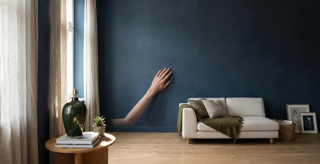
A matte finish can make a room feel softer by reducing sharp reflections, allowing colour and surface texture to become the focus rather than glare. The challenge is preserving enough variation in light, material and sheen to prevent that softness from becoming visually lifeless.
A low-sheen wall does not need to look dull. Daylight moving across textured plaster, a satin ceramic vase catching a quiet highlight or a brushed metal fitting against matte cabinetry can all introduce depth without disturbing a restrained interior. The result depends less on making every surface matte than on choosing where reflections should appear.
Paint colour, viewing angle and maintenance also matter. A deep matte shade that looks elegant in a bright showroom may become heavy in a north-facing room, while a beautiful flat wall finish may prove frustrating beside frequently used light switches. Understanding how different finishes respond to light and everyday contact makes it easier to create a calm room that remains practical.
Matte finishes: the essentials
- Matte surfaces soften visual glare by scattering reflected light, allowing colour and texture to take greater prominence.
- Controlled contrasts with satin, glass or brushed metal introduce highlights without overwhelming a calm scheme.
- Choose paint by its actual light response, washability and intended use rather than the sheen name alone.
- Why Does a Matte Finish Make Colours Look Softer and Deeper?
- Why Does the Same Colour Look Different on Matt and Glossy Surfaces?
- Soft Against Hard or Matt Against Gloss: Which Contrast Has More Impact?
- How Can You Mix Matte Surfaces With Glass or Metal Without Losing Calm?
- When Should You Add Reflective Accents to a Mostly Matte Interior?
- How Can You Choose Surface Finishes That Suit Both the Material and the Room?
- Matte or Satin Finish: Which Is More Practical for Busy Walls?
- Where Can a Matte Finish Become Difficult to Maintain?
Why Does a Matte Finish Make Colours Look Softer and Deeper?
A matte finish can make colours appear softer and more visually substantial because it disperses reflected light rather than producing strong, concentrated highlights. Without bright reflections competing for attention, the underlying colour becomes easier to appreciate. However, matte does not automatically make every colour darker or richer: lighting conditions, paint formulation and viewing position influence the result.
When light strikes a glossy painted surface, a noticeable portion returns in a directional reflection. Windows, lamps and other bright objects can become visible as highlights. Matte paint scatters reflected light across a wider range of directions, reducing those concentrated bright spots.
This distinction changes how a wall is perceived. A glossy surface can appear brighter from certain positions, while a matte surface generally offers a quieter, more even impression. As explained in Sherwin-Williams‘ explanation of how light and paint finish affect colour, sheen can significantly influence apparent colour, especially under different lighting conditions.
Visual softness is not the same as visual flatness. A matte wall can retain gentle changes in brightness as daylight moves across it. Subtle plaster texture, shallow surface irregularities and the changing angle of illumination create restrained tonal variation. These soft gradients provide depth without the sharp highlights associated with polished finishes.
The effect becomes less successful when the entire room lacks variation. For example, a dark grey matte wall under weak, uniform lighting may appear visually heavy, particularly beside equally dark furniture and flooring.
Before choosing a deep or muted shade, place a substantial sample on the intended wall and observe it in morning daylight, afternoon light and the artificial lighting used after sunset. If the finish feels oppressive, test a lighter or warmer alternative rather than assuming additional decorative objects will solve the problem.
The most convincing matte interiors preserve subtle light gradients. Recognising that balance also explains why an identical colour can seem surprisingly different when applied in another sheen.
Why Does the Same Colour Look Different on Matt and Glossy Surfaces?
The same paint colour can look different in matt and glossy finishes because colour appearance depends on both the coating and the light reaching the viewer. Gloss creates stronger directional reflections, while matt reduces visible highlights. The difference changes with illumination and viewing angle, even when the underlying colour formulation is nominally identical.
Consider a warm beige painted on two adjacent boards. Under a window, the glossy board might show a bright patch reflecting the sky, while the matt board appears more uniform. Move the boards, however, and the difference changes. Gloss does not simply make a colour lighter in every situation; it creates stronger variations between reflected highlights and the surrounding surface.
Matt paint reduces that directional contrast, although its underlying colour can still shift noticeably between daylight and warm artificial light. A muted green, for instance, may seem fresh beside a bright window and comparatively subdued under a low-output evening lamp.
The most useful comparison keeps as many variables consistent as possible:
- Prepare two sample boards with the same nominal colour in different sheen levels.
- Apply the recommended number of coats to equally prepared surfaces.
- Place the boards together on the intended wall.
- Observe them in morning, midday and evening light.
- Compare both straight-on and from the angles at which the wall will normally be viewed.
Viewing direction matters especially in hallways and connected rooms. A long wall viewed obliquely receives and reflects light differently from a wall seen directly opposite a window. Gloss can produce pronounced highlights at particular angles, whereas matt usually appears more visually consistent, though not necessarily brighter.
This is why matching paint names alone cannot guarantee a matching visual result. Even where adjoining rooms share the same colour, their orientation and finish can create noticeable differences.
Once the behaviour of each finish becomes clear, the next design question is how to use these differences deliberately rather than treating sheen as an incidental specification.
Soft Against Hard or Matt Against Gloss: Which Contrast Has More Impact?
Matt-against-gloss contrast usually has a more immediate visual effect in a restrained colour scheme, while soft-against-hard contrast influences texture, touch and physical comfort. Both can add depth, but they operate differently. Sheen contrast changes how highlights appear across a room; material contrast changes how surfaces feel and interact with their surroundings.
Imagine a living room with a pale stone floor, linen upholstery and matte painted walls. The soft furnishings contrast with the hard floor, creating tactile variation without necessarily introducing strong highlights. Replacing a matte cabinet front with a satin or glossy equivalent changes something else: the way daylight travels visually across the furniture.
In a monochromatic interior, this difference can be especially valuable. A painted door with a restrained satin finish can stand out against a matte wall even when both share the same colour. Instead of adding a contrasting hue, the designer allows reflections to define the architectural detail.
The choice depends on what is missing from the room:
| Design consideration | Soft against hard | Matt against gloss |
|---|---|---|
| Main effect | Tactile and material variation | Variation in reflected light |
| Useful when | A room feels physically austere | A tonal scheme lacks visual definition |
| Typical pairing | Linen upholstery with stone or timber | Matte wall with satin or gloss trim |
| Potential drawback | Materials may still look visually uniform | Too many highlights can make the room feel busy |
For rooms already rich in colour and pattern, material contrast can be enough. A wool rug, timber table and upholstered chair may introduce all the variation needed. In a monochrome space, a modest change in sheen often provides a more noticeable visual hierarchy.
A limited sheen palette generally reads as more intentional. Rather than introducing matte, eggshell, satin and high gloss across every adjoining surface, begin with one dominant low-sheen finish and one carefully chosen accent finish. Two compatible levels offer a useful starting point, not a technical requirement.
The accent does not need to be dramatically glossy. Satin on woodwork or a softly glazed ceramic object may create enough contrast without producing distracting reflections.
The same principle applies when bringing glass and metal into a predominantly matte space: reflective materials work best when their effect is controlled.
How Can You Mix Matte Surfaces With Glass or Metal Without Losing Calm?
Matte surfaces can sit comfortably alongside glass and metal when reflective elements are limited, thoughtfully positioned and balanced by quieter materials. The goal is not to eliminate shine but to prevent competing highlights. Brushed metal, textured glass and small polished accents often introduce enough variation without making a room feel visually restless.
Every reflective surface contributes something to the room’s visual activity. A mirror can reproduce a view, polished metal can create bright highlights, and clear glass can show reflections from nearby windows and lamps. These effects are not inherently undesirable, but several competing reflections within one sightline can fragment an otherwise calm composition.
A useful design approach is to think in terms of a reflection budget. This is a practical design concept rather than a measured scientific quantity: decide where the eye should encounter the strongest reflections, then keep surrounding finishes quieter.
For example, a room might feature one generous mirror opposite a window, brushed brass lighting and matte cabinetry. The mirror becomes the dominant reflective element, while the metal fittings provide smaller highlights without competing for attention.
Material placement is equally important. Matte linen curtains between a mirror and a glazed door can visually interrupt the sequence of reflections. Textured upholstery and low-sheen painted walls give the eye calmer surfaces between polished elements.
For metal fittings, consider aged brass, brushed stainless steel or other finishes with subdued directional reflection. Reeded or fluted glass can also break up reflected images, although its effectiveness depends on the glass construction, lighting and viewing angle.
There is an acoustic distinction worth making. Matte paint alone should not be treated as sound absorption. Curtains, rugs and soft furnishings may help reduce some sound reflections because of their physical construction and material properties, not simply because they look matte. A room can therefore achieve visual and acoustic softness together, but these require different material considerations.
Once the mix feels harmonious, reflective accents can do more than decorate: they can clarify where natural and artificial light should draw attention.
When Should You Add Reflective Accents to a Mostly Matte Interior?
Add reflective accents when a matte-dominant room lacks distinct highlights, important features seem visually lost or the lighting feels overly uniform. Begin by assessing the room’s illumination and colour values rather than immediately adding shiny objects. A well-positioned reflective surface can improve visual interest, but it cannot compensate for every lighting problem.
Some rooms feel subdued because their matte finishes are surrounded by similarly muted materials. A dark wall, low-contrast flooring and fabric-covered furniture may provide little change in reflected light. In this situation, a small amount of sheen can help establish focal points.
Look for three practical signs:
- Colours become difficult to distinguish under normal evening lighting.
- Furniture and architectural details appear to merge together.
- The room feels visually uniform despite having varied materials.
These observations suggest considering more contrast, but the remedy may be a lighter colour, better lighting or an accent with slightly higher sheen.
Position reflective elements according to actual light sources. A mirror placed to reflect an illuminated wall or window may brighten a particular view and redistribute some light. A glazed artwork frame near a wall lamp may create a subtle highlight. Polished ceramics can provide small points of sparkle without changing the overall illumination.
A larger reflective feature can have a more noticeable effect on perceived space and light distribution than several small objects, but size alone is not decisive. Its orientation, reflectivity and what it reflects determine the result. A mirror reflecting a dark corner may provide little benefit.
In rooms where the matte wall itself is too dark, consider improving ambient lighting or testing a lighter paint before introducing more reflective accessories. Otherwise, shiny additions may compete with the very calmness the finish was intended to create.
With the balance of reflection established, choosing finishes becomes a question of material suitability, room conditions and long-term performance.
How Can You Choose Surface Finishes That Suit Both the Material and the Room?
Choose a surface finish by assessing two things separately: what the material and coating can withstand, and what the room requires from it. A matte wall may be ideal for reducing glare, while a frequently cleaned table needs a finish selected for wear resistance. Light direction, moisture, handling and existing reflections should guide the final decision.
The first filter is material compatibility. Paint intended for interior plaster cannot automatically be treated as interchangeable with a protective coating designed for timber, metal or furniture. Different surfaces need appropriate preparation, adhesion, protection and cleaning performance.
The second filter is room behaviour. A bedroom wall rarely faces the same cleaning demands as a busy hallway. A bathroom also introduces moisture and ventilation considerations that may make an ordinary decorative matte paint inappropriate, even if the appearance is attractive.
According to Benjamin Moore‘s comparison of interior paint finishes, matte coatings can conceal minor imperfections, while eggshell and satin finishes are frequently considered for more demanding applications. The manufacturer also identifies specially formulated matte options for areas requiring improved durability or moisture resistance.
Light direction should be considered alongside durability. A wall facing a large window may benefit visually from a low-reflection surface because it avoids concentrated glare. A darker room may benefit from a carefully chosen sheen variation, although changing finish alone is not a substitute for adequate illumination.
Room-by-room selection is therefore more useful than a rigid rule:
| Room | Suitable starting point | Check before choosing |
|---|---|---|
| Bedroom | Matte or low-sheen walls | Natural light and touch-up needs |
| Living room | Matte walls with restrained sheen accents | Window reflections and furniture finishes |
| Hallway | Washable matte, eggshell or satin | Scuff resistance and repeated cleaning |
| Kitchen | Cleanable finish appropriate to the exposure | Grease, splashes and product instructions |
| Bathroom | Moisture-suitable wall coating | Humidity, ventilation and manufacturer approval |
Finish terminology also varies between manufacturers. A product labelled eggshell by one brand may not look identical to another brand’s version. Even matte and flat can describe different levels of sheen and product performance.
Checking the actual coating on the intended substrate is more reliable than assuming that a finish name guarantees a particular appearance or level of protection.
A five-step finish-selection checklist
- Map the room’s light. Mark its windows and principal lamps on a simple floor sketch, identifying surfaces receiving direct highlights.
- Identify contact areas. Annotate the sketch with frequently touched, splashed or scuffed surfaces to produce a maintenance-zone map.
- Shortlist compatible finishes. Record the substrate and intended use for each surface, alongside suitable product descriptions.
- Test real samples. Prepare a labelled comparison of the selected colours and sheen levels under the room’s usual lighting.
- Confirm product performance. Save the selected coating’s technical guidance on cleaning, moisture suitability, application and curing before purchase.
A completed shortlist should contain more than a desired sheen: it should identify a compatible coating, the surface where it will be applied, its expected cleaning demands and an acceptable visual result under the room’s own lighting.
This becomes especially important for walls subject to frequent contact, where the practical differences between matte and satin can outweigh their initial visual appeal.
Matte or Satin Finish: Which Is More Practical for Busy Walls?
Satin is often a practical option for busy walls because its smoother, more reflective finish can make routine cleaning easier. Matte is better at visually disguising minor wall imperfections and can be easier to repair discreetly. Modern washable matte formulations complicate the traditional comparison, so product-specific scrub and stain resistance matter more than the finish label alone.
In a hallway, marks generally fall into two categories: deposits that need cleaning and damage that needs repair. Fingerprints, splashes and everyday dirt test the coating’s cleanability. Scrapes, chipped paint and wall imperfections test its ability to hide uneven surfaces and accept touch-ups.
Satin may have an advantage when frequent wiping is unavoidable, but it also reflects more directional light, potentially making surface imperfections easier to notice. Matte creates a more subdued appearance, although unsuitable low-sheen paints may develop visible marks when repeatedly rubbed.
The distinction becomes more meaningful when comparing actual products rather than broad sheen categories. ASTM D2486 standard for wall-paint scrub resistance describes laboratory procedures for evaluating a coating’s resistance to erosion caused by repeated scrubbing.
That test addresses scrub resistance, not every aspect of stain removal or the appearance of a cleaned wall. A coating may perform well against abrasion while still showing certain household stains, so manufacturers’ technical information should be assessed in context.
One practical approach is to concentrate more durable finishes in genuine contact areas. The wall beside a light switch, the space behind a frequently used door handle or a particularly narrow passage may need greater washability than the rest of the room.
Where possible, place changes in sheen at natural architectural boundaries, such as a doorway, panel or section of trim. Switching between matte and satin in an arbitrary patch on a continuous wall can make the difference look accidental.
Touch-up behaviour is another important distinction. Lower-sheen paints generally make local repairs easier to blend, while reflective coatings can reveal changes in texture or sheen more clearly. Nevertheless, fresh matte paint is not guaranteed to disappear into an older wall.
The right decision balances how often a surface becomes dirty against how often it becomes damaged. A well-performing washable matte may offer both visual calm and sufficient practicality, provided its maintenance requirements are respected.
What matters before committing to matte
- Assess real exposure: repeated contact, steam, grease and cleaning are more important than room names alone.
- Check whether marks can be removed without polishing or damaging the coating’s low-sheen appearance.
- Keep product instructions for curing, cleaning and touch-ups so the finish remains consistent after installation.
Where Can a Matte Finish Become Difficult to Maintain?
Matte finishes become harder to maintain on surfaces exposed to frequent handling, grease, splashes, abrasion or aggressive cleaning. Marks may remain visible on some low-sheen coatings, while repeated rubbing can create shiny patches. Dark matte colours can also reveal dust and scratches prominently, so successful maintenance depends on coating quality and placement.
The highest-risk areas are those where everyday activity repeatedly affects the same surface. Near cooking equipment, airborne grease and splashes can produce deposits that demand more than gentle dusting. Around door handles and light switches, hands repeatedly transfer oils and dirt. At hallway corners, bags, shoes and furniture may scrape the wall.
Bathrooms introduce a different concern. Humidity and condensation require a coating approved for the expected environment, supported by adequate ventilation and suitable surface preparation. A matte appearance does not automatically indicate whether a product can tolerate these conditions.
The characteristic maintenance problem is burnishing. On susceptible matte coatings, rubbing can change the surface texture or sheen, leaving a polished-looking patch. The affected spot may reflect light more strongly than the surrounding wall, making an attempted clean more noticeable than the original mark.
Start with the coating manufacturer’s cleaning instructions. For suitable washable finishes, a soft cloth and mild cleaning solution may be appropriate. Avoid assuming that abrasive pads, strong cleaners or vigorous scrubbing are safe simply because a product is advertised as durable.
Dark matte walls need particular care. Fine dust, light-coloured deposits and scratches can stand out against a deep background. Although matte finishes often disguise minor substrate imperfections, this does not mean they conceal everything deposited on the surface.
Local repairs are often preferable to repeated aggressive cleaning when a mark cannot be removed safely. Benjamin Moore’s instructions for matching and touching up paint explain why matching the original colour, sheen, texture and application technique matters. The guidance also notes that flatter finishes are generally easier to touch up than glossier ones.
Before attempting repairs, check the coating’s drying and full-curing instructions. A wall may be dry to the touch before it has developed its intended resistance to handling and cleaning. The relevant times vary by formulation and conditions, so the product guidance should determine when normal use and maintenance can begin.
For a high-contact wall, keeping a record of the exact paint product, colour, sheen and application method can make future repairs more consistent. Retaining properly stored leftover paint may also help, subject to its condition and the manufacturer’s storage instructions.
Before decorating an entire room, test the selected finish under its real light conditions, verify its suitability for the busiest surfaces and confirm its care requirements. A matte interior feels most refined when low glare, restrained highlights and practical durability are planned together.
Can matte paint make a small room feel smaller?
Matte paint does not inherently make a room feel smaller. However, a very dark matte colour combined with limited illumination may make boundaries less distinct and the interior feel enclosed. Lighter values, balanced lighting and subtle changes in material finish can help maintain a sense of openness without relying on glossy walls.
Is matte paint suitable for ceilings as well as walls?
Matte and flat finishes are commonly used on ceilings because their low reflection can minimise the visibility of surface imperfections and prevent distracting highlights from overhead lighting. Choose a coating designed for the ceiling substrate and its environment, especially where moisture or staining could be an issue.
Can you combine different matte textures without using glossy accents?
Yes. Smooth matte paint, textured plaster, natural timber and woven fabrics can provide visual depth through changes in grain, shadow and surface structure. The effect is usually subtle, so directional lighting and differences in material value become important when all finishes have similarly low sheen.
Does adding more light always make matte walls look better?
Not necessarily. Strong, uniform lighting can reduce the soft gradients that give textured matte surfaces their character. Combining ambient light with carefully positioned task or accent lighting often creates a more balanced result. The aim is to make surfaces readable without eliminating their natural tonal variation.
Can a matte wall be repainted with satin without changing its colour?
A satin coating can be applied in the same nominal colour if the products and surface preparation are suitable, but the finished wall may not appear identical. Greater directional reflection can alter colour perception under windows and lamps. Test the proposed satin product on a prepared sample and follow its application instructions before repainting the entire wall.