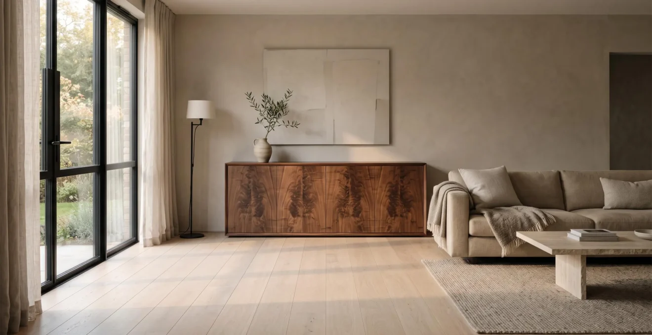
Natural wood grain can make a contemporary room feel warmer without introducing the heavy, weathered character associated with rustic interiors. The difference lies in how the grain is selected, distributed and finished. A finely grained oak floor, for example, adds subtle variation beneath neutral furniture, while a walnut sideboard can provide a more expressive focal point without dominating the space.
The aim is not to hide the wood’s natural character. It is to make that character feel deliberate. Grain direction, undertone, contrast and surface sheen all influence whether timber reads as quietly sophisticated or visually busy.
For homeowners working with oak, walnut, ash or similar timbers, a refined result usually comes from giving visible grain a clear role and allowing surrounding materials to remain restrained. Thoughtful combinations of wood, fabric and stone create depth without requiring distressed finishes, exposed beams or other overtly rustic features.
How to make natural wood grain feel contemporary
- Choose fine or moderately figured grain for large surfaces, reserving dramatic patterns for a single focal piece.
- Coordinate wood undertones and finish sheens rather than trying to match every species exactly.
- Balance visible grain with plain textiles, quiet stone surfaces and simple furniture silhouettes.
- Why Does Natural Wood Grain Make Neutral Rooms Feel More Inviting?
- How Can You Mix Different Wood Grains Without Making Furniture Look Uncoordinated?
- Fine or Bold Wood Grain: Which Works Better in a Contemporary Interior?
- When Can Too Much Visible Wood Grain Make a Room Feel Overwhelming?
- When Should You Refinish Natural Wood Instead of Covering Its Grain?
- How Can You Layer Wood, Fabric and Stone Without Creating Visual Clutter?
- Colour, Shape or Material: Which Should Lead Your Room’s Visual Identity?
- How Can You Choose Surface Finishes That Suit Both the Material and the Room?
Why Does Natural Wood Grain Make Neutral Rooms Feel More Inviting?
Natural wood grain makes neutral rooms feel more inviting by introducing small, irregular variations that contrast with otherwise uniform surfaces. Even pale timber can provide visual warmth without adding strong colour. The effect depends on the wood’s undertone, the prominence of its grain, the direction of the boards and how daylight or artificial lighting reveals their texture.
White, greige and taupe interiors often rely on subtle differences in texture rather than saturated colours. Against these backgrounds, the changing lines of natural grain give the eye detail to explore. A straight-grained ash cabinet might appear almost uniform from a distance, yet reveal delicate organic variation when viewed nearby.
Colour warmth and textural warmth are separate qualities. Honey-toned oak introduces warmth through its golden undertone, while pale oak or ash can achieve a gentler effect through visible fibres, pores and grain movement. This distinction matters when the room’s colour palette needs to stay light and restrained.
Research provides some context for the broader perception of wood. A 2025 Journal of Wood Science study on wood and material combinations examined visual responses to different interior materials. Wood achieved the highest combined Warm-factor score among the individual materials tested, with a mean of 3.93. However, the study did not isolate grain from colour or establish that irregular patterns alone make neutral rooms more welcoming.
3.93
Wood’s mean score on the combined Warm factor in a controlled study using material models and 44 college-student participants. The result describes the experiment, not a universal rating of residential interiors.
Kwak and Choi, Journal of Wood Science, 2025.
Grain orientation offers another way to shape the impression of a room. Horizontal lines across wall panelling can encourage a sense of breadth, while vertical grain emphasises height. These are compositional effects rather than guaranteed changes in perceived room dimensions.
Before specifying flooring or cabinetry, compare samples in daylight and under the lighting used after dark. Flatsawn boards may show sweeping patterns, whereas quartersawn surfaces often appear straighter. Lighting can make either more or less prominent.
The most convincing warmth often comes from modest variation rather than obvious contrast. Once the timber supplies that quiet character, other materials can remain simple.
How Can You Mix Different Wood Grains Without Making Furniture Look Uncoordinated?
Different wood grains can work together when their undertones, visual weight and surface finishes are coordinated. Start with one dominant timber, introduce a secondary wood with a compatible temperature and reserve additional tones for smaller accents. Varying grain intensity deliberately is usually more effective than matching every board or furniture piece to the same species.
Consider a room with pale oak flooring and a walnut dining table. The woods have different colours and potentially different grain figures, but the combination can feel intentional if both finishes avoid conflicting orange, red or grey casts.
Undertone matters more than identical species. Two oak furnishings can look mismatched when one has an amber glossy finish and the other a cool grey wash. Conversely, walnut and oak can sit comfortably together when their undertones are compatible and both surfaces have a restrained matte or satin sheen.
A practical distribution gives each wood a distinct role:
- Dominant wood: The floor, extensive cabinetry or largest furniture family establishes the main temperature and grain rhythm.
- Secondary wood: A table, sideboard or shelving unit introduces controlled contrast without competing across every surface.
- Accent wood: A frame, stool or small accessory adds an optional third tone without becoming another substantial visual plane.
Grain scale helps establish the hierarchy. A boldly figured walnut cabinet works particularly well when neighbouring oak flooring has relatively straight, consistent lines. Combining equally prominent cathedral patterns across multiple furnishings can make unrelated pieces appear to compete.
One useful design exercise is to photograph the proposed wood samples together and convert the image to black and white. This removes colour temporarily, making their relative lightness and darkness easier to judge. A legible tonal sequence may help the arrangement feel coherent, although the test cannot establish whether the original undertones are compatible.
Compare finish samples separately under room lighting. Two woods can share a similar sheen while keeping enough contrast to remain individually recognisable.
Once the wood combinations have a consistent visual relationship, the next decision is how expressive each grain pattern should be.
Fine or Bold Wood Grain: Which Works Better in a Contemporary Interior?
Fine wood grain generally offers a quieter foundation for contemporary interiors, while bold grain is useful when timber should become a focal point. The better choice depends on room size, surrounding patterns and how much attention the wood is intended to attract. Both can look refined when their visual roles are clear and their finishes are controlled.
The distinction begins with the way a board is cut. Flatsawn timber commonly displays curved or cathedral-like figures, while quartersawn and riftsawn surfaces tend to have straighter, more consistent patterns. Quartersawn oak may also reveal distinctive medullary ray flecking, which adds visual detail even when its longitudinal grain is relatively straight.
The Wood Database’s explanation of wood grain and sawing orientation illustrates these differences and explains why the orientation of growth rings influences the appearance of a finished board.
This gives homeowners a more useful specification than requesting oak or walnut by species alone. When consistency matters, ask the supplier to show representative boards with the intended grain orientation, not just a small colour sample.
The following comparison can guide a practical selection.
| Room condition | Fine, straighter grain | Bold, expressive grain |
|---|---|---|
| Small room with several furnishings | Usually creates a quieter visual background | Best restricted to one smaller focal surface |
| Large room with plain walls | Maintains a restrained, continuous appearance | Can add character to an otherwise understated composition |
| Room with patterned rugs or veined stone | Allows existing patterns to remain prominent | May compete unless surrounding details are simplified |
| Single statement cabinet | Offers subtle material character | Can replace the need for a separate decorative focal point |
Fine grain suits many minimalist and Japandi-inspired interiors because it behaves visually more like texture than a pronounced decorative pattern. That is an aesthetic preference, not a technical requirement of those styles.
Highly figured woods such as walnut burl or zebrano can also be used effectively in contemporary settings. Restricting a dramatic figure to one cabinet face, tabletop or wall panel allows the pattern to remain coherent. Plain walls, restrained upholstery and simple silhouettes then provide contrast without creating additional visual noise.
Neither option is inherently more contemporary. The deciding factor is whether the surrounding interior gives the timber enough visual space.
When Can Too Much Visible Wood Grain Make a Room Feel Overwhelming?
Visible wood grain can become overwhelming when several large surfaces carry competing patterns and the room offers few quiet areas for the eye to rest. Grain-heavy floors, cabinets, ceilings and furnishings can create cumulative visual movement, particularly in smaller spaces. Reducing pattern contrast or replacing one prominent wood surface with a simpler material often restores balance.
The tipping point is not a fixed percentage of wood. Surface area, contrast, lighting and grain figure interact. A large floor covered in relatively uniform timber may look calmer than a smaller room containing multiple dramatically figured cabinets, even if the latter uses less wood overall.
Pattern density and grain contrast are different problems. Strongly contrasting cathedral grain can attract attention even on a small surface. Conversely, subtle grain repeated across extensive floors, walls and furniture may gradually dominate the composition through sheer coverage.
Other natural patterns contribute to the total effect. Highly veined marble, irregular linen textures and botanical prints each introduce additional detail. Combining all of them with strongly figured timber can leave the room without a clear visual hierarchy.
To diagnose this, stand in the doorway and briefly narrow your eyes. Notice whether the overall composition feels ordered or whether several wood surfaces compete for attention. This is an informal design exercise, not a scientifically validated assessment.
Possible adjustments include using plain upholstery, changing a highly figured cabinet front to a matte painted finish, or introducing a quieter stone surface. A low-contrast stain or finish may also reduce the apparent prominence of some grain patterns, although the result depends on the wood and product.
Five checks before adding more visible wood grain
- Photograph the room from its main entrance and mark every large grain-bearing surface; produce a simple visual inventory.
- Select the floor, wall or furniture group that should carry the strongest grain; identify one primary visual anchor.
- Compare neighbouring wood samples in the room and record their undertones, grain scales and finish sheens.
- Remove one competing patterned accessory from the proposed scheme and take a second photograph for comparison.
- Review the revised composition in daylight and artificial light, then record which surfaces should remain wood-led and which should stay visually quiet.
Reducing grain does not necessarily mean replacing existing timber. Sometimes the right surface treatment can make familiar wood feel quieter while preserving its character.
When Should You Refinish Natural Wood Instead of Covering Its Grain?
Refinishing natural wood is worth considering when the underlying timber remains sound and the main problems involve worn coatings, superficial scratches or a dull surface. Painting becomes a more reasonable option when the existing grain conflicts with the design or restoration is impractical. The crucial first step is establishing whether the surface is solid timber, veneer or another construction.
A scratched oak sideboard, for example, may still contain an attractive natural grain beneath its tired finish. If the damage is largely superficial, careful preparation and a compatible new coating may reveal the figure without changing the furniture’s basic character.
Deep stains, unevenly absorbed dyes or previous coatings that are difficult to remove can make refinishing less predictable. Sanding does not automatically restore a uniform colour, and water damage may extend beyond the finish into the timber itself.
Thin veneer requires particular caution. Unlike solid wood, which may tolerate more extensive resurfacing when structurally suitable, veneer has a limited thickness. Aggressive sanding can penetrate the decorative layer and expose the substrate beneath it.
WOOD Magazine’s article on repairing sanded-through veneer explains how easily this damage can occur and why the resulting defect may be difficult to conceal convincingly.
Before attempting restoration, inspect inconspicuous edges or construction details to identify the substrate. Test any proposed cleaning, stripping or refinishing method in a hidden area where appropriate. Valuable, delicate or uncertain pieces may justify professional assessment rather than experimental sanding.
When the surface is suitable, a compatible low-build oil or hardwax oil may preserve visible texture while refreshing the appearance. The original coating must be considered first, because not every finish can be applied directly over another.
Opaque paint conceals grain and creates a more uniform surface, but it does not necessarily destroy the underlying wood pattern permanently. Whether that grain can later be exposed depends on the material and the removal process.
Preserving recoverable grain often supports a warmer, more material-focused interior. Where restoration is inappropriate, a quieter painted surface may be a better contribution to the overall scheme.
How Can You Layer Wood, Fabric and Stone Without Creating Visual Clutter?
Wood, fabric and stone can create a richly layered interior without clutter when each material contributes a different visual quality. Let one material carry the strongest pattern, then use the others for subtle texture and contrast. Coordinating finish sheen, varying lightness and distributing materials across different surfaces helps them feel related without becoming indistinguishable.
Natural materials have their own inherent variation. Timber grain, linen weave and stone veining can all attract attention, but they do not need equal prominence. A walnut table with dramatic grain, for example, may work best with lightly textured plain linen chairs and a relatively uniform honed stone surface.
Choose one prominent pattern per zone. If strongly veined marble leads the composition, use quieter grain on adjacent cabinetry. If the wood is the focus, choose stone with less pronounced movement and fabric that contributes softness rather than additional decorative motifs.
Finish sheen also connects different materials. Matte timber, honed stone and natural woven textiles can form a consistent low-reflection palette despite their differences in colour and texture. High-gloss lacquer next to deeply textured linen is not inherently wrong, but the contrast becomes another visual feature that must be managed.
Distribution matters as much as selection. A hypothetical living room might place pale stone at coffee-table height, walnut across a single sideboard and linen on a sofa and curtains. This separates materials into recognisable functional areas rather than crowding several strong surfaces together.
Entirely matching beige values can create another problem: the room loses definition. Instead of introducing a bright colour, vary the lightness of the surfaces. A pale linen sofa, medium-toned oak and a slightly darker stone table may provide enough depth to distinguish each element.
The 2025 wood-and-material-combinations research discussed earlier found that material proportions, diversity and brightness influenced participants’ perceptions. Its controlled models do not establish a precise formula for combining wood, linen and natural stone in homes.
When the materials feel coherent, their combined character can become the room’s main design identity rather than relying on strong colours or elaborate furniture shapes.
Colour, Shape or Material: Which Should Lead Your Room’s Visual Identity?
Colour, shape and material can all define a room, but one should usually take the lead. In an interior where natural wood grain supplies the main character, keep the palette relatively restrained and furniture forms clear. This allows the material’s organic variation to become noticeable without requiring competing colours, sculptural shapes or decorative patterns.
The first question is simple: what does the eye notice on entering the room? If it is a walnut cabinet, carefully selected oak flooring or a continuous timber wall, material is already directing the composition.
That observation can guide subsequent choices rather than treating every design decision independently.
- Colour-led rooms: Wall colours, upholstery or artwork provide the main identity. Timber often works best as a supporting texture with restrained grain contrast.
- Shape-led rooms: Sculptural furniture and architectural geometry attract attention. Natural grain can enrich those forms without becoming a competing pattern.
- Material-led rooms: Timber, stone and fabric provide the strongest character. Colours and furniture silhouettes support their inherent textures.
For a wood-led interior, one useful design constraint is to work with three principal tonal values: light, medium and dark. This is a planning device, not a mandatory design formula. An example might combine off-white walls, medium-toned oak and smaller dark walnut accents.
Silhouettes can then remain straightforward. Rectangular cabinet faces, clean shelving and uncomplicated upholstered forms give expressive timber an orderly setting. Subtle curves are equally possible when they do not introduce a competing emphasis.
A material-led room also benefits from selecting the major wood surfaces before finalising surrounding fabrics and finishes. The grain’s undertone and figure become reference points for the rest of the palette.
Once that hierarchy is established, the remaining technical decision is how to finish the timber so it delivers the intended appearance while remaining suitable for everyday use.
Key takeaways before choosing a wood finish
- Identify whether the grain should remain subtle or become the room’s focal pattern before selecting a coating.
- Check the timber’s construction and existing treatment before considering sanding, staining or refinishing.
- Evaluate finish appearance and functional protection separately; a visually appealing sample is not automatically suitable for a high-use surface.
How Can You Choose Surface Finishes That Suit Both the Material and the Room?
Choose a wood finish by balancing grain visibility, colour, sheen and the surface’s practical demands. Oils, lacquers, polyurethane coatings and stains can produce noticeably different appearances on the same timber. The right finish should reinforce the room’s intended visual character while providing protection and maintenance requirements appropriate to its location and use.
A penetrating oil often enriches the wood’s natural colour and makes its figure more apparent. A pale matte coating may preserve a lighter, quieter impression, while darker stains can increase tonal contrast between grain features. Actual effects vary with wood species, surface preparation and finish formulation.
Appearance alone is not enough. Kitchen worktops, flooring and frequently handled furniture require finishes appropriate to greater wear and exposure. Decorative wall panelling and low-contact furniture can often prioritise appearance more heavily, although maintenance remains relevant.
The USDA Forest Products Laboratory’s Wood Handbook guidance on finishing explains that coatings influence appearance, protection and cleanability. Finish selection therefore needs to account for substrate characteristics and expected service life rather than relying on a preferred sheen alone.
These general comparisons can help narrow the options before product-specific testing.
| Finish approach | Typical visual effect | Important consideration |
|---|---|---|
| Penetrating oil | Often enriches natural colour and grain definition | Protection and maintenance depend on the product and use |
| Hardwax oil | Can preserve a natural-looking, low-sheen surface | Verify suitability for the intended floor or furniture application |
| Matte lacquer or polyurethane | Can create a restrained, more uniform-looking surface | Protection, repairability and appearance vary by formulation |
| Whitewash or pale pigmented finish | Can reduce the visual prominence of darker grain | Pigment absorption may vary across the surface |
| Darker stain | Changes the timber’s colour and may emphasise some grain features | Uneven absorption and undertone shifts require testing |
A practical comparison starts with identical off-cuts or suitably prepared samples. Apply the proposed finishes according to their manufacturers’ instructions, then assess the results beside the actual wall colours, flooring and textiles.
Review the samples under both daylight and evening lighting. A finish that looks pleasantly warm beside cream upholstery may appear unexpectedly orange against cooler grey walls. Assess grain contrast, reflected light and overall colour rather than judging the timber sample in isolation.
For demanding surfaces, confirm the manufacturer’s compatibility, application and maintenance guidance before specifying the product. A matte appearance does not establish durability, just as an oil-based finish does not automatically guarantee a more natural or warmer result.
Begin with a small set of representative timber samples, compare a restrained selection of compatible finishes in the actual room, and choose the combination that preserves the desired grain character without compromising everyday practicality.
Can natural wood grain work in a minimalist white interior?
Yes. Pale oak, ash and other relatively light timbers can introduce organic variation while preserving a restrained palette. Fine grain on flooring or cabinetry provides subtle detail without requiring strong colour contrast. Limiting additional patterns helps maintain a minimalist appearance.
Does walnut furniture always make a room look darker?
No. Walnut is often darker than pale oak or ash, but its effect depends on the size, location and finish of the furniture. A single walnut sideboard against light walls may add depth without making the overall room feel dark. Extensive dark cabinetry can create a substantially different impression.
Should all wooden furniture have the same finish?
Not necessarily. Matching every finish can look overly coordinated, while completely unrelated sheen levels may make the arrangement feel fragmented. Keeping major timber surfaces within a compatible matte or satin range is a practical starting point, with deliberate contrast reserved for selected accents.
Can a pale stain make strongly figured wood look more contemporary?
A pale stain or pigmented finish may soften the apparent contrast of pronounced grain, depending on the species and application. Some treatments can also accentuate pores or absorb unevenly. Testing on representative material is essential before applying the finish across a large visible surface.
Is solid wood necessary to achieve a natural grain appearance?
No. Real wood veneer can provide authentic natural grain over a manufactured core. The important differences concern construction, edge detailing, refinishing potential and suitability for the application. Thin veneers require particular care during sanding because the decorative wood layer can be damaged or penetrated.