A room can contain beautiful individual colours and still feel strangely unsettled. The walls may complement the sofa, the cushions may look attractive on their own, and the curtains may be exactly the shade intended. Yet when everything comes together, the space feels disconnected, overly busy or unexpectedly dull.
The solution is not necessarily to choose fewer colours. It is to give each colour a clear role, understand its relationship with the surrounding materials and check how the entire combination behaves under the room’s actual lighting.
A successful room colour palette establishes visual continuity without making every surface look alike. Dominant colours create a foundation, secondary colours provide depth, and accents guide attention. Texture, contrast and light determine how those relationships are experienced.
Before buying paint or replacing furnishings, assess what cannot easily change: flooring, fitted cabinetry, architectural finishes and large furniture. These existing elements provide a starting point for building a controlled, comfortable colour scheme.
The essentials of a cohesive room colour palette
- Choose one dominant colour, give supporting colours defined roles and control the visual weight of accents.
- Use tonal variation, material texture and carefully placed contrast to create interest without unnecessary colour.
- Test large paint samples alongside furniture and textiles in the room’s real daylight and evening lighting before committing.
- Why Can Individually Beautiful Colours Look Wrong When Used Together?
- How Can You Build a Room Palette Around One Main Colour Without Making It Monotonous?
- Warm or Cool Colours: Which Palette Better Suits a North-Facing Room?
- When Do Accent Colours Start to Make a Room Feel Too Busy?
- How Can You Rebalance a Room When One Colour Feels Too Dominant?
- Why Does Wall Paint Look Different in Morning and Evening Light?
- Colour, Shape or Material: Which Should Lead Your Room’s Visual Identity?
- How Can You Choose Wall Paint That Looks Right in Both Daylight and Artificial Light?
Why Can Individually Beautiful Colours Look Wrong When Used Together?
Individually attractive colours can look wrong together because they compete for attention, lack sufficient contrast or respond differently to the room’s lighting. The difficulty often lies less in the hues themselves than in their relative saturation, brightness and visual weight. A cohesive palette needs a clear relationship between its colours, not simply a collection of pleasing shades.
Imagine a hypothetical living room with a vivid emerald sofa, saturated terracotta walls and brilliant mustard curtains. Each colour could work beautifully in another setting. Together, however, their strong saturation and large surface areas may give all three equal prominence. With no obvious visual hierarchy, the eye constantly shifts between them.
That is visual competition: several elements demand attention without one establishing a foundation for the others. Reducing the intensity of one colour, changing its placement or giving a quieter neutral more space can create separation without abandoning the original combination.
The opposite problem is a palette that feels flat. A beige sofa against similarly toned walls, paired with a rug of almost identical brightness, may leave too little distinction between surfaces. Here, greater contrast in lightness, texture or tone provides the missing structure.
These two problems need different solutions. An overstimulating scheme generally benefits from clearer hierarchy and quieter supporting surfaces. An under-differentiated scheme benefits from a focal point, tonal contrast or a carefully chosen connecting accent.
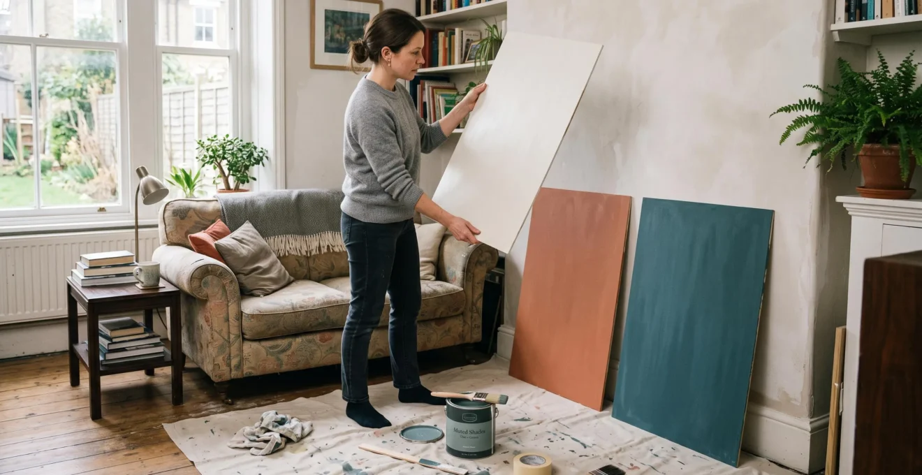
To test a combination, place candidate colours side by side alongside existing furniture and textiles. Use samples large enough to judge how they interact at approximately their intended visual scale. A small paint chip cannot fully convey the effect of a colour covering an entire wall.
Retail displays are also unreliable substitutes for home testing. Shop illumination, surrounding displays and viewing conditions may differ considerably from those in the intended room. There is no universal reason to assume every shop uses cooler or stronger lighting, but those differences can influence how colours appear.
For a more dependable comparison, follow Benjamin Moore‘s paint sampling instructions, which recommend larger painted areas, movable sample boards and observation under natural and artificial light.
Once the sources of competition or flatness are understood, the next task is to establish a dominant colour that gives the entire room a recognisable foundation.
How Can You Build a Room Palette Around One Main Colour Without Making It Monotonous?
Build a room palette around one main colour by allowing it to establish the atmosphere while using related tones, varied textures and restrained secondary colours to introduce depth. A dominant colour should unify the room, not appear identically on every surface. The aim is to maintain visual continuity while providing enough contrast and interest for the eye.
Start by listing the major visible elements: walls, flooring, sofa, curtains, rug, cabinetry, large artwork and smaller accessories. Then assign each one a role in the palette rather than selecting its colour independently.
A practical structure includes three levels:
- Dominant colour: establishes the main visual foundation, often through walls, large furniture or broad textile surfaces.
- Secondary colours: support the dominant shade through complementary or related undertones, lighter or darker values, and connecting materials.
- Accent colours: introduce limited focal points through selected cushions, artwork, decorative objects or smaller furnishings.
The familiar 60–30–10 proportion can serve as an informal design prompt, but it is not a scientifically established requirement. Surface size alone does not determine visual dominance: a relatively small but highly saturated object may attract more attention than a much larger muted surface.
Consider a hypothetical room based on muted olive green. The walls could carry a softened olive, the upholstery a deeper moss tone, and the curtains a lighter grey-green. Natural linen, dark timber and a small amount of warm brass could provide further variation without introducing several unrelated colours.
Texture is especially valuable in a restrained scheme. A brushed fabric, smooth painted wall, woven rug and reflective metal surface interact differently with light. Even when their colours are closely related, those differences prevent the room from becoming visually uniform.
Interior designer Brian Gluckstein describes this relationship in his interview on connecting interior colour schemes. His approach considers architectural finishes, materials and furnishings together, while tonal variation and contrasting textures create interest in monochromatic spaces.
How can you tell whether a restrained palette has become monotonous? Look for a lack of visual pauses and focal points. A calm room can feel coherent without demanding attention; a monotonous room provides so little differentiation that furniture, walls and accessories visually merge.
When introducing a secondary colour, borrowing it from an existing fixed element is often safer than selecting an entirely independent shade. A subtle grey within stone flooring, a honey tone in timber or a muted colour from a large rug can become a natural thread throughout the room.
This structure provides continuity, but the main colour still needs to respond to the room’s daylight, particularly when the windows receive predominantly cool illumination.
Warm or Cool Colours: Which Palette Better Suits a North-Facing Room?
Both warm and cool palettes can work in a north-facing room. Warm colours can counterbalance cool daylight and create a more inviting impression, while cool colours can deliberately emphasise a calm, crisp atmosphere. The better choice depends on the intended mood, available natural light and the actual appearance of each colour in the space.
In many Northern Hemisphere homes, north-facing windows receive relatively little direct sunlight, creating cooler, more diffuse daylight. The effect varies with window size, external obstructions, reflective surfaces and building geometry. The same assumption should not automatically be applied to north-facing rooms in the Southern Hemisphere.
Under cool, limited daylight, paint colours may appear less warm or less vivid than expected. A beige that looks creamy on a sample card might take on a grey or dull appearance in the room itself.
That does not mean all pale warm neutrals are poor choices. Their performance depends on their undertones, reflectance, surrounding materials and light conditions. The risk is choosing a weak, ambiguous neutral in the hope that its lightness alone will make a dim room feel sunny.
Two approaches can work particularly well:
- A warm scheme built around sufficiently distinctive clay, muted ochre, warm stone or softly earthy colours can create a welcoming atmosphere without pretending the room receives direct sunshine.
- A cool scheme using deliberate blue-grey, soft green or slate undertones can embrace the existing daylight, especially when balanced with timber, tactile fabrics and appropriate artificial lighting.
According to Sherwin-Williams‘ advice on room orientation and paint colour, north-facing rooms commonly benefit from attention to warmer undertones and light reflectance value, or LRV. The LRV scale runs from 0 to 100, indicating how much light a colour reflects, but it cannot predict whether that colour will feel aesthetically right in a particular interior.
The most reliable way to choose between these directions is to compare large painted boards vertically against different walls. Move them near the window, into darker corners and beside existing furnishings. Observe them throughout the day, then repeat the comparison with the room’s evening lamps switched on.
A board that looks balanced near the window may become dull beside a dark cabinet. Conversely, a deeper paint can give an intentionally enveloping effect even when its LRV is modest. Brightness is only one component of the desired atmosphere.
Once the overall temperature of the scheme is established, controlling the size and distribution of accent colours becomes essential to preserving that atmosphere.
When Do Accent Colours Start to Make a Room Feel Too Busy?
Accent colours start making a room feel too busy when their placement fragments attention rather than creating a clear visual rhythm. The problem is not necessarily the number of colours. Several small, equally prominent accents scattered around the room can create more visual noise than the same colours arranged in fewer, larger and more deliberate groups.
Imagine a hypothetical neutral living room with teal cushions, coral vases, yellow lampshades, green ornaments and patterned curtains. Each item may be attractive, but if the accents compete equally across multiple locations, the eye has no obvious place to settle.
Now consider keeping the colours while changing their distribution. A larger grouping of teal cushions might establish one focal area, while the coral objects are consolidated on a single shelf. The overall variety remains, but the arrangement gains intention.
This illustrates an important distinction: accent management is largely about visual distribution, not simply reducing a room to an arbitrary maximum number of colours.
Patterns deserve additional attention. A patterned curtain may already introduce several hues, contrasts and repeated shapes. Adding separate decorative objects in each of those colours can amplify the room’s visual activity beyond what was originally intended.
To assess the existing arrangement, count the distinct accent colours and note where each appears. Do not include every subtle variation in a natural material as a separate accent; focus on colours that genuinely attract attention.
Next, identify any scattered, similarly sized accents. Could two or three objects become one stronger grouping? Could a busy collection of cushions be simplified by using larger areas of a repeated fabric?
The room itself provides useful feedback. If the eye moves constantly between unrelated objects, or a photograph feels more cluttered than the room seemed in person, the accent structure may need adjustment.
Conversely, a room with numerous colours can still feel cohesive when the colours are organised by clear spatial groupings, consistent undertones or a dominant connecting material.
If the imbalance persists even after accents have been organised, the difficulty may lie with a single dominant colour whose visual weight exceeds its intended role.
How Can You Rebalance a Room When One Colour Feels Too Dominant?
A colour that dominates a room can often be balanced without repainting. Start by reducing its concentration in accessories, changing the position of strongly coloured objects or increasing the presence of a quieter secondary shade. If the imbalance remains, introduce larger neutral surfaces before considering a more permanent change to the walls.
Visual dominance is not determined by surface area alone. A vivid red armchair positioned directly opposite the doorway can attract more attention than a much larger muted wall. Saturation, contrast, placement and the viewer’s normal line of sight all influence perceived weight.
Begin with the least disruptive adjustments:
- Rearrange accessories and textiles. Move or temporarily remove smaller items that repeat the dominant colour, then assess the effect from the doorway and main seating positions.
- Introduce broader quiet surfaces. A neutral rug, understated curtains, plain cushion covers or a softer lampshade can reduce visual competition.
- Strengthen a secondary colour. Repeat an existing supporting shade in a meaningful area so the dominant colour no longer carries the entire composition.
- Reconsider major furniture placement. Where practical, move a strongly coloured piece away from an immediate focal position.
- Change the wall finish or colour. Reserve repainting for cases where smaller interventions fail to resolve the imbalance.
Strengthening a secondary colour is an especially useful alternative to suppressing the main shade. In a hypothetical room with deep blue walls and a blue sofa, a larger oatmeal rug and coordinated light curtains could establish a contrasting secondary foundation while preserving the original blue-led identity.
This approach also helps distinguish between a colour that is genuinely overwhelming and one that simply lacks sufficient supporting elements.
A five-action room palette correction checklist
- Photograph the room from its main entrance and usual seating position. Deliverable: two reference images showing the current visual hierarchy.
- Record the dominant, secondary and accent colours of the largest visible elements. Deliverable: an annotated list of the room’s colour roles.
- Temporarily regroup or remove scattered accessories in the strongest colour. Deliverable: a comparison photograph showing the revised distribution.
- Test one larger supporting surface, such as a rug or curtain sample, alongside the existing palette. Deliverable: a documented comparison between two arrangements.
- Review the preferred arrangement in daylight and under the room’s actual evening lighting. Deliverable: a final set of observations identifying any remaining imbalance.
Make one significant adjustment at a time. Otherwise, it becomes difficult to identify which change improved the result. A quieter rug may solve the problem by itself, making new paint unnecessary.
Finally, assess every change in both natural and artificial light. A supporting colour that looks subtle during the afternoon may become unexpectedly prominent under evening lamps.
This daylight-versus-evening comparison matters because the apparent colour of every surface depends partly on the changing light that reaches it.
Why Does Wall Paint Look Different in Morning and Evening Light?
Wall paint looks different in morning and evening light because its apparent colour depends on the light illuminating it. Changes in daylight direction, intensity and spectral composition affect the wavelengths reflected towards the eye. Artificial lamps introduce another light source with different characteristics, so a paint colour can appear warmer, cooler, brighter or duller at different times.
Paint does not generate its own colour. Its pigments absorb some wavelengths of light and reflect others. When the illumination changes, the reflected light reaching the viewer changes too, even though the paint itself remains the same.
This is why choosing paint solely at midday can produce disappointing results. A room may be primarily used for breakfast or evening relaxation, yet its palette might have been selected under afternoon conditions that occupants rarely experience.
Window orientation influences these changes. East-facing windows may receive direct morning sun, while west-facing windows can experience stronger late-afternoon sunlight. North-facing spaces in many Northern Hemisphere settings often receive more diffuse light, although surroundings and building design can substantially modify the pattern.
External reflections matter as well. Sunlight reflected from a neighbouring wall, garden foliage or coloured exterior surface may change the character of incoming light. Two rooms painted in the same shade can therefore look noticeably different.
Digital photographs and professionally styled interiors cannot fully account for these differences. Camera processing, image editing and display settings introduce further uncertainty when trying to match a reference colour.
The technical explanation extends to electric lighting. In its guidance on efficient lamps, the U.S. Department of Energy explains light-bulb colour temperature and colour rendering as characteristics relevant to how illuminated objects appear.
For example, a lamp around 2700 K typically has a warm appearance, while one around 4100 K appears cooler. These values describe light sources, not guaranteed paint outcomes. Two lamps with similar colour temperatures may still render particular colours differently because their spectral properties differ.
When testing a wall colour, decide which time of day matters most for the room’s function. A bedroom used mainly in the evening should be judged carefully under evening conditions, while a breakfast room deserves particular attention in morning light.
However, lighting should not be the only influence on palette selection. The strongest visual feature of the room may be its architecture, furniture or materials rather than colour itself.
Colour, Shape or Material: Which Should Lead Your Room’s Visual Identity?
A room’s visual identity should usually be led by whichever feature already has the greatest presence or deserves the most attention. Colour can lead in a simple, flexible space, while strong architecture, sculptural furniture or distinctive materials may provide a more natural foundation. Selecting a primary visual direction helps prevent competing colours, shapes and finishes from fragmenting the overall design.
Before finalising the palette, look at the room without concentrating on paint. What attracts attention first: the proportions of the space, a striking piece of furniture, a stone fireplace, exposed timber or a particular colour?
The answer helps identify which elements should lead and which should support.
A useful comparison is:
| Visual leader | Best suited to | How the colour palette supports it |
|---|---|---|
| Colour | Simple rooms with relatively restrained architecture and furnishings | A clear dominant hue establishes mood, supported by controlled contrasts and textures. |
| Shape | Rooms with sculptural furniture, distinctive proportions or strong architectural details | Quieter colours provide separation without distracting from the forms. |
| Material | Rooms featuring characterful timber, stone, brick, metal or textured finishes | Colours are drawn from the undertones and natural variation of existing materials. |
For example, a hypothetical room with an expressive stone fireplace may benefit from colours borrowed from the stone’s warmer and cooler tones. The fireplace remains the focal point, while walls and textiles reinforce its existing character.
By contrast, a plain room with simple furniture and unobtrusive finishes may offer greater freedom for a deep green, terracotta or blue-led palette.
The aim is hierarchy, not the elimination of variety. Bold colour, unusual shapes and multiple materials can coexist. The challenge arises when all three demand equal attention without a connecting idea.
A material-led scheme can also create continuity across several surfaces. Undertones from oak flooring might reappear in woven textiles, while the cooler notes of a stone worktop inform a restrained wall colour. Repetition need not be literal; subtle relationships are often sufficient.
Once a visual leader is identified, avoid introducing new colours solely because they are fashionable or attractive in isolation. Ask whether each addition supports the chosen identity or competes with it.
With those priorities established, the final decision is whether the chosen wall paint retains the right character under both daylight and artificial illumination.
Key decisions before committing to your palette
- Confirm which existing colours and materials must remain, then use them to narrow down candidate wall colours.
- Evaluate the palette in the lighting conditions that matter most for the room’s everyday use.
- If a colour works by day but fails in the evening, examine the lamps as well as the paint before discarding the entire scheme.
How Can You Choose Wall Paint That Looks Right in Both Daylight and Artificial Light?
Choose wall paint for both daylight and artificial light by testing large samples under the exact conditions in which the finished room will be used. Focus particularly on undertones, contrast with existing furnishings and the quality of the evening lighting. The best choice is not necessarily identical-looking in every condition, but remains visually acceptable and coherent as illumination changes.
Begin by narrowing the candidates to a few colours that already complement the room’s permanent materials. Avoid comparing too many unrelated shades at once, as this makes differences in undertone and visual weight harder to assess.
Undertones are particularly important with neutrals. A paint described as grey, white or beige may have a subtle pink, green, yellow or blue cast. These undertones can become more or less noticeable depending on the illuminating light and surrounding colours.
To identify them, compare candidate neutrals directly against one another and alongside the actual flooring, cabinetry or upholstery. A grey that appears neutral by itself may reveal a green cast beside a warmer grey.
Use a controlled paint-testing procedure:
- Prepare sufficiently large boards using a suitable paint-sampling product and follow its application instructions. Apply two coats where recommended to obtain a representative colour sample.
- Position the boards vertically against the intended wall, without permanently fixing them.
- Compare each candidate in morning, midday and late-afternoon daylight, prioritising the times when the room is usually occupied.
- Repeat the comparison under the actual lamps and bulbs intended for everyday evening use.
- Assess each board beside large furnishings, flooring and textiles, recording any unwanted undertone shifts or changes in contrast.
There is no requirement for paint to appear exactly the same throughout the day. Some variation is inevitable and can add character to an interior. The important question is whether the differences support the desired atmosphere or undermine it.
Consider a hypothetical warm grey that looks balanced during the day but takes on an unwanted yellow appearance in the evening. The paint may not be the only cause. The lamps’ spectral characteristics, their colour temperature and the colours of nearby furnishings all contribute to the result.
Before rejecting the paint, compare suitable alternative bulbs, considering both correlated colour temperature and colour-rendering quality. A change in lighting may improve the appearance of the walls, although it cannot guarantee a particular colour outcome.
Also check whether the evening light illuminates the painted surfaces evenly. A colour may look satisfactory under one lamp yet appear much darker elsewhere because the room’s illumination is uneven.
Finally, review the shortlisted colours as part of the entire room rather than as isolated wall finishes. The chosen paint should preserve the intended relationship between dominant surfaces, supporting colours and accent placements.
Before buying the full quantity of paint, keep the preferred sample in the room through a complete day and evening. Record how it looks at the most important times, check it beside the main furnishings, and confirm that the combination still creates the atmosphere originally intended.
Should the ceiling and woodwork match the wall colour?
Not necessarily. Matching or closely related colours can create continuity, while contrasting trim may emphasise architectural details. The best approach depends on whether the room is intended to feel visually continuous or whether its structural features should stand out. Test the finishes alongside the walls because differences in sheen can also affect their appearance.
Can a room have several neutral colours without looking mismatched?
Yes. Several neutrals can work together when their undertones, lightness and textures are considered deliberately. Compare them side by side rather than assuming all beiges, greys or off-whites are interchangeable. A clear difference in depth or texture can make the combination look intentional rather than accidentally mismatched.
Do all rooms in a home need the same colour palette?
No. Individual rooms can have distinct identities while maintaining continuity through repeated materials, related undertones or selected connecting colours. A consistent timber finish or recurring muted accent, for example, can connect rooms without requiring identical wall colours.
Is a high-LRV paint always better for a small or dark room?
No. Higher light reflectance value means a paint reflects more light under specified conditions, but it does not guarantee that the room will feel larger, warmer or more comfortable. Window conditions, contrast, furnishings and artificial lighting also matter. A darker paint may suit a deliberately intimate scheme, while a higher-LRV colour may suit a brighter, more open atmosphere.
How can you tell whether a new furniture colour will fit an existing room?
Compare a representative fabric or finish sample with the walls, flooring and largest furnishings under the room’s normal lighting. Consider the new item’s size, saturation and expected position. A small vivid sample may look manageable, while the same colour on an entire sofa could become the dominant feature. The decision should reflect its intended visual role, not simply whether the colour is attractive on its own.