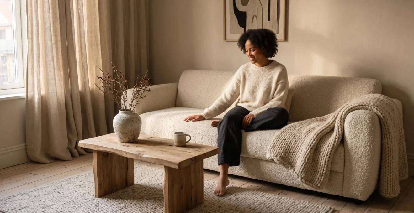
A neutral room can look beautifully composed and still feel strangely uninviting. The colours coordinate, the furniture is carefully chosen, and the surfaces appear clean. Yet sitting down or walking across the room may reveal what the visual arrangement lacks: materials that feel pleasant, substantial and varied to the touch.
Tactile materials make neutral interiors feel warmer by introducing softness, surface variation and sensory comfort without requiring additional colour. A wool rug changes the experience of walking across a floor, linen adds gentle irregularity to a window, and visible wood grain gives otherwise uniform furniture a more natural character.
The effect depends less on the number of textures than on their placement and relationship. A few carefully chosen surfaces can make a restrained room feel complete, while too many competing materials may undermine its calm appearance.
For homeowners working with beige, cream, white, taupe or grey, the most useful approach is to treat texture as a practical part of interior design: something experienced through sitting, walking, touching and living in a space, rather than simply another decorative finish.
How to make a neutral room feel warmer through texture
- Start where the body makes contact: prioritise comfortable upholstery, rugs, throws and bedding before decorative accessories.
- Balance softness with structure: combine wool, linen or velvet with grained wood, woven fibres and smooth ceramics.
- Keep the palette consistent: use a small family of complementary textures, selecting durable materials and rotating lighter textiles seasonally.
- Why Do Tactile Surfaces Matter More in Neutral Interiors?
- How Can You Add Tactile Materials Without Covering Every Surface?
- Soft or Rough Textures: Which Create a More Comfortable Living Space?
- Which Tactile Materials Are Difficult to Maintain in Busy Homes?
- How Can You Adjust a Room’s Texture Between Warmer and Cooler Months?
- Why Do Rooms With Mostly Smooth Materials Often Feel Flat and Unfinished?
- Why Do Contrasting Textures Add Depth to Rooms With Similar Colours?
- How Can You Use Contrasting Textures Without Making an Interior Feel Disconnected?
Why Do Tactile Surfaces Matter More in Neutral Interiors?
Tactile surfaces become particularly important in neutral interiors because limited colour variation places greater emphasis on materials, finishes and light. When walls, furniture and flooring share similar tones, differences between wool, linen, timber and smooth stone help define individual objects. Touchable materials also add physical comfort that a coordinated colour palette cannot provide on its own.
Consider a living room with cream walls, a beige sofa and pale flooring. If everything has a similarly smooth finish, the furnishings may blend into one continuous visual field. Replace the sofa’s flat upholstery with a more textured fabric, introduce a wool rug and add a wooden table with visible grain. The colour scheme remains largely unchanged, but the surfaces become easier to distinguish.
This distinction helps explain why visual warmth and physical warmth are not the same thing. Warm-white paint and amber lighting can create a welcoming visual impression, while a soft armrest or comfortable rug contributes directly to the experience of contact. Neither necessarily changes the room’s air temperature, but both influence how the space is perceived and used.
Touch should therefore be considered alongside sight. In a scientific review of multisensory architectural design, Charles Spence examines how different senses contribute to architectural experience, including the tactile qualities and perceived temperature of materials. The review supports a broader sensory approach to interiors, although it does not establish that neutral rooms objectively require more texture than colourful ones.
The practical question is whether a material invites comfortable everyday contact. A visually striking sofa may still feel unpleasant against bare arms, while a simple cotton-covered seat may encourage someone to settle in. A rug that feels comfortable underfoot may make a floor-level reading or play area more appealing.
These are potential effects rather than guaranteed behavioural changes. Individual preferences, seating ergonomics, temperature and household routines still matter.
Once those everyday contact points are clear, the next challenge is introducing enough tactile variation without turning a restrained interior into a collection of competing finishes.
How Can You Add Tactile Materials Without Covering Every Surface?
The simplest way to introduce tactile materials without visual clutter is to concentrate them in a few important locations. Choose one substantial textured element for each main activity zone, such as a wool rug beside a sofa or linen bedding in a bedroom. Prioritise frequently touched surfaces before adding smaller decorative details.
A restrained room rarely needs textured cushions on every chair, multiple baskets, woven wall hangings and decorative objects in every corner. A single generous rug can introduce more noticeable sensory change than numerous small accessories, particularly when it occupies the area people walk across most often.
Placement matters more than quantity. A useful starting point is to observe how people move through the room during an ordinary day.
- Seating areas: concentrate softness on the sofa upholstery, armrests, throws or the rug beneath the coffee table.
- Bedrooms: prioritise sheets, pillowcases, blankets and the surface encountered when stepping out of bed.
- Dining areas: use comfortable chair upholstery, a tactile table surface or a restrained woven runner.
- Reading corners: combine a comfortable chair with one substantial textile and a stable side table.
For budget-conscious homeowners, textiles offer a practical starting point because many can be changed without replacing furniture. A throw allows a low-commitment experiment with wool or cotton. A rug changes both the visual composition and the experience of walking. Curtains introduce texture vertically, particularly when daylight passes across their weave.
Harder materials can follow once the softer foundation is established. A wood-grain table, rattan chair detail, ceramic lamp base or stone tray can introduce a contrasting surface without requiring a larger renovation.
For example, a hypothetical cream living room might begin with a flat-weave wool rug, then add linen curtains and one sealed-oak table. Those three changes address the floor, window and furniture surfaces without filling shelves or adding unnecessary colour.
Leave some materials deliberately quiet. Smooth walls and simple cabinetry give textured elements space to register, so restraint becomes part of the layering strategy rather than a restriction.
After identifying where texture belongs, deciding how soft or coarse those materials should feel becomes the next practical consideration.
Soft or Rough Textures: Which Create a More Comfortable Living Space?
Neither soft nor rough textures create a comfortable room on their own. Soft textiles generally suit surfaces intended for prolonged body contact, while coarser materials provide visual structure and contrast. A welcoming interior usually places comfortable fabrics where people rest and uses firmer or more irregular surfaces on furniture, flooring details and decorative accents.
Softness is particularly useful around sofas, beds and lounge chairs. Upholstery, cushions and rugs can make these areas feel inviting while reducing the dominance of hard furniture edges. However, a room containing nothing but deep-pile rugs, heavily cushioned seating and oversized knitted textiles may appear visually dense or lack definition.
Coarser surfaces offer a counterweight. A visible timber grain, woven jute edge or lightly textured stone brings irregularity to a composition without necessarily introducing extra colours.
These materials should be selected according to their function. Jute can work well as a visual grounding element, for example, but some weaves feel abrasive under bare feet. A natural-looking wooden surface may be attractive but needs an appropriate finish if it is used for drinks and everyday handling.
One way to assess the balance is to look at the seating area as a whole. If the sofa, cushions and rug are all heavily textured and visually bulky, replace one element with a flatter weave. If the room feels dominated by hard flooring, polished tables and smooth leather, introduce a substantial soft surface rather than another decorative object.
Personal sensation remains important. A PLOS ONE study of textile touch perception, published in 2024, examined evaluations of 22 textile swatches and found that tactile sensitivity and familiarity influenced how participants perceived textile textures.
The study did not evaluate comfort in furnished living rooms, but it provides a useful reason to test fabric samples physically. A bouclé that feels pleasant to one person may seem too coarse to another. A velvet that appears luxurious in a photograph may feel overly warm or resistant against the skin.
Climate and room size can also change the preferred balance. Heavy, deep-pile fabrics may feel less appealing during hot weather or in compact rooms where several bulky textiles dominate the available space.
Comfort is only one part of the decision. In households with children, pets or frequent visitors, cleaning and wear can make an otherwise appealing texture impractical.
Which Tactile Materials Are Difficult to Maintain in Busy Homes?
Deep-pile rugs, loosely woven textiles, snag-prone bouclé, absorbent fabrics and unfinished wood can require more attention in busy homes. Their main challenges include trapped debris, pulled threads, spills, surface wear and cleaning restrictions. Tightly constructed textiles, suitable performance upholstery and properly finished wood often provide tactile interest with a more manageable maintenance routine.
The difficulty does not come from texture alone. Fibre type, weave construction, protective treatments and cleaning instructions can matter more than whether a material looks rough or soft.
For example, a tightly woven cotton cushion cover that can be removed and washed may be easier to live with than a pale, loose-weave upholstered chair with a fixed cover. Similarly, some densely constructed wool rugs withstand normal household use well, while particular long-pile constructions need more careful vacuuming.
The Carpet and Rug Institute explains in its technical bulletin on high-pile carpet care that certain shag and high-nap carpets can be damaged by unsuitable brush rollers. The guidance specifically concerns these carpet constructions rather than every textured rug.
The following decision grid offers practical starting points for different households. These are material-selection considerations, not laboratory-tested durability rankings.
| Household profile | Textures needing extra consideration | Potentially easier alternatives |
|---|---|---|
| Young children | Long-pile rugs, delicate upholstery and fabrics with restrictive spot-cleaning instructions | Washable tight-weave cotton, removable covers and lower-profile rugs |
| Pets | Loose bouclé loops, open jute weaves and fabrics prone to snagging | Dense upholstery with tested snag resistance and short, secure rug constructions |
| Frequent guests | Untreated wood tables, delicate seat fabrics and highly absorbent surfaces | Sealed timber, cleanable woven upholstery and appropriately specified performance fabrics |
| Busy family living areas | Multiple delicate textiles requiring different cleaning methods | Coordinated, cleanable fabrics and durable finishes selected for frequent contact |
Performance velvet can be an option when the particular product meets the household’s cleaning and wear requirements. However, the word “performance” alone does not guarantee resistance to every stain, pet claw or cleaning product. Check the manufacturer’s specifications and test a sample where possible.
Wood deserves similar scrutiny. Finishes can help protect wood and make surfaces easier to clean, while unfinished wood can be more demanding. A well-chosen sealed-oak table, for instance, may retain visible grain without requiring the same care as an untreated surface.
Neutral palettes add another consideration: visibility. Hair, crumbs and dust may stand out against certain plain-coloured fabrics, especially where fibres create small crevices. The effect varies with the material, the colour of debris and the lighting; patterned fabrics sometimes disguise marks more effectively.
Maintenance frequency matters as much as durability. A material might resist wear but still require frequent cleaning to look presentable. Before purchasing, consider whether the cleaning process fits the household’s existing routine.
A five-step tactile material suitability check
- Identify daily contact: list the three surfaces receiving the most frequent handling, sitting or foot traffic. Keep a short priority list.
- Inspect the construction: note the pile height, weave openness, removable covers and exposed loops of each shortlisted textile. Create a comparison sheet.
- Check care instructions: record the permitted cleaning method, vacuum requirements and any restrictions for each material. Keep a care-reference list.
- Test physical samples: assess touch, apparent snag vulnerability and how easily visible debris can be removed using approved methods. Record observations without assuming the sample predicts long-term durability.
- Make a maintenance decision: choose the option whose care requirements match the household’s available time and equipment. Produce a final material shortlist with reasons for each choice.
Once a durable foundation is established, smaller and more easily changed textiles provide a way to adapt the room’s atmosphere throughout the year.
How Can You Adjust a Room’s Texture Between Warmer and Cooler Months?
A neutral room can adapt to changing seasons by keeping its major furniture and colour scheme stable while rotating selected textiles. Wool throws, plush cushions and velvet can create a heavier, more insulating impression in cooler months. Linen, washed cotton and lighter weaves can make the same room feel more breathable and visually open during warmer weather.
The most practical approach separates materials into fixed and rotating layers.
Fixed layers usually include the sofa upholstery, main rug, flooring, cabinetry and larger furniture. These establish the room’s ongoing character. Rotating layers include throws, cushion covers, bedding and, where practical, curtains.
This distinction keeps seasonal changes manageable. Instead of replacing a sofa or buying a different rug every few months, change the materials that are easiest to store, wash and reintroduce.
In cooler months, a thick wool throw folded over the arm of a sofa adds visible volume and an additional layer for warmth. Velvet cushions bring a directional nap that changes appearance under light, while a knitted blanket contributes a more pronounced surface pattern.
During warmer months, these elements can give way to smoother linen cushion covers, lightweight cotton throws and bedding better suited to the temperature. Breathability depends on the specific fabric construction and fibre blend, so weight and personal comfort are more reliable selection criteria than material names alone.
The palette can remain cream, sand and warm grey throughout. Only the relative weight, weave and feel of the textiles change.
| Surface | Cooler months | Warmer months |
|---|---|---|
| Sofa | Wool or chunky-knit throw | Light cotton or linen throw |
| Cushions | Velvet or substantial woven covers | Washed linen or lighter cotton covers |
| Bed | Additional wool blanket or warmer layered bedding | Lighter bedding appropriate to room temperature |
| Windows | Heavier curtains where insulation or light control is useful | Lighter curtains where privacy and light-control needs permit |
The seasonal change should not come at the expense of function. Window coverings may need to remain consistent for privacy, glare management or thermal performance. Some lightweight-looking fabrics also provide less warmth than their substantial appearance suggests.
A common mistake is changing colours, patterns and materials simultaneously. That may be enjoyable, but it makes it harder to preserve the coherent character of a restrained interior.
Rotating texture while maintaining a stable palette creates a quieter shift. Storage also becomes simpler when cushion inserts and other reusable components remain in place.
This flexibility works best when the permanent materials already provide enough variation to make the room feel complete without relying entirely on temporary accessories.
Why Do Rooms With Mostly Smooth Materials Often Feel Flat and Unfinished?
Rooms dominated by similarly smooth finishes can feel flat because their surfaces offer few differences in reflection, shadow and visual depth. When walls, furniture and flooring share both a narrow colour range and a uniform texture, individual elements may become less distinct. Introducing varied finishes at several viewing distances creates definition without requiring additional colours.
Imagine a living room containing smooth painted walls, flat upholstery, polished furniture and a uniform floor. Each element may look attractive individually, but together they offer little variation in how light meets the surfaces.
From the doorway, the eye encounters similar responses to light across much of the scene. The overall arrangement may appear visually quiet, but it can also seem underdeveloped when there are few changes in material character.
Visual calm is not the same as material uniformity. Minimal interiors can feel complete with very little decoration if their surfaces create subtle differences in texture and depth.
A matte wall, a gently napped sofa, a timber table and a glazed ceramic vessel can coexist within the same pale palette. Their variations remain understated, but they help the eye distinguish the foreground, middle ground and background.
Even smooth materials are not necessarily a problem. Polished stone, glass and flat painted surfaces can provide welcome contrast when paired with more irregular finishes. The concern is using similarly smooth textures on almost every visible surface.
A simple diagnostic exercise can reveal whether texture, rather than colour, is the missing ingredient:
- Stand in the doorway at the viewing position most people use when entering.
- Scan from the nearest furniture to the farthest wall.
- Identify the distinct finishes visible without moving closer.
- Check whether at least three clearly different surface qualities are noticeable, such as smooth, woven and grained.
- If most materials look alike, consider changing one large finish before introducing new colours or objects.
The three-finish check is a practical design heuristic, not a scientifically validated minimum. Its value lies in encouraging deliberate observation rather than unnecessary purchasing.
Lighting conditions should also be considered. A textured fabric may show substantial relief beside a window but appear almost flat under uniform overhead lighting. Evaluate the room during the periods when it is normally occupied.
Once the room’s finishes are easier to distinguish, contrasting materials can introduce an additional layer of visual depth while maintaining a consistent colour scheme.
Why Do Contrasting Textures Add Depth to Rooms With Similar Colours?
Contrasting textures add depth to rooms with similar colours because different surfaces interact with light in different ways. Smooth finishes produce relatively continuous reflections, while woven, grained or napped materials create smaller variations of highlight and shadow. These differences help separate objects visually, allowing a monochromatic interior to appear more layered without relying on strong colour contrasts.
The effect can be understood as a vocabulary of small shadows. A wool rug contains fibres that catch light at different angles. Linen’s irregular weave produces subtle tonal changes. A timber table reveals grain lines and surface variations that are visible even when its colour closely matches the floor.
By contrast, a polished ceramic object often reflects light more continuously. Placing it near rougher materials makes both surfaces easier to appreciate.
Consider a hypothetical all-beige living room. One version contains uniformly matte walls, flat sofa upholstery, smooth furniture and a plain floor covering. Another retains almost identical colours but combines linen, wool, aged wood and glazed ceramic.
The second arrangement may appear richer because different textures give the eye more material information. The effect comes from variation in surface structure, reflectance and shading rather than a broader palette.
Colour contrast remains a separate design tool. Texture is not a scientifically established substitute for it in every circumstance, but material contrast can perform a similar compositional role by separating neighbouring elements.
Lighting determines how clearly those differences appear. Side lighting often makes raised fibres, woven irregularities and wood grain more noticeable through small shadows. Diffuse overhead lighting can reduce their apparent relief, particularly when surfaces are viewed from a distance.
This makes evening assessment especially useful for living rooms. Switch on the lamps normally used after sunset and look at how their light travels across the sofa, rug and tables.
If the room feels flat, changing the direction or position of a lamp may reveal existing material differences before any replacement is necessary. A table lamp to one side of a textured curtain, for example, can emphasize its weave more effectively than evenly distributed ceiling light.
The same principle applies to daylight. Window orientation, blinds and nearby furniture affect whether surface relief is visible during daily activities.
Excessive contrast is not automatically better, however. A heavily textured sofa, coarse rug, strongly veined stone table and elaborate ribbed glass can compete for attention, even when they share a similar colour.
The most cohesive results come from selecting contrasting textures that still share a recognisable visual relationship, rather than accumulating unrelated materials.
Key takeaways for a cohesive material palette
- Choose a dominant tactile character first, then introduce contrasting materials that support it rather than compete with it.
- Use shared tones, repeated finishes and similar visual weight to connect otherwise different surfaces.
- Assess the materials together in the room’s usual lighting before committing to more furniture or accessories.
How Can You Use Contrasting Textures Without Making an Interior Feel Disconnected?
Contrasting textures feel cohesive when the materials share a clear visual relationship. A consistent neutral undertone, a repeated wood finish or a similar degree of visual weight can connect soft, rough and smooth surfaces. Establish one dominant texture, use a second to create depth, and reserve more dramatic contrasts for a few intentional accents.
The easiest linking method is colour consistency. A cream wool rug, sand-coloured linen curtains and a pale oak table differ in texture but remain connected through their warm undertones.
Repeating a material creates another connection. If oak appears in the coffee table, a smaller matching detail on a shelf or chair can help that finish feel integrated rather than accidental.
The repetition does not have to be identical. A woven basket and cane chair panel may relate through their visible fibre structure even when they are made from different materials.
Visual weight also matters. Two materials can share a colour while still competing if both have unusually large, pronounced textures. A thick bouclé sofa beside a substantial shag rug may feel heavier than intended, while one of those materials paired with a flatter weave may create a more balanced composition.
A useful starting framework is a 60/30/10-style texture balance:
- Dominant family — approximately 60%: the broad material character that establishes the room’s atmosphere, such as smooth matte finishes or quiet woven upholstery.
- Secondary family — approximately 30%: a contrasting but complementary character, such as visible wood grain or soft wool textiles.
- Accent family — approximately 10%: a more distinctive surface, such as ribbed glass, irregular stone or coarser natural fibres.
These percentages are an illustrative styling framework rather than measured proportions or a research-backed formula. They are not intended for precise calculation by floor area, object count or material weight.
The principle is simply to make one family visually dominant while giving other textures supporting roles. In some rooms, the most effective proportion will differ substantially because of furniture scale, architecture or natural light.
The most common mistake is what might be called texture shopping: adding bouclé, rattan, travertine, ribbed glass, chunky knits and decorative ceramics because each looks appealing separately.
Without a shared tone, repeated material or clear hierarchy, these finishes can appear to have been collected independently rather than selected for the same room.
A brief material audit is more useful than buying another accessory. Write down each prominent finish currently visible, then identify whether it plays a distinct role or duplicates an existing effect.
For example, a hypothetical neutral living room containing a linen sofa, wool rug, oak table, rattan basket, ribbed glass lamp and stone tray could be simplified by keeping linen as the primary textile, oak as the repeated structural material and glass as a modest accent. If the rattan basket and stone tray contribute little to the overall arrangement, they can be moved elsewhere rather than supplemented with further decoration.
Repeating important finishes in more than one location can help establish continuity, but repetition is a design choice rather than an obligation. A single distinctive ceramic piece may work perfectly well as an intentional focal point.
The final test is experiential: do the materials feel appropriate where they are used, do their tones remain harmonious, and can the eye recognise a clear relationship between them?
Start with one everyday contact surface that could be more comfortable, compare a few physical material samples in the room’s normal light, and make one considered change. A neutral interior becomes more inviting through thoughtful layers that earn their place, not through the number of textures it contains.
Can a neutral room feel warm without using beige or cream?
Yes. Grey, white and other restrained palettes can feel welcoming when comfortable upholstery, tactile rugs, natural grain and considered lighting introduce variation. The warmth comes partly from the experience of materials and the way surfaces respond to light, not simply from the colour of the walls.
What is the best first texture to add to a minimalist living room?
Start with a material on a frequently used surface. A comfortable rug can improve the experience of walking or sitting near a sofa, while a throw can make a seating area more pleasant at relatively low cost. Choose according to the room’s current materials, cleaning requirements and everyday habits rather than assuming one texture suits every space.
Is bouclé upholstery suitable for households with pets?
Suitability depends on the particular fabric construction and the pet’s behaviour. Pronounced or loosely constructed loops may be vulnerable to snagging, especially where claws regularly contact the surface. Inspect samples, review manufacturer care and durability information, and compare dense, less snag-prone upholstery alternatives before choosing.
Can tactile materials improve comfort without changing room temperature?
They can change how a surface feels against the skin and how comfortable an activity seems. Textiles differ in contact sensation, softness, breathability and insulating behaviour. These qualities should be distinguished from actual air temperature: adding cushions or textured upholstery does not necessarily warm the entire room.
Should natural materials always be left untreated to preserve their texture?
No. Untreated materials can require additional care, particularly where they are exposed to spills and frequent handling. Wood finishes, for example, can protect surfaces and improve cleanability, although different treatments may alter their appearance or feel. Select a finish according to the material, intended use and manufacturer’s guidance rather than assuming untreated surfaces are always preferable.