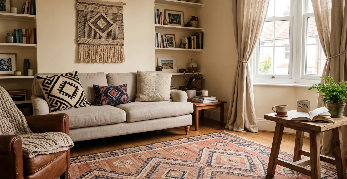
A handwoven kilim beside an embroidered cushion, an indigo throw and a textured wall hanging can make a living room feel collected, personal and visually rich. Yet the same combination can become overwhelming when every fabric demands equal attention or when cultural references are treated as interchangeable decorations.
The solution is not to restrict a room to textiles from one tradition. It is to create a clear visual relationship between the pieces while respecting the materials, makers and meanings behind them. A shared color, contrasting pattern scales and a few quiet surfaces can give very different textiles room to coexist.
Start with one textile worth building around, then evaluate every addition for its visual contribution, practical suitability and provenance. This approach works in both neutral interiors and expressive bohemian spaces. It also allows a collection to grow naturally without turning the home into a staged cultural theme.
Global textile mixing: the essentials
- Connect patterns through color and scale: establish a recognizable palette while combining large, medium and small motifs rather than repeating patterns of similar visual weight.
- Respect the objects and their origins: identify makers and traditions where possible, avoid reducing culturally significant designs to generic decoration, and choose materials appropriate to their intended use.
- Preserve visual breathing space: anchor the room with one substantial textile, distribute smaller accents deliberately and leave selected surfaces plain.
- Why Can Too Many Global Patterns Make an Interior Feel Visually Chaotic?
- How Can You Layer Patterned Rugs and Cushions Without Creating Visual Competition?
- One Statement Rug or Several Patterned Accents: Which Creates Better Balance?
- What Should You Avoid When Decorating With Textiles From Different Cultures?
- How Should You Introduce Bold Global Textiles Into a Neutral Room?
- How Can You Layer Rugs, Cushions and Art in a Small Bohemian Living Room?
- Flatweave or Thick Woven Rug: Which Works Better in a Busy Home?
- How Can You Create a Bohemian Interior Style Without Overcrowding the Room?
Why Can Too Many Global Patterns Make an Interior Feel Visually Chaotic?
Too many global patterns can make a room feel chaotic when their colors, contrasts and motif sizes compete for attention without a clear visual hierarchy. The problem is rarely the number of cultural traditions represented. More often, similarly prominent patterns occupy every surface, leaving the eye without a calm area or an obvious focal point.
Consider a hypothetical living room containing a Moroccan-inspired geometric rug, an embroidered cushion from a different textile tradition and a vividly patterned throw. Each could be attractive individually. But if all three use medium-sized motifs, strong contrast and unrelated color temperatures, they may appear to compete rather than complement one another.
Pattern density and visual incoherence are different problems. A richly layered interior can remain balanced when its textiles share a recognizable connection. This might be a recurring terracotta tone, muted natural dyes or a consistent range of warm neutrals.
Interior designer Sara Gilbane, whose recommendations appear in Architectural Digest’s advice on mixing patterns, emphasizes combining related tones with differing pattern scales. Her approach offers a practical starting point for interiors containing visually diverse fabrics.
The historical perspective is useful too. Cooper Hewitt’s analysis of historical pattern combinations describes coordinated French Art Deco wallpapers that share colors while using differently scaled motifs. Although these examples concern wallpaper rather than woven textiles, they illustrate how visual connections can help intricate surfaces coexist.
A simple diagnostic exercise makes the problem easier to identify:
- Photograph the room from its main entrance or usual viewing position.
- Look at the photograph from a distance or slightly squint to reduce detail.
- Convert the photograph to grayscale to compare areas of light-dark contrast.
- Identify which textile attracts attention first and whether several pieces compete equally.
- Temporarily remove one textile or replace it with a solid fabric, then compare the composition.
Grayscale photography is a practical design experiment, not a scientifically validated measurement of pattern overload. Its advantage is that it separates differences in brightness from the distractions of color.
If removing one accent immediately improves the room, reconsider that item’s scale, placement or contrast before abandoning the entire combination.
Once the competing elements become clear, the next step is to arrange textiles so that different patterns perform complementary roles.
How Can You Layer Patterned Rugs and Cushions Without Creating Visual Competition?
Layer patterned rugs and cushions by assigning each fabric a different visual role. Start with a dominant large-scale motif, introduce a medium-scale geometric or organic pattern, then add a small motif or solid textured fabric. Connect the pieces through one or two repeated colors so they look intentionally coordinated rather than randomly assembled.
Imagine a large kilim rug with broad geometric shapes in clay and cream. A cushion with smaller indigo-and-clay motifs introduces detail without repeating the rug’s visual rhythm. A third cushion in plain, nubby cream wool adds tactile interest while giving the eye a quieter surface.
The large-medium-small approach is a useful working method, not a mandatory design formula. Patterns can overlap in scale successfully when their contrast, placement and surrounding furnishings establish sufficient distinction.
Use a visual bridge to connect otherwise different fabrics. A single cushion containing two colors already present elsewhere can make separate patterns feel related. The connecting piece need not match either textile exactly; recognizable color relationships are often sufficient.
Texture offers another form of separation. A flatwoven rug, embroidered cotton cushion and loosely woven wool throw reflect light differently. Their contrasting surfaces create interest even when their colors are restrained.
Before purchasing or permanently arranging the textiles, test the combination in the actual room. A shop display rarely reproduces the light, furniture proportions or viewing distances of a home.
Lay the fabrics side by side on the floor, then examine them from the sofa and the doorway. Notice whether the main rug still reads as the anchor or whether a smaller cushion has unexpectedly become the dominant element.
When possible, live with the arrangement for three days, observing it in morning, afternoon and artificial evening light. This is a suggested trial period rather than a research-based requirement. It helps reveal combinations that initially seem exciting but become visually tiring with everyday use.
A five-step textile layering check
- Choose an anchor: identify your dominant rug or fabric and write down its two most noticeable colors.
- Sort by scale: place your textiles into large-, medium- and small-motif groups, producing a simple visual inventory.
- Find a bridge: select one item that repeats colors from two other textiles and photograph the connection.
- Test in context: lay out the arrangement and take photographs under daylight and evening lighting.
- Edit the final composition: remove or replace the strongest competing accent and keep a comparison photograph of the improved arrangement.
The result should feel connected without being perfectly matched. Once the individual patterns work together, consider whether the room benefits more from one dominant rug or several smaller textile accents.
One Statement Rug or Several Patterned Accents: Which Creates Better Balance?
One statement rug generally creates better balance when the room already contains colorful artwork, books, furniture or architectural details. Several patterned accents can work better in a neutral interior that needs visual interest distributed across different areas. The strongest choice depends on the existing room, maintenance needs and how frequently the homeowner wants to change the arrangement.
A statement rug establishes an immediate focal point. It can connect furniture around a shared palette and provide a visual foundation for less prominent cushions and throws. This approach is particularly useful when the room already has plenty of decorative detail.
Several accents create a different rhythm. Patterned cushions, woven throws and small textile artworks allow the eye to encounter color gradually instead of concentrating attention at floor level. They also offer more opportunities to rotate pieces seasonally.
There are practical trade-offs beyond appearance. A large statement rug may represent a significant investment, and its placement can expose it to concentrated foot traffic, spills or difficult cleaning. Smaller accessories are generally easier to move or replace individually, but they can accumulate until the room feels crowded.
The following comparison is a qualitative decorating guide, not a measured ranking of durability or cost.
| Consideration | One statement rug | Several patterned accents |
|---|---|---|
| Visual effect | Creates a strong central anchor | Distributes interest around the room |
| Best starting point | Already decorated or visually active room | Minimal, neutral or sparsely furnished room |
| Flexibility | Changing the main pattern may require replacing or relocating a large piece | Smaller items are easier to rearrange or rotate |
| Maintenance | Cleaning requirements depend on the rug’s fiber, construction and size | Individual pieces may be easier to handle, depending on their materials |
| Main risk | One expensive or high-contrast piece may dominate | Too many small accents may create visual fragmentation |
A hybrid approach offers useful flexibility. Choose a low-contrast flatweave or tone-on-tone rug as the quiet foundation, then add bolder cushions and throws from different traditions.
For example, a hypothetical room with an oatmeal-colored woven rug could accommodate a hand-embroidered cushion, an indigo throw and a small patterned wall textile. If the homeowner’s collection changes, the neutral rug continues to support new combinations.
Keep the most valuable or delicate piece away from conditions that could damage it, regardless of whether it serves as the main statement or an accent.
However the room is organized, good visual balance should not come at the expense of understanding where the textiles originate or what they represent.
What Should You Avoid When Decorating With Textiles From Different Cultures?
When decorating with textiles from different cultures, avoid treating traditions as anonymous aesthetic themes, presenting mass-produced imitations as handmade originals or using potentially sacred designs without understanding their context. Instead, learn what can be established about each piece, credit its maker where possible, choose transparent sellers and integrate culturally meaningful objects thoughtfully into daily life.
Respectful decoration does not require keeping every cultural tradition in a separate room. It requires recognizing that textile patterns, techniques and objects may carry histories that extend beyond their decorative appearance.
Start with provenance, not appearance. Ask who made the textile, where it was produced, what materials and techniques were used, and whether the seller can support claims about its origin.
Labels such as « tribal, » « ethnic » or « global-inspired » are often too broad to provide useful information. Specific descriptions, when verifiable, communicate more about the object’s character and the people who produced it.
There is also an important distinction between a contemporary product inspired by a historical technique and an original textile made within that tradition. Either can have a place in an interior, but the descriptions should not blur the difference.
In the United States, the U.S. Department of the Interior’s consumer tips for Native American art recommend purchasing from reputable dealers and requesting written verification of authenticity. The guidance also encourages buyers to obtain relevant maker and tribal affiliation information.
Those recommendations concern the particular context of American Indian and Alaska Native arts and crafts and associated U.S. consumer protections. They should not be presented as a universal legal framework covering textiles from every cultural tradition.
For textiles more generally, provenance records, maker identification and honest product descriptions are stronger indicators of origin than visual appearance alone. Irregularities in a weave may indicate handwork, but they cannot independently establish authenticity or cultural attribution.
Another risk is the theme-park effect: combining numerous stereotyped accessories to make an entire room resemble an imagined version of one culture. Matching imitation artifacts, decorative props and textiles can reduce a complex tradition to a visual costume.
Instead, allow individual objects to become part of a wider personal interior. A well-documented woven rug can sit alongside contemporary furniture, books and artworks without requiring every surrounding object to imitate its place of origin.
Exercise particular care with ceremonial, sacred or restricted symbols. Their meaning and appropriate use can differ between communities. If a piece’s cultural role is uncertain, investigate before using it as casual upholstery, floor covering or decoration.
Finally, avoid treating meaningful textiles as disposable seasonal trends. Regular inspection, suitable storage, careful handling and fiber-appropriate cleaning help preserve both their physical condition and the knowledge attached to them.
For valuable, fragile or historic pieces, consult an appropriate textile specialist rather than assuming ordinary household cleaning is safe. The Victoria and Albert Museum‘s conservation approach underscores why material, condition and provenance matter when determining how an object should be handled.
Once the origin and suitability of a piece are understood, a neutral room offers a particularly forgiving setting for introducing its colors and patterns.
How Should You Introduce Bold Global Textiles Into a Neutral Room?
Introduce bold global textiles into a neutral room one piece at a time, using existing pale surfaces, natural materials and restrained furnishings as visual breathing space. Begin with a patterned rug or throw, observe its effect, then repeat one of its colors in small surrounding details. Add further textiles only when the first feels integrated.
Neutral interiors provide a useful starting point because off-white walls, undyed linen upholstery and natural wood do not usually compete strongly with saturated textiles. Instead of changing the entire room, one distinctive woven piece can establish a new color direction.
A throw is an especially flexible first addition. It can be folded, draped or relocated without committing a large area of the room to pattern. A rug creates a stronger transformation but needs more attention to proportions, daily wear and furniture placement.
Choose an item with colors that suit the existing finishes. If the room contains warm oak, beige linen and cream walls, a textile featuring rust, muted indigo and warm ivory may feel easier to integrate than one whose colors have no relationship to the surroundings.
The color-pickup rule is a simple way to establish continuity. Select one noticeable color from the textile and repeat it in two smaller existing elements, such as a ceramic vase, a book spine, a picture frame or the piping on a cushion.
These echoes should be subtle. The objective is not to purchase a matching set, but to make the textile appear connected to the room’s existing composition.
For a hypothetical example, imagine placing a rust-and-indigo handwoven throw on an off-white sofa. A terracotta vase and the reddish cover of a book can quietly repeat the rust without making the arrangement look coordinated to excess.
After adding the first textile, evaluate the room from different positions. Does it still feel restful? Is there a strong focal point? Does the textile look like a deliberate addition rather than an isolated burst of color?
If the answers are positive, introduce a second pattern at a different scale. If the room feels unsettled, adjust the first textile’s placement or surrounding accents before adding more.
Neutrality does not have to mean an entirely white interior. Warm gray, oatmeal, soft clay and natural wood can all provide restrained backgrounds, provided the main surfaces remain visually consistent.
In smaller spaces, the same principles remain useful, but floor area, wall proportions and the placement of quiet zones become even more important.
How Can You Layer Rugs, Cushions and Art in a Small Bohemian Living Room?
Layer rugs, cushions and art in a small bohemian living room by distributing pattern across different heights while keeping the largest surfaces visually consistent. Use a restrained base palette, leave at least one major surface plain and give every decorative textile enough space to be appreciated. Vertical display can add richness without consuming valuable floor area.
In a compact room, a warm tonal foundation helps varied textiles feel connected. Walls, major furniture and flooring do not need to match, but closely related background tones reduce the number of competing visual elements.
For example, a small living room with cream walls, a sand-colored sofa and light wood flooring can accommodate an intricate rug, embroidered cushions and a woven wall hanging without requiring additional contrasting colors on every surface.
Build upward rather than outward. A carefully mounted textile can provide visual interest at eye level without occupying a side table or another section of the floor.
However, the hanging should remain proportionate to the furniture beneath it. A very large, visually dense wall textile can make a compact wall feel crowded, especially when paired with several unrelated artworks.
Check the piece’s condition and weight before hanging it. Fragile or valuable textiles may require specialist display methods rather than ordinary clips or hooks.
Layering rugs can work in small rooms, but restraint is useful. As a starting experiment, limit the arrangement to two rugs and keep part of the base rug visible so their relationship is readable.
Choose dimensions that do not create awkward edges in main walkways, interfere with doors or make furniture unstable. Suitable non-slip solutions may be necessary, particularly when a lighter flatweave sits over another rug.
A common problem is pattern creep: the gradual appearance of decorative motifs on every available surface. Printed curtains, densely embroidered cushions, patterned upholstery, a busy rug and multiple wall hangings may each seem appealing in isolation, yet together they can remove every quiet area.
Reserve one uninterrupted zone. A solid-colored sofa, plain curtains or a relatively empty wall can give the layered textiles a stronger presence precisely because the surrounding area is calm.
The arrangement should also respect everyday movement. Leave accessible paths, keep furniture usable and avoid adding decorative objects merely to fill gaps. A small room feels more expressive when each piece has a clear role.
Beyond visual composition, the floor textiles themselves must suit how the household actually uses the room.
Flatweave or Thick Woven Rug: Which Works Better in a Busy Home?
A flatweave rug is often a practical choice for busy areas where chairs move frequently and a low-profile surface is useful. A thick woven or piled rug generally offers more underfoot softness and can contribute to acoustic comfort in seating or resting areas. Neither construction is universally better; traffic, fiber, cleaning requirements and placement determine suitability.
Flatweaves, including many kilims and dhurries, typically have a relatively low profile. This can make them convenient under dining chairs and in areas where raised pile would interfere with movement.
However, flatweave does not automatically mean washable or stain-resistant. A loosely woven or delicate textile may still require specialist care, and its performance depends on fiber, weave structure, dyes and backing.
Thicker rugs can offer a softer surface for sitting, playing or walking barefoot. Their additional material can also contribute to sound absorption, although the effect depends on the rug, its underlay and the surrounding room.
Deep pile can make some forms of maintenance more demanding, particularly when debris becomes embedded or vacuum equipment is unsuitable for the construction.
The relevant comparison is therefore between specific rugs in specific locations, not a universal claim that one construction always lasts longer.
| Household factor | Flatweave rug | Thick woven or piled rug |
|---|---|---|
| Dining chairs | Low profile often allows easier chair movement | Deeper pile may create resistance |
| Entryways and hallways | Potentially useful where clearance is limited | Requires closer attention to door movement and pile height |
| Seating comfort | Firmer feel, depending on weave and underlay | Usually softer underfoot |
| Cleaning | Low pile can simplify surface access, but care varies by material | Pile depth and fiber can complicate cleaning |
| Sound absorption | Depends on material, thickness and underlay | Additional pile may provide greater absorption in some settings |
| Safety | May shift or curl without suitable positioning | Thicker edges may present clearance or trip concerns |
Consider a hypothetical busy household with a dining area, entrance hall and quiet reading corner. A securely positioned flatweave may be convenient beneath movable dining chairs. Another low-profile rug could suit the entrance if its material tolerates the expected dirt and moisture. A softer, thicker rug could then provide comfort beside the reading chair.
That placement-based strategy avoids asking one rug construction to perform equally well under every condition.
Before buying, check door clearance and cleaning compatibility. Measure the space between the bottom of any moving door and the floor, accounting for the rug and any necessary underlay. Confirm that the intended cleaning equipment and methods are suitable for the actual fibers and construction.
For older or unusually valuable textiles, prioritize their condition and preservation over convenience. The Victoria and Albert Museum identifies materials, condition, provenance and specialist analysis as central considerations in collection conservation; this supports an individual assessment rather than applying one cleaning method indiscriminately.
Practical placement decisions provide the foundation for a room that can remain expressive without gradually becoming overcrowded.
Key takeaways before completing your bohemian interior
- Give the collection structure through a dominant color family, a substantial anchoring textile and compatible natural materials.
- Make editing part of decorating: adding a new textile does not require increasing the total number on display.
- Plan for rotation and suitable storage so meaningful pieces can be enjoyed over time without occupying every available surface.
How Can You Create a Bohemian Interior Style Without Overcrowding the Room?
Create a bohemian interior without overcrowding by concentrating expressive textiles in one or two deliberately composed areas while preserving open space elsewhere. Establish a consistent color family, use one major textile as an anchor and repeat compatible natural materials. Treat the collection as something to edit and rotate rather than a reason to fill every surface.
Bohemian design is often associated with abundance, but an expressive interior does not depend on the number of objects it contains. Its character can come from contrasts between materials, meaningful collections, personal history and distinctive craftsmanship.
Think in terms of curated abundance. A richly patterned rug and several carefully chosen cushions can create an engaging seating area, particularly when the rest of the room retains plain curtains, uncluttered furniture and a few open surfaces.
Three structural anchors can help organize the composition.
- One dominant color family: use a recognizable tonal foundation, such as earth colors, muted blues or warm neutrals, while allowing individual textiles to introduce controlled contrast.
- One substantial anchoring textile: let a rug or another visually significant fabric establish the main scale and palette of the arrangement.
- Consistent natural materials: repeat wood, linen, wool, cotton or other appropriate materials to create continuity between textiles and furnishings.
These anchors are practical design principles rather than fixed requirements. Their purpose is to give independently chosen objects a recognizable relationship.
For a hypothetical living room, a warm geometric rug could establish the foundation. A neutral linen sofa would support two contrasting handmade cushions, while a wooden table and one woven wall hanging would complete the arrangement. The remaining surfaces could stay relatively open.
Another useful technique is the one-in, one-out editing rule. Whenever a new decorative textile is introduced, temporarily remove or store an existing item. This does not require discarding meaningful objects. It simply keeps the display from expanding automatically.
Rotation can make a collection more enjoyable. A heavier wool throw may be used during cooler months, while a lighter cotton piece takes its place in warmer weather. Wall textiles and cushion covers can also be exchanged to refresh the room without purchasing an entirely new decorative scheme.
Store textiles according to their materials and condition, ensuring they are clean and fully dry before being put away. Avoid imposing one storage or cleaning method on every item, especially when fragile fibers, unstable dyes or historic construction are involved.
As a collection develops, photograph successful arrangements and retain basic information about each textile’s maker, origin, materials and recommended care. This turns decorating into an informed process and makes it easier to bring pieces back into the room thoughtfully.
Leave room for ordinary life. A home must still support conversation, movement, cleaning and relaxation. Furniture should remain accessible, circulation routes clear and the main seating area comfortable.
A layered room can feel more personal when it contains fewer but better-understood objects. A distinctive textile does not need a cluster of matching accessories to communicate its craftsmanship or history.
Begin with the room as it is today: choose the textile that matters most, identify its connecting colors, remove one competing object and photograph the result. Build from that clear starting point, adding only pieces that contribute visual interest, everyday usefulness or personal meaning.
Can traditional handmade textiles work alongside modern furniture?
Yes. Contemporary furniture with simple shapes and restrained upholstery can provide a calm setting for intricate woven or embroidered textiles. Look for a connection through color, material or proportion rather than trying to make every object follow the same historical style. Keep the textile’s provenance and cultural identity recognizable instead of presenting it as an anonymous design motif.
Do textiles from different countries need to share the same colors?
No. An exact palette match is unnecessary. A small repeating color, related undertones or a consistent balance between muted and saturated tones can provide sufficient continuity. Contrasting colors may also work when motif scales differ and neutral surfaces separate the strongest patterns.
How can you check whether a handmade textile is genuinely from its claimed tradition?
Request information about the maker, place of production, technique, materials and available provenance records. Choose sellers who describe their products accurately and can substantiate authenticity claims. Handmade irregularities or traditional-looking motifs alone cannot establish cultural origin. Requirements and legal protections differ by country and product category.
Should valuable vintage textiles be used as everyday rugs?
That depends on the textile’s condition, construction, cultural significance and expected exposure to wear. Some sturdy older rugs may remain suitable for normal use, while fragile, historically important or unusually valuable pieces may be better displayed away from heavy traffic. Seek specialist advice when cleaning or placement could cause irreversible damage.
What is the easiest way to refresh a textile-rich interior without buying more decorations?
Rotate existing cushion covers, throws or wall hangings, then reassess the arrangement from the doorway. Move one prominent piece to a new location, repeat a color already present and remove an accent that no longer contributes to the composition. A small change in placement can create a noticeably different visual hierarchy without expanding the collection.