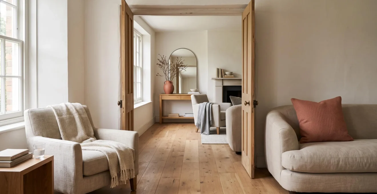
A home develops a recognisable visual identity when its furniture, colours and decorative details follow a consistent set of design cues. The pieces do not need to belong to the same collection, period or style. They need enough shared characteristics to feel deliberately connected.
The most useful starting point is to identify what should remain consistent: perhaps a family of warm neutrals, softly rounded silhouettes and predominantly matte finishes. Those characteristics become a visual language that can guide furniture purchases, colour decisions and even the placement of small accessories.
Consistency, however, is not the same as uniformity. A room needs variation in proportion, texture and emphasis to avoid becoming repetitive. The challenge is to establish a few reliable rules while leaving space for individual pieces and different room functions.
Building this system from existing furnishings is often more practical than starting again. Once the underlying cues are clear, new pieces can be assessed against them, and adjoining rooms can share a design identity without losing their individual character.
The essentials of a cohesive visual language
- Choose two or three recurring design cues, such as a colour family, a dominant shape and a consistent finish.
- Repeat those cues in different forms and proportions rather than purchasing identical furnishings.
- Allow deliberate exceptions, but give unusual pieces a clear role within the overall composition.
- How Can You Make Separate Rooms Feel Cohesive Without Matching Everything?
- Which Features Should You Repeat Across Rooms to Create Visual Continuity?
- Why Do Repeated Shapes Make Different Furnishings Feel Like They Belong Together?
- How Can You Build Simple Design Rules for Colours, Shapes and Finishes?
- Colour, Shape or Material: Which Should Lead Your Room’s Visual Identity?
- When Can a Statement Piece Disrupt the Visual Language of a Room?
- How Can You Carry an Existing Design Identity Into a New Room?
- Which Decorative Accessories Can Disrupt an Otherwise Cohesive Room?
How Can You Make Separate Rooms Feel Cohesive Without Matching Everything?
Separate rooms feel cohesive when they repeat recognisable colours, shapes or finishes without duplicating the same furniture. Rather than matching every item, establish a small set of shared design cues and express them differently in each space. This creates continuity while preserving differences in room function, scale and personality.
Matching relies on identical or closely coordinated objects: the same chair collection, matching tables or repeated decorative sets. Cohesion relies on relationships between objects. A rounded armchair in one room might relate to an arched mirror in another, even when their materials, colours and styles differ.
Colour offers a straightforward starting point. The familiar 60-30-10 approach allocates approximately 60% of a room’s palette to a dominant colour, 30% to a secondary colour and 10% to an accent. Sherwin-Williams’ colour-palette recommendations present these proportions as a practical guideline for individual rooms.
For a connected home, the same proportions can be adapted as a planning method rather than treated as mandatory measurements. A living room might combine predominantly warm beige, secondary oak tones and a little terracotta. The adjoining dining room could maintain the same colour relationships while expressing terracotta through artwork rather than upholstery.
The guiding principle is echo, don’t copy. Repeat a characteristic through a different object, material or scale. A curved sofa can be echoed by a round dining table; a timber cabinet can relate to dining chairs with similar wood undertones.
Use a simple doorway test to evaluate the result. Stand at the threshold between two rooms and look for at least one recognisable cue visible on both sides. It could be the flooring, an accent colour or a repeated silhouette. If nothing connects the view, consider introducing one modest visual echo.
This approach allows each room to respond to its practical purpose while remaining part of the same home. The next decision is which features carry those connections most effectively.
Which Features Should You Repeat Across Rooms to Create Visual Continuity?
Repeat the features that remain visible across connected spaces and have the greatest influence on their overall appearance. Continuous flooring, compatible wall colours and consistent architectural details provide a useful foundation. Smaller recurring elements, such as metal finishes, wood tones or accent colours, can reinforce that foundation without making every room identical.
A practical hierarchy begins with relatively permanent elements. Flooring, doors, skirting boards and trim often remain in place through several decorating changes, making them useful candidates for continuity. Large painted surfaces come next, followed by movable furniture and decorative details.
This is a planning hierarchy, not a universal measure of visual importance. A particularly prominent rug or vividly coloured sofa may attract more attention than a discreet architectural feature.
Visibility matters as much as repetition. As a working diagnostic, consider whether a shared feature is visible across roughly two-thirds of the connected sightline. This is not an established scientific threshold; it is simply a prompt to concentrate design effort where adjoining rooms can be viewed together.
For example, repeating a warm oak tone in a living room and the dining area directly beyond it may contribute more to the perceived connection than introducing the same wood into an isolated bedroom.
Vary the strength of each recurring cue to maintain a visual hierarchy:
- Strong expression: use the selected colour on a substantial wall or large upholstered piece.
- Moderate expression: repeat it through a rug, occasional chair or curtain.
- Subtle expression: introduce it through ceramics, picture frames or cushions.
Where several rooms connect, assign stronger expressions to primary gathering areas and quieter versions to transitional spaces. A hallway might require only a consistent trim colour and a small accent rather than a complete decorative scheme.
Limiting the system to two or three recurring cues is a useful editorial constraint, not a scientifically established maximum. It encourages selective repetition and prevents every room from appearing to reproduce the same showroom arrangement.
Once these connecting features are chosen, the next opportunity is often less obvious: repeating the geometry of furnishings that otherwise have little in common.
Why Do Repeated Shapes Make Different Furnishings Feel Like They Belong Together?
Repeated shapes make different furnishings feel related because similar outlines establish a recognisable visual pattern. Rounded corners, straight edges or angular profiles can connect objects made from different materials and belonging to different styles. The strongest results usually come from repeating a shape family while varying its scale and expression.
A curved sofa, an arched mirror and a cylindrical lamp do not match in the conventional sense. Their silhouettes nevertheless share rounded geometry, giving the eye a recurring characteristic to follow.
This is consistent with the principles described in Iowa State University Extension’s Elements of Design, which explains how repetition of lines, shapes, colours and textures can support visual rhythm and unity.
The principle does not establish that people recognise repeated shapes faster than repeated colours. Rather, geometry provides an additional means of creating relationships between objects when colour or material alone would not be sufficient.
To assess a room’s existing shape language, conduct a silhouette audit:
- Photograph the room from its main entrance or usual viewing position.
- Blur the photograph slightly or squint until small decorative details become less prominent.
- Identify the most noticeable outlines: curves, rectangles, diagonals or a combination.
- Look for one additional object that could echo the dominant geometry without repeating an existing piece exactly.
There are two useful forms of repetition. Hard repetition recreates nearly identical geometry, such as two tables with matching leg profiles. Soft repetition uses related but non-identical shapes, such as a rounded sofa arm, a shallow oval table and a curved ceramic vase.
Soft repetition is particularly useful when combining vintage and contemporary pieces or furnishings from different price ranges. It creates a connection without requiring a matching collection.
Scale introduces necessary variation. Several identical arches positioned at similar heights may become predictable, while a large arched mirror, a smaller rounded lamp and a low oval table establish a more varied rhythm.
Some contrasting geometry can also sharpen the composition. Straight-lined shelving beside curved furniture may provide a deliberate counterpoint rather than an inconsistency.
Once the room’s dominant geometry becomes apparent, it can be translated into a simple set of purchase and styling rules alongside colour and finish choices.
How Can You Build Simple Design Rules for Colours, Shapes and Finishes?
Build design rules by identifying the colours, shapes and finishes already present in furnishings you intend to keep. Turn those common characteristics into a short personal design brief, then use it to assess new purchases. The rules should be specific enough to guide decisions but flexible enough to accommodate meaningful exceptions.
Start with three long-term pieces, such as a sofa, dining table and storage cabinet. Note their dominant colours, visible silhouettes and surface finishes. Look for compatible characteristics rather than forcing similarities that do not exist.
For instance, a cream linen sofa, oak dining table and matte ceramic lamp might suggest warm neutrals, softly rounded forms and low-sheen natural finishes. These qualities can become the foundation of a repeatable design language.
A useful personal brief needs only three to five lines:
- Palette: warm neutrals with a muted terracotta accent.
- Shapes: predominantly rounded forms balanced by simple straight lines.
- Finishes: natural oak, matte ceramics and brushed metal.
- Contrast: one deliberately distinctive item per room where it improves the composition.
Before purchasing something new, compare it with the three main rules. If it conflicts with two or more, pause and decide whether the contrast is intentional. This is a practical filtering convention rather than an absolute test of good design.
Build exceptions into the brief from the beginning. A favourite antique cabinet or inherited armchair should not automatically be excluded because it uses a different material or shape. It may become the room’s designated contrast, supported by one compatible feature elsewhere.
Create your five-part visual identity checklist
- Photograph three furnishings you intend to keep and save them together as a reference board.
- Extract their shared colours and record a compact palette with a dominant, secondary and accent family.
- Identify the dominant silhouettes and write down one shape family to repeat.
- Select up to two compatible finish families and attach physical samples or photographs to the brief.
- Test one proposed purchase against all three rules and record whether it fits, needs adjustment or qualifies as a deliberate exception.
Review the brief periodically, particularly before buying several accessories or replacing a major furniture item. If something no longer fits, consider regrouping it with compatible objects, refinishing it where practical or moving it to another space.
These rules become more effective when one element leads the room’s identity and the others play supporting roles rather than competing for attention.
Colour, Shape or Material: Which Should Lead Your Room’s Visual Identity?
Choose the leading design element according to the room’s existing constraints and what is practical to change. Colour is a useful starting point when light and wall surfaces dominate the experience. Shape often works well in furniture-heavy open-plan spaces, while material can lead where substantial existing furnishings already share compatible finishes.
The purpose of selecting a leader is not to eliminate the other elements. It is to establish a hierarchy of visual decisions so that colour, shape and material do not all compete to define the room.
The following comparison offers a practical starting framework rather than a universal ranking.
| Decision criterion | Best starting point | Practical implication |
|---|---|---|
| Small or poorly lit room with prominent wall surfaces | Colour | Coordinate undertones and test shades in the room’s actual light. |
| Open-plan area containing numerous furniture styles | Shape | Repeat related silhouettes across seating, tables and lighting. |
| Room with several permanent or long-term furnishings | Material | Use established wood tones, textiles and surface finishes as anchors. |
| Room intended for frequent decorative updates | Colour accents | Preserve the underlying shapes and materials while changing smaller items. |
Each approach has different practical consequences. Changing a palette through accessories or repainting may be relatively accessible, although extensive redecoration can still be costly. Shape-led identities can remain recognisable when colours change because the main furniture silhouettes remain. Material-led schemes may offer continuity through durable furnishings, but replacing unsuitable large pieces can involve considerable expense.
These are contextual trade-offs, not evidence that any one approach universally lasts longer or costs less.
As a planning exercise, let the chosen leader inform every major furnishing decision. Introduce the secondary characteristic across roughly half the significant elements and use the third more selectively. Those proportions are optional design guidelines, not measured requirements.
For example, a shape-led living room could use curved seating, an oval coffee table and rounded lighting. Warm neutrals would support those forms, while timber and brushed metal would supply quieter material variation.
Be alert to over-direction. If every object repeats exactly the same colour, silhouette and finish, the room may lack contrast and personality. Count how often the three characteristics appear together, then consider relaxing one where the composition feels repetitive.
With a clear hierarchy established, an unusual piece can become a purposeful focal point rather than a threat to the room’s cohesion.
When Can a Statement Piece Disrupt the Visual Language of a Room?
A statement piece becomes disruptive when its colour, shape and material differ so strongly from the surrounding scheme that it no longer feels connected. Deliberate contrast works more reliably when the object breaks one established rule while retaining other shared characteristics. Its placement and relationship to nearby furnishings also determine whether it reads as intentional.
Imagine a living room built around muted neutrals, curved furniture and matte finishes. A deep-blue velvet chair introduces an unexpected colour and texture but may still belong if its silhouette relates to the existing furniture.
A brightly coloured, sharply angular chair with a reflective metallic surface would introduce several simultaneous contrasts. It could still work as an expressive focal point, but it would require more careful placement and stronger connections to the surrounding composition.
A practical rule is to change one dimension deliberately while maintaining the other two. It is a useful starting method, not a prohibition against more adventurous interiors.
Placement also changes the effect of contrast. Give the statement piece enough clear wall or floor area to distinguish its outline. Avoid surrounding it with several competing accessories of similar visual strength.
A small material or tonal connection elsewhere can help integrate it. For example, a chair with an unusual brass frame might relate to an existing brushed-metal lamp, even though the objects differ in style.
As described in Oklahoma State University Extension’s design principles, visual unity and variety need to be balanced. Repetition supports organisation, while sufficient variation prevents an arrangement from becoming monotonous.
To evaluate a statement piece, imagine the room without it and ask two questions. Does removing it make the composition more coherent? Does it also eliminate a useful focal point or an element of personality?
If the piece strengthens the room while retaining some visual connection, its contrast may be justified. If the room feels fundamentally unresolved without it, the surrounding design rules may need attention before adding further accents.
One prominent statement piece per main sightline is a reasonable initial constraint. Multiple focal points can coexist, particularly in spacious or deliberately eclectic rooms, but they need enough separation or hierarchy to avoid competing indiscriminately.
A distinctive piece can become part of the home’s identity when the surrounding design system is strong enough to accommodate it. That same flexibility is important when transferring an established style into another room.
How Can You Carry an Existing Design Identity Into a New Room?
Carry an existing design identity into a new room by transferring its underlying characteristics rather than copying exact furniture or paint colours. Record the established palette, dominant shapes and finish families, then adapt their expression to the new room’s light, dimensions and fixed features. Start with the most visible area before developing secondary details.
Create a portable identity kit that describes the current design in transferable terms. It might specify a predominantly warm neutral palette, rounded furniture silhouettes, natural wood and low-sheen finishes.
These characteristics can guide a bedroom, study or kitchen even when the furnishings required are completely different.
Colour needs particular care. A shade that looks balanced in a bright living room may appear cooler, duller or darker in a bedroom with different daylight exposure.
Benjamin Moore’s guide to warm and cool paint colours explains how undertones and natural or artificial lighting affect colour appearance. Testing actual samples in each room is therefore more reliable than assuming that identical paint will produce an identical visual effect.
Translate the palette through relationships, such as warm, cool, muted or saturated, before deciding on specific shades. A muted terracotta used in a bright room might become a softer clay tone in a darker space while maintaining a recognisable family resemblance.
When the new room contains inherited or permanent finishes, assess them individually:
- Neutralise: reduce the prominence of an awkward finish through compatible surrounding colours or furnishings.
- Echo: repeat a suitable characteristic of the existing surface elsewhere to make it feel deliberate.
- Accept: allow an immovable feature to act as the room’s distinctive contrast rather than forcing a complete match.
For example, existing cool-toned tiles might be balanced with appropriate neutral colours while warm timber appears more selectively. The objective is to manage the relationship, not necessarily to conceal every difference.
During phased decorating, establish the identity first in the area seen immediately upon entering. This might be the wall behind a bed, a prominent cabinet or the main seating arrangement. Apply the dominant colour, shape and material cues there before filling less visible corners.
A new room should be recognisably connected to the rest of the home while remaining suited to its own conditions. Once the major elements are established, smaller accessories become the final test of consistency.
Key takeaways for maintaining your home’s design identity
- Evaluate decorative objects against the main colour, shape and finish rules before adding them to a room.
- Pay particular attention to large accessories and adjacent finishes, where small differences can become conspicuous.
- Keep meaningful exceptions, but give them a clear position or recurring visual connection instead of scattering them throughout the space.
Which Decorative Accessories Can Disrupt an Otherwise Cohesive Room?
Decorative accessories can disrupt a cohesive room when they introduce dominant colours, incompatible undertones, conflicting finishes or too many competing focal points. Large rugs, curtains, throws and prominent artwork generally deserve the closest attention because they occupy substantial visible areas. Smaller objects can also create visual noise when unrelated styles are scattered throughout the space.
The effect depends partly on visual weight. A brightly patterned rug covering much of the floor may change the room’s colour balance more substantially than several small ornaments. Similarly, a large artwork can redirect attention away from an otherwise restrained palette.
Some conflicts are subtler than obvious colour differences. Warm white upholstery beside a distinctly cool white wall can reveal differences in undertone. High-gloss ornaments may stand out against predominantly matte surfaces, while adjacent metals with noticeably different colours or levels of polish can create an unplanned contrast.
These differences are not automatically design mistakes. They become relevant when they undermine the intended hierarchy rather than contributing purposeful variation.
When evaluating accessories, consider three common sources of disruption:
- Large textile surfaces that introduce unrelated colours or strong patterns.
- Decorative finishes whose sheen or undertones clash with prominent neighbouring surfaces.
- Collections of small objects that create several disconnected points of attention.
Souvenirs, gifts and trend-led purchases deserve a different response from simply discarding them. A personally meaningful object can either become a deliberate accent or join a contained collection.
For example, a colourful ceramic souvenir might work as a focal point when its accent colour appears in two other small details. Alternatively, several unrelated souvenirs could be grouped on one shelf, creating a deliberate display rather than scattering competing colours throughout the room.
When something feels visually wrong but the cause is unclear, use a temporary removal test. Take the suspected accessories out of the room for a day, observe the underlying composition, then reintroduce each item separately.
For every object, choose whether to retain it, relocate it, refinish it where appropriate or incorporate it into a more intentional arrangement. This method isolates possible conflicts without requiring a complete redesign.
Begin with one frequently used room: photograph it, identify its three strongest recurring characteristics and remove any accessories whose role remains unclear. Reintroduce only those that support the chosen visual language or provide a deliberate, worthwhile contrast.
Can a home have a cohesive style if every room uses different furniture?
Yes. Cohesion depends on relationships between furnishings rather than identical furniture collections. Repeating a consistent colour family, related silhouettes or compatible surface finishes can connect rooms furnished in different styles. A vintage wooden table and contemporary upholstered chairs, for example, can feel connected through complementary shapes or material tones.
Do all rooms need to use the same paint colour?
No. Related colours, compatible undertones and repeated accents can establish continuity without identical walls. Light conditions also affect how paint appears, so different shades from a common colour family may provide a more consistent impression than copying one paint reference throughout the home.
How can you keep an eclectic interior from looking cluttered?
Give the collection a recognisable structure. Repeat selected colours or geometric characteristics, group smaller objects into intentional displays and establish a clear focal point. Eclectic interiors can accommodate considerable variety, but shared characteristics help different pieces feel related rather than randomly accumulated.
Should you choose a colour palette before buying furniture?
Not necessarily. If you already own large furnishings you intend to keep, their colours, shapes and materials are often better starting points. If the room is empty, a preliminary palette can guide decisions, but it should remain flexible until important furniture, textile and finish samples have been assessed together.
How often should you review your home’s visual identity?
Review it when making significant purchases, changing a room’s function or accumulating new decorative objects. There is no fixed schedule required. A short comparison against your existing colour, shape and finish rules is usually more useful than repeatedly redesigning the entire home.