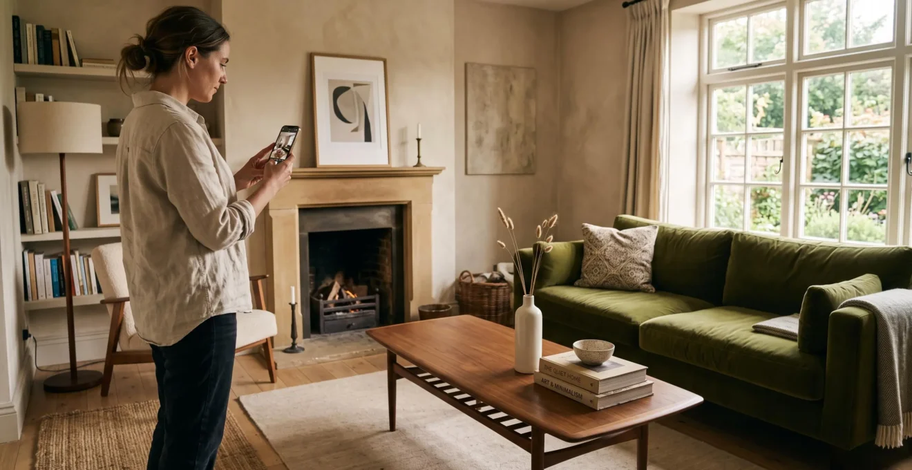
Decorative accessories give a home its individual character, but displaying everything at once can make even a carefully furnished room feel restless. The solution is not to eliminate personal objects. It is to choose which pieces deserve attention, arrange them deliberately, and allow enough space around them to be appreciated.
A ceramic vase collected while travelling, a framed family photograph, or a handmade bowl can introduce more personality than an entire shelf of unrelated ornaments. The difference lies in visual hierarchy: meaningful accessories should complement the room’s furniture, architectural features, and everyday functions rather than compete with them.
Start by identifying what already attracts attention, then use small decorative groupings to support those features. Vary heights and textures, repeat a few connecting colours, and leave some surfaces intentionally clear. A thoughtful display can feel personal without looking sparse or overly arranged.
These principles work across contemporary, traditional, eclectic, and collected interiors. The objective is not a universal number of accessories, but a room where every visible object has a recognizable purpose.
Decorating with personality, not clutter
- Edit before adding: keep your favourite pieces visible in selective groupings rather than spreading them across every available surface.
- Create visual hierarchy: combine objects with varied heights and a shared visual connection while preserving clear space around them.
- Refresh instead of accumulating: rotate accessories you already own and use larger statement pieces when a room needs a stronger focal point.
- Why Do Too Many Small Accessories Make a Room Feel Cluttered?
- How Can You Style Decorative Accessories Without Filling Every Surface?
- Large Statement Pieces or Small Accessories: Which Look More Balanced?
- Which Decorative Accessories Can Disrupt an Otherwise Cohesive Room?
- When Should You Rotate Decorative Accessories Instead of Buying More?
- How Can You Apply the Rule of Three to a Coffee Table or Shelf?
- One Large Artwork or a Gallery Wall: Which Better Suits a Wide Empty Wall?
- How Can the Rule of Three Make Decorative Displays Look More Natural?
Why Do Too Many Small Accessories Make a Room Feel Cluttered?
Too many small accessories make a room feel cluttered because each object demands a separate moment of attention. When shelves, consoles, and tables contain numerous similarly sized pieces, the eye struggles to identify a clear focal point. Even an organized room can appear visually busy if decorative objects compete rather than form coherent groups.
Visual clutter and physical clutter are different problems. Physical clutter involves items occupying space needed for storage, movement, or daily activities. Visual clutter occurs when the number, placement, or contrast of visible objects makes a room feel fragmented.
A tidy bookshelf filled with small figurines, individual framed photographs, candles, and souvenirs may create more visual activity than a table holding an untidy but contained stack of books. The issue is not simply how many things exist, but how frequently the eye must shift between them.
Every room also has a natural hierarchy. A fireplace, a distinctive sofa, or a generous window view may already provide its central feature. When a collection of small objects attracts equal attention, that hierarchy becomes less obvious. Instead of appreciating the room as a whole, the viewer notices disconnected details.
Interior designers interviewed in Architectural Digest’s expert tips for styling surfaces recommend coordinating colours, varying object proportions, and giving decorative arrangements sufficient negative space. These are professional styling recommendations rather than experimentally established rules for measuring clutter.
Try a simple photographic check. Take a picture from the room’s entrance, then squint at the photograph or apply a slight blur. Ask whether your main furniture and architectural features still form recognizable shapes, or whether scattered accessories dominate the composition.
This is an informal editing exercise, not a scientifically validated diagnostic test. Its value comes from allowing you to see the room at a distance, without concentrating on the sentimental importance of individual pieces.
That emotional connection matters. Gifts, travel keepsakes, and inherited objects can all feel too meaningful to put away. Yet keeping something does not require displaying it permanently. Choosing a few items for each arrangement can make those objects more noticeable rather than less valued.
Once the problem is understood as competition for attention, the next step is to redistribute that attention instead of treating every empty surface as a decorating opportunity.
How Can You Style Decorative Accessories Without Filling Every Surface?
Style decorative accessories without filling every surface by creating a small number of intentional displays and leaving clear space around them. Group objects that share a colour, material, or personal story, and use differences in height to create interest. Empty areas are part of the composition, not unfinished spaces waiting for decoration.
Negative space helps establish boundaries. On a console, side table, or wide shelf, consider leaving roughly one-third to one-half of the usable area visibly empty as an initial styling exercise. This is a flexible practical suggestion, not a measured design standard. A busy kitchen counter may need considerably more free space than a purely decorative mantel.
Instead of spreading favourite objects across five surfaces, try the one surface, one story approach. Give each chosen display a common thread: three pieces collected on different trips, objects in earthy ceramic finishes, or a photograph beside an inherited item and a contemporary vase.
Those connections need not be immediately obvious. A shared colour undertone or texture can bring together objects from different periods without making them look like a matching set.
Vertical layering also introduces personality without occupying much additional tabletop space. A framed print leaning behind a small bowl creates depth. A tall sculptural vase adds height, while a wall-mounted shelf can hold a compact collection that would otherwise spread across a desk.
Make sure vertical arrangements do not interfere with lighting, sightlines, doors, or everyday access. The intention is to use space more thoughtfully, not merely transfer clutter from one position to another.
A five-step surface styling audit
- Clear one surface completely. Take a photograph of the empty table or shelf as your starting reference.
- Identify its primary function. Write down whether it mainly supports everyday activities, decorative display, or both.
- Select one connected group. Choose two or three meaningful accessories and identify the colour, material, or story linking them.
- Arrange and preserve clear space. Photograph the revised display, making sure its objects have distinct heights and practical space remains usable.
- Evaluate the room from its entrance. Compare the before-and-after photographs and record which accessories can be stored or moved elsewhere.
Different rooms should not have identical accessory density. An entryway may legitimately contain keys, a catchall tray, and frequently used essentials. A living room coffee table may need open space for drinks, while a bedroom benefits from keeping bedside necessities easily accessible.
With surfaces edited and their functions preserved, choosing between a single expressive piece and several smaller accessories becomes easier.
Large Statement Pieces or Small Accessories: Which Look More Balanced?
Large statement pieces generally create a clearer focal point with fewer competing objects, while small accessories offer flexibility and more opportunities for personal detail. Neither approach is inherently more balanced. The better choice depends on the room’s dimensions, existing architectural features, available display space, and how frequently you like to change your decor.
The distinction becomes clearer when considering visual weight rather than physical size. A large matte ceramic vase may feel quieter than several small, brightly coloured ornaments, even if those ornaments collectively occupy less space. The vase forms one recognizable shape; the smaller objects introduce several separate points of attention.
Large pieces are particularly effective when the room feels generic or lacks a strong feature. An oversized mirror, an expressive artwork, or a substantial plant can establish character without requiring numerous additional accessories.
Small objects work well when the room already has a focal point. If a distinctive fireplace or sculptural sofa anchors the space, a restrained combination of books, ceramics, and photographs can add personal detail without competing with the larger feature.
The practical differences are worth considering before making a purchase.
| Consideration | Large statement piece | Small accessories |
|---|---|---|
| Visual effect | Creates one strong point of attention | Adds several layers of personal detail |
| Clutter risk | Usually fewer competing elements | Requires more careful editing and grouping |
| Flexibility | Often harder to relocate or replace | Easy to rearrange, store, or rotate |
| Best situation | A room that needs a focal point | A room with an established visual hierarchy |
| Commitment | Potentially greater cost and placement constraints | Can be developed gradually using existing possessions |
A hybrid approach often offers the most control. Let one prominent item anchor the composition, then surround it with a limited number of quieter details. For example, a large abstract artwork might provide the main colour reference for two modest ceramic objects on a nearby console.
Before investing in an expensive statement piece, test the effect with something easier to change. Move an existing tall plant into position, temporarily lean a substantial mirror against a suitable wall, or use a large paper template to assess scale. Secure mirrors and other heavy objects appropriately rather than leaving them unstable.
There is also no need to fill a room immediately. An intentional gap can be preferable to purchasing a statement object that later feels disproportionate.
Whichever approach you choose, consistency in colour, finish, and proportion becomes important when individual accessories are introduced.
Which Decorative Accessories Can Disrupt an Otherwise Cohesive Room?
Decorative accessories are most likely to disrupt a cohesive room when their colour undertones, finishes, design language, or proportions compete with established elements. A single object can feel unexpectedly dominant because it is too bright, reflective, large, or stylistically disconnected. The solution is to identify the particular attribute causing friction rather than automatically remove the entire piece.
Colour temperature is one potential source of mismatch. A cool, blue-based white ornament may look noticeably different beside warm ivory ceramics, especially when both are placed together. Mixed metal finishes can also appear disconnected if their tones and placement lack any deliberate relationship.
Contrast is not automatically a mistake, however. Brass, chrome, timber, and blackened metal can coexist successfully when their proportions and distribution feel intentional. The same applies to different stylistic periods.
A rustic carved object placed in a sleek contemporary interior might become a memorable accent. Several unrelated pieces featuring contrasting textures, highly polished finishes, and competing colours may instead make the display feel accidental.
Scale matters as much as style. A narrow console crowded with broad decorative bowls will feel physically and visually constrained. Conversely, a tiny ornament positioned alone on a very long mantel may appear disconnected from its surroundings.
Use a simple spot-the-disruptive-attribute exercise before discarding a meaningful object:
- Temporarily move the object away from its current neighbours.
- Check whether its colour, finish, silhouette, or scale creates the strongest contrast.
- Try pairing it with something that shares one characteristic, such as a similar material or colour undertone.
- View the arrangement from the room’s entrance before deciding whether it belongs there.
A beloved travel souvenir with a vivid glaze, for instance, may work better on a neutral bookshelf than beside several patterned objects. Changing its context can preserve its emotional value while improving the overall display.
Another useful check is to stand at the principal entrance and identify the first three elements that catch your attention. If an accessory appears among them without being an intended focal point, consider adjusting its placement or visual contrast. This is a subjective styling check, not a fixed design measurement.
One deliberate oddity can also give a cohesive room individuality. The distinction is whether the contrast appears chosen and supported by surrounding restraint, rather than resulting from an accumulation of unrelated accents.
Once the strongest accessories have suitable positions, maintaining balance becomes less about finding new objects and more about deciding which existing pieces should be visible.
When Should You Rotate Decorative Accessories Instead of Buying More?
Rotate decorative accessories when a room feels familiar or visually crowded even though you still enjoy the objects you own. Rearranging and temporarily storing selected pieces can make a display feel refreshed without increasing your collection. This approach is especially useful when shelves are full, spare accessories already exist in storage, or new purchases seem motivated mainly by the desire for change.
A common signal is feeling dissatisfied with the overall arrangement while remaining attached to every individual piece. That suggests the issue may be presentation rather than a genuine shortage of decorative options.
Another signal appears when a newly discovered interior photograph inspires an immediate urge to shop. Before purchasing anything, consider whether a similar effect could be achieved by removing, relocating, or regrouping existing possessions.
In Architectural Digest’s advice on restyling shelves without buying anything new, interior designer Fiona Byrne describes taking objects off shelves, selecting pieces worth displaying, and reorganizing possessions according to shared characteristics.
That editing-first approach offers a useful starting point for a repeatable rotation system.
Keep an active selection and a resting selection. Display the pieces that suit your current arrangements and store the remaining suitable accessories in one clearly labelled container per room, provided their size and fragility make that practical. Wrap delicate pieces and avoid stacking heavy objects over breakable ceramics.
There is no need to change everything according to a strict schedule. Seasonal updates can work, but rotating pieces whenever an arrangement feels stale is equally reasonable. Swapping one vase or photograph may be enough to create a different composition.
Rotation has another practical advantage: it creates opportunities to reassess what you genuinely want to keep. An accessory that repeatedly remains in storage may no longer suit your preferences. If it has no continuing sentimental or practical role, donation or responsible resale may be worth considering.
Not everything belongs in the rotation pool. A strongly coloured artwork designed for one particular wall or a sculptural piece chosen for a specific console may have limited versatility. Rather than forcing it into other arrangements, allow it to retain a permanent position.
Smaller accessories with adaptable colours, materials, and proportions are usually easier to exchange between displays. This makes them particularly useful for refreshing a room without replacing its major decorative elements.
After editing your collection, a simple grouping principle can help arrange the accessories that remain on display.
How Can You Apply the Rule of Three to a Coffee Table or Shelf?
Apply the rule of three by choosing three decorative elements with different heights, shapes, or textures and arranging them as one connected group. Start with the tallest piece, position the others at slightly different depths, and leave usable space around the arrangement. A shared colour or material helps the objects feel related without requiring them to match.
For a coffee table, consider combining a tall vase, a small stack of books, and a shallow ceramic bowl. Place the vase toward the rear of the grouping, with the books and bowl positioned forward and slightly apart. Viewed from above, their positions should suggest a loose triangle rather than a rigid straight line.
The height variation matters. Three candles of nearly identical proportions may create a relatively flat arrangement, while objects with different vertical profiles establish a more interesting silhouette.
Use three distinct visual roles:
- Anchor: select a taller element, such as a vase, candlestick, or small sculptural object.
- Support: add a medium-height piece, such as a framed photograph or short stack of books.
- Base: complete the group with a low object, such as a bowl, tray, or flat keepsake.
Position the pieces so they can be appreciated individually without appearing scattered across the entire surface. On a coffee table that supports daily use, the arrangement should leave enough space for drinks, books, or other routine activities.
The same principle can organize shelving. A tall object may anchor one end of a shelf, with a horizontal stack of books and a smaller ceramic piece providing variation nearby. On the shelf above, reverse the arrangement or use a different number of objects to avoid repetitive patterns.
Three does not always mean three separate objects. A decorative tray can contain three smaller pieces while functioning visually as one organized arrangement. Likewise, a stack of books may read as one compositional element rather than several unrelated accessories.
In House Beautiful’s triangle method for styling shelves, Nick Lowry describes establishing visual hierarchy through the positions of objects and the spaces between them. His approach emphasizes beginning with the tallest piece, varying neighbouring shapes, and editing overcrowded displays rather than insisting on exactly three objects.
That distinction prevents the technique from becoming another decorating obligation. Not every shelf requires a trio, and three groupings repeated across every table can make a room feel formulaic.
The same principles of scale, grouping, and visual restraint also apply to walls, where a collection of smaller frames can compete with a single larger artwork.
One Large Artwork or a Gallery Wall: Which Better Suits a Wide Empty Wall?
One large artwork usually suits a wide wall when the room needs a calm, clearly defined focal point. A gallery wall is more appropriate when the aim is to display a collection of meaningful images and introduce layered personality. Both approaches can work, provided the artwork relates to the furniture below, the available wall area, and the room’s existing visual activity.
A single artwork creates one dominant shape. This can be particularly effective behind a sofa or above a console when nearby shelves and decorative accessories already introduce several smaller details.
A gallery wall distributes attention across multiple frames, making it well suited to family photographs, collected prints, or artwork acquired over time. Hallways, staircases, and home offices can be natural settings for this more narrative arrangement, although the available viewing distance and wall dimensions still matter.
For a large artwork above furniture, a commonly used starting point is approximately two-thirds of the furniture’s width. Some compositions can extend toward three-quarters, but that broader range is a styling option rather than a fixed requirement.
The Spruce’s advice on wall art proportions and placement reports interior designers’ recommendations to relate artwork scale to the furniture beneath it and identifies approximately two-thirds of furniture width as a useful guideline.
For example, a sofa measuring 90 inches wide would suggest artwork around 60 inches wide under the two-thirds guideline. Treat that as an initial proportion to visualize, then adjust according to ceiling height, surrounding architecture, and the actual composition of the artwork.
A gallery wall needs a different form of control. Too many small frames, inconsistent gaps, or unrelated frame finishes can produce the same visual fragmentation as overcrowded tabletops.
To create a more unified arrangement, maintain reasonably consistent spacing, work within a restrained frame palette, or repeat a recognizable theme across the images. The artwork does not need to match, but the collection should have some visual connection.
Before drilling into the wall, cut paper templates to the intended frame sizes and attach them using suitable removable tape. Try one larger rectangle first, then replace it with a proposed gallery arrangement. View both from the room’s main seating position and entrance.
Leave the templates in position for a few days if possible. This gives you an opportunity to observe how each layout feels under different lighting conditions and during normal use of the room.
The test is especially valuable because a large artwork and a gallery wall may look equally appealing in isolation but produce different effects alongside existing furniture and accessories.
Once the wall treatment is settled, the final challenge is making smaller decorative arrangements feel natural without turning every composition into a predictable formula.
Key takeaways before arranging your displays
- Use a recognizable focal point to establish which objects should attract attention first, rather than giving every accessory equal emphasis.
- Let changes in height, depth, and texture create interest within a small grouping instead of increasing the number of objects.
- Treat styling rules as flexible tools: a deliberate pair or single sculptural piece may serve the room better than another trio.
How Can the Rule of Three Make Decorative Displays Look More Natural?
The rule of three can make decorative displays look more natural by encouraging small, asymmetrical groups instead of rigidly repeated arrangements. Objects with different heights, textures, and positions create a sense of movement and individuality. The principle works best as a guide to visual composition, not as a requirement to place exactly three accessories on every surface.
Odd-numbered arrangements are a familiar interior styling preference because they can establish an identifiable centre of interest without creating perfect symmetry. The result may resemble a collection assembled gradually rather than a group purchased and positioned all at once.
This remains an aesthetic convention, not a scientifically proven guarantee of visual harmony. Symmetry can be equally appropriate when a room’s architecture, furniture, or formal character calls for it.
The rule becomes more useful when treated as a way to assign different visual roles. One piece contributes height, another introduces width, and a third supplies texture or colour. Objects can relate to one another without appearing interchangeable.
For example, an inherited brass candlestick, a small handmade bowl, and a favourite hardcover book could form a distinctive display. Their materials and histories differ, but a shared warm colour palette and varied proportions help them read as one group.
The arrangement can also prevent over-accessorizing. Starting with three complementary elements encourages a pause before adding a fourth, fifth, or sixth. Ask whether each additional object improves the composition or merely occupies the space that remains.
However, the rule of three should not become a room-wide repetition. A trio on the coffee table, another on the console, and an identical arrangement on every shelf can feel unnecessarily staged.
Use contrasting arrangements to introduce rhythm. One shelf might display a single sculptural object with generous empty space around it. Another could hold a compact collection of three pieces, while a nearby sideboard carries a pair of matching lamps.
Pairs work particularly well when balance and repetition serve a functional purpose, as with lighting on either side of a sofa or bed. A single object can be equally effective when its shape, scale, or craftsmanship deserves uninterrupted attention.
The strongest displays therefore balance consistency with variation. Repeating a colour or material across the room can provide continuity, while differences in grouping, scale, and placement keep the overall arrangement personal.
Rather than asking whether every surface follows the same numerical rule, consider whether each arrangement looks intentional and whether the room retains clear areas where the eye can rest.
Choose one shelf, table, or console to restyle today. Remove its accessories, return only the pieces that genuinely contribute to the arrangement, and assess the result from across the room. Keep the objects that add personality, preserve the space that gives them presence, and leave everything else available for a future rotation.
How many decorative accessories should you put on a side table?
There is no universally correct number. A small side table may need only one decorative object alongside a lamp or other practical essentials. A larger table can accommodate a compact grouping of two or three complementary pieces. The deciding factors are the available surface area, how the table is used, and whether the arrangement feels crowded.
Can sentimental decorations fit into a minimalist room?
Yes. Minimalist interiors can include meaningful photographs, inherited objects, and travel souvenirs. Displaying a smaller selection, grouping related items, and preserving negative space allows individual pieces to contribute personal character without overwhelming the overall composition. The remaining objects can be safely stored rather than discarded.
Should decorative accessories match the furniture?
Accessories do not need to match furniture exactly. Repeating one connecting characteristic, such as a colour undertone, wood finish, or shape, can establish cohesion while leaving room for contrast. An unexpected accent may look intentional when its surrounding arrangement is restrained.
How can you decorate open shelves without making them look crowded?
Begin by removing everything, then return books and decorative pieces in selected groups. Alternate vertical and horizontal arrangements, vary object heights, and leave visible gaps between collections. Avoid repeating the same arrangement on every shelf. If the result still feels crowded, remove one or two accessories and assess the overall balance again.
Is it better to buy matching decorative sets or collect individual pieces?
Either approach can work, but individual pieces often make it easier to reflect personal interests and experiences. Matching sets provide immediate consistency, whereas gradually collected objects can create a more varied display. The important consideration is how the pieces relate through colour, proportion, material, or personal meaning, rather than whether they were purchased together.