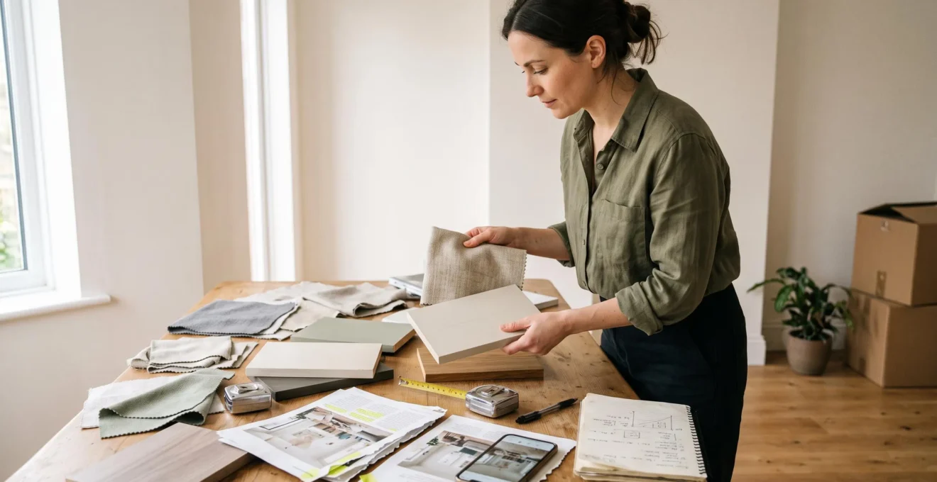
A clear visual aesthetic begins with a set of design decisions, not a shopping list. Before purchasing furniture or accessories, establish the atmosphere you want your home to convey, the colours and materials that support it, and the visual relationships that should connect individual pieces.
This becomes particularly important when several decorating styles appeal to you. A contemporary sofa, antique cabinet and industrial lamp can work together, but their compatibility depends on more than personal taste. Proportion, repetition, material finishes and the degree of formality all influence whether a room feels deliberate or assembled by chance.
Defining an aesthetic does not mean eliminating personality or committing permanently to one design category. It means creating a practical framework that makes future choices easier to evaluate. That framework should also account for the home’s natural light, architecture, existing furnishings and everyday activities.
The goal is not to make every object match. It is to establish enough consistency that contrasting pieces can belong to the same interior.
Defining a Cohesive Home Aesthetic: Key Decisions
- Identify a dominant visual direction through recurring colours, materials, proportions and atmosphere rather than relying solely on decorating-style labels.
- Assess natural light, architectural constraints, existing furniture and daily routines before choosing new pieces.
- Use moodboards and repeatable design criteria to filter purchases, while keeping expensive, difficult-to-replace elements less dependent on temporary trends.
- Why Can Beautiful Furniture Still Produce an Interior That Feels Disjointed?
- How Can You Turn a Moodboard Into a Practical Interior Without Copying It Exactly?
- Which Visual Direction Works Best When You Like Several Decorating Styles?
- Which Trend-Led Choices Can Make a Carefully Designed Interior Date Quickly?
- What Should You Assess First Before Changing the Visual Direction of a Room?
- Colour, Shape or Material: Which Should Lead Your Room’s Visual Identity?
- What Makes Mixed Decorating Styles Look Accidental Rather Than Intentional?
- How Can You Choose an Interior Design Style That Suits the Way You Actually Live?
Why Can Beautiful Furniture Still Produce an Interior That Feels Disjointed?
Beautiful furniture can create a disjointed interior when individual pieces follow incompatible visual rules. A room may contain well-designed, high-quality objects but lack consistency in colour, scale or formality. The problem is often not the furniture itself: it is the absence of a shared aesthetic direction connecting otherwise attractive choices.
Consider a hypothetical living room containing an elegant traditional armchair, a minimalist oak coffee table, a black steel shelving unit and a brightly patterned contemporary rug. Each object might be appropriate in another setting. Together, however, their relationships need closer examination.
Three distinct conflicts are particularly useful to investigate:
- Palette conflict: Unrelated colour families compete for attention without a recurring base, accent or tonal relationship.
- Scale conflict: Oversized furniture overwhelms smaller pieces, or several dominant objects compete without a clear hierarchy.
- Formality conflict: Highly polished, ceremonial furnishings sit alongside deliberately rough or casual pieces without a material or compositional connection.
The Texas 4-H Home Environment interior-design workbook identifies unity, repetition, proportion and balance among the principles of design. These provide a useful framework for analysing visual relationships rather than judging furniture solely by its individual appearance.
Buying one object at a time can make those relationships harder to maintain. An impulse purchase is evaluated against what happens to be appealing that day, while earlier purchases may have been guided by entirely different preferences. This does not make gradual decorating inherently unsuccessful; it simply makes consistent selection criteria more valuable.
Before replacing anything, identify the specific conflict. A mismatched palette may be resolved through upholstery, textiles or repeated accents. A scale problem may require rearrangement rather than replacement.
Once the sources of visual fragmentation are clear, a moodboard can help translate your preferences into a consistent set of decisions.
How Can You Turn a Moodboard Into a Practical Interior Without Copying It Exactly?
Turn a moodboard into a practical interior by extracting its underlying design rules rather than purchasing the objects pictured. Identify dominant colours, recurring materials, contrast levels and overall atmosphere. Then test those characteristics against your room’s dimensions, daylight and existing furniture. The moodboard becomes a decision-making filter rather than a literal shopping guide.
A collection of inspiring photographs is useful for exploration, but it is not yet a workable design specification. An image might appeal because of its warm lighting, generous proportions or understated textures rather than the exact sofa or pendant light it contains.
The distinction matters when translating inspiration into a real home. Instead of recreating a photograph, identify which visual qualities can be reproduced independently.
For a hypothetical moodboard featuring natural oak, creamy upholstery, soft shadows and dark metal accents, the resulting selection criteria might be:
- Colour distribution: A predominantly warm-neutral base, supported by a smaller secondary colour family and limited dark accents.
- Material family: Natural-looking wood, linen, matte ceramics and restrained metal finishes.
- Contrast: Mostly gentle tonal transitions, with occasional darker elements creating definition.
- Overall atmosphere: Relaxed, tactile and visually quiet rather than highly polished or formal.
These are illustrative design choices, not scientifically established proportions. The precise balance should respond to the room and personal preferences.
The University of the Arts London‘s article on visual development and moodboards describes visual references as tools for communicating a design direction. It emphasises selecting references for their relevance to a concept rather than merely collecting striking images. Although its guidance addresses broader creative practice, the same distinction is useful when developing an interior.
Be especially cautious with aspirational images. A sunlit room with tall ceilings and uninterrupted glazing may depend heavily on architectural characteristics your home does not share. A dark apartment cannot acquire those physical conditions simply by adopting the same pale furniture.
Test actual paint and material samples in the space, observe them at different times of day, and measure whether the furniture proportions shown in reference images would work with existing circulation routes.
A functional moodboard should help reject unsuitable purchases just as effectively as it helps identify promising ones.
The next challenge is deciding which criteria deserve priority when your inspiration comes from several different decorating styles.
Which Visual Direction Works Best When You Like Several Decorating Styles?
When several decorating styles appeal to you, the most useful visual direction is often the set of qualities they share. Rather than choosing between Scandinavian, industrial or traditional design as fixed categories, identify recurring colours, materials, forms and levels of visual complexity. Build around those common characteristics, then introduce selected influences from other styles.
A decorating style is a broad classification. A visual direction is more specific: it describes how a particular room should look and feel through a coordinated set of choices.
For example, a homeowner might admire Scandinavian interiors for their light wood, traditional interiors for their craftsmanship and contemporary interiors for their restrained forms. Those preferences need not be mutually exclusive. They could support a direction defined by warm natural materials, carefully made furniture and simple silhouettes.
To uncover that shared direction, examine your existing preferences rather than relying exclusively on a style quiz. Gather photographs you have saved, interiors you consistently admire and furnishings you have previously chosen.
Sort those references into groups according to what actually appeals to you. One group might contain pale woods and warm neutrals, another dark architectural details, and another woven or textured surfaces. Look for common characteristics across the groups, even when the rooms belong to different style categories.
Next, write a short description of your preferred aesthetic without naming a decorating style. For example: « Warm, understated interiors with natural textures, clean furniture profiles and a few characterful older pieces. »
This description is a more practical purchasing guide than trying to reproduce several entire styles simultaneously.
Choose one dominant direction to establish the room’s identity, then allow one or two secondary influences to introduce contrast. A predominantly contemporary room might incorporate an antique wooden cabinet and a handcrafted ceramic lamp without needing to become equally contemporary, traditional and rustic.
No fixed numerical proportion guarantees success. What matters is whether the dominant direction remains recognisable and the supporting influences have a clear purpose.
Once you have established a dominant direction, consider how much of it should depend on current trends, particularly when a decision will be expensive to reverse.
Which Trend-Led Choices Can Make a Carefully Designed Interior Date Quickly?
Trend-led choices are most likely to make an interior feel dated when they dominate expensive, permanent or difficult-to-replace features. Highly distinctive flooring, fitted cabinetry, large furniture and extensive wall treatments create stronger long-term commitments than cushions, artwork or accessories. Trends are not inherently poor choices, but their replacement cost and visual prominence should influence how they are used.
A particular colour, finish or silhouette can become associated with a specific decorating period as it appears repeatedly in homes, shops and online imagery. That association is not proof that the design is unattractive or obsolete. It simply means its historical identity may become more immediately recognisable.
Before following a trend, distinguish between structural commitments and easily reversible details.
| Decision type | Examples | Practical approach |
|---|---|---|
| High commitment | Flooring, fitted kitchens, extensive built-in finishes | Evaluate long-term compatibility with the home before adopting a distinctive trend. |
| Medium commitment | Large sofas, substantial rugs, statement light fixtures | Prioritise functionality, dimensions and lasting personal preference. |
| Lower commitment | Cushions, small decorative objects, movable artwork | Experiment more freely, provided the pieces reinforce the room’s visual direction. |
These categories describe relative replacement difficulty, not fixed prices. Costs and effort depend on the particular products, installation and household circumstances.
Apply a simple removal test to any highly fashionable feature: if it disappeared tomorrow, would the room still possess a recognisable identity?
If the answer is yes, the trend is likely functioning as an accent. If the entire room depends on that single feature for its character, it deserves more careful consideration before becoming a permanent investment.
Keeping existing quality furnishings can also reduce unnecessary replacement. The EPA guidance on reducing waste through reuse and repair recommends considering whether purchases are necessary and repairing usable furniture rather than automatically discarding it. That is an environmental recommendation, not evidence that older furniture is always aesthetically preferable.
Personal attachment also matters. A distinctive material you have loved for years may be a more enduring choice for your home than a supposedly timeless alternative that leaves you indifferent.
Even an enduring aesthetic can fail if it ignores the room itself, which is why architectural and practical constraints should be assessed before selecting finishes.
What Should You Assess First Before Changing the Visual Direction of a Room?
Before changing a room’s visual direction, assess its fixed architecture, natural light, proportions, existing furniture and actual patterns of use. These factors determine which design ideas can be implemented comfortably without unnecessary alterations. A successful aesthetic should work with the space’s physical conditions and household routines rather than depend on replacing everything that currently exists.
Begin with the elements that are difficult or impractical to change. These may include flooring, window positions, ceiling height, door openings, radiators, mouldings and fitted storage.
Next, assess daylight at the times when the room is actually used. Window orientation, neighbouring buildings and shading influence how much natural light enters a space. The U.S. Department of Energy‘s daylighting guidance explains that glazing orientation affects daylight, glare and solar heat gain, although the impact varies according to building conditions and location.
That information matters when testing colours and finishes. A paint sample viewed in a bright showroom may look different on a shaded wall at home. There is no universally correct palette for any window orientation, but observing real lighting conditions makes the selection more informed.
Measure the room and record the circulation space required around furniture. A visually attractive large sofa is not necessarily appropriate if it obstructs access to windows, doors or frequently used storage.
Then identify the pieces worth retaining. A well-made dining table, comfortable armchair or inherited cabinet can become the foundation of a new direction rather than an obstacle to it.
Five Checks to Complete Before Buying New Décor
- Record the fixed features: Create a simple room sketch showing windows, doors, architectural details and immovable fittings.
- Observe the lighting: Make a short daylight log noting the room’s appearance during the hours you use it most.
- Measure furniture and circulation: Produce a dimensioned floor plan indicating existing furniture and necessary walking routes.
- Audit existing possessions: Create a keep, repair, relocate or replace inventory with a reason for each decision.
- Define functional requirements: Write a room-use brief identifying activities, occupants, storage demands and acceptable maintenance.
The final assessment concerns everyday life. A family room used for play, remote work and entertaining has different requirements from a quiet reading room. Upholstery, storage and furniture arrangements should reflect those activities.
With those constraints established, the next decision is which visual element should lead the composition and which should provide supporting consistency.
Colour, Shape or Material: Which Should Lead Your Room’s Visual Identity?
Colour, shape and material can each lead a room’s visual identity, but none is universally the best starting point. Colour establishes an immediate visual atmosphere, shape influences spatial relationships, and materials create tactile and visual continuity. Choose the dominant element according to the room’s fixed features, the changes you can realistically make and the qualities you most want to emphasise.
These three design levers operate differently, so treating them as interchangeable can make decisions less precise.
| Design lever | Primary influence | Practical limitation |
|---|---|---|
| Colour | Establishes tonal relationships, atmosphere and visual contrast. | Paint may be relatively easy to change, while colour embedded in flooring or upholstery is less reversible. |
| Shape | Defines silhouettes, visual weight, proportions and the perception of space. | Changing major furniture dimensions or architectural forms can be disruptive. |
| Material | Provides texture, reflectivity and sensory consistency. | Existing floors, worktops and fitted surfaces may limit material choices. |
Colour-led interiors benefit from a disciplined palette. A room built around muted greens and warm neutrals, for example, may accommodate diverse silhouettes while keeping additional surface finishes relatively restrained.
Shape-led interiors emphasise profiles and proportions. Repeated curved furniture forms can create a recognisable aesthetic even when individual pieces use different materials, provided the scale and visual density remain controlled.
Material-led interiors depend on recurring surfaces and textures. Oak, linen, stone and ceramics can create continuity across furniture styles without requiring identical silhouettes.
In practice, coordinating two of the three levers often creates a useful balance between consistency and variation. A narrow palette and coherent material family can allow greater freedom in furniture shape. Alternatively, recurring curves and consistent finishes can accommodate more colour variation.
This is a design strategy rather than a measurable law. Contrasting materials or highly varied palettes can also work when the composition has deliberate repetition and hierarchy.
The best starting point is frequently the element you are least able to change. Existing timber flooring may suggest a material-led direction, while substantial architectural detailing may encourage greater attention to shape and proportion.
Once that hierarchy is established, it becomes easier to combine contrasting decorating influences without losing the intended identity.
What Makes Mixed Decorating Styles Look Accidental Rather Than Intentional?
Mixed decorating styles look accidental when objects lack a repeated visual connection or a clear hierarchy. An intentional mixture can combine different periods, silhouettes and materials, but recurring colours, finishes, proportions or levels of formality help those differences feel related. Without those connections, the room may resemble a collection of independent purchases rather than one considered composition.
The central principle is repetition with variation. Repeating exactly the same furniture style is not necessary, but repeating a few recognisable characteristics makes the mixture easier to interpret.
Imagine a contemporary living room with a traditional walnut cabinet. The cabinet need not match the sofa’s silhouette. Its wood tone could instead reappear in picture frames, a side table or another modest detail elsewhere in the room.
Likewise, an industrial metal lamp could feel integrated with classical furniture if a similar dark finish appears in handles, table legs or architectural elements. The shared finish gives the contrast a visual explanation.
Scale and formality also matter. A very delicate antique chair beside an exceptionally bulky sofa may require careful placement so neither appears stranded. Similarly, rough utilitarian furnishings mixed with highly polished formal pieces can feel unresolved if no finish or texture bridges the contrast.
Quality does not need to mean expense. A carefully restored second-hand table can sit comfortably beside new furniture when the condition, finish and construction support the overall aesthetic.
Proportion is another useful organising tool. If three contrasting styles occupy similar amounts of visual space, the room may lack a dominant identity. Giving one direction most of the visual weight makes secondary influences easier to understand.
A hypothetical example would be a primarily minimalist room with one traditional storage piece and a small number of handcrafted accessories. The contrast becomes part of the composition rather than a competing design programme.
No mathematical ratio guarantees coherence. Furniture scale, architectural context, placement and personal taste can all change how dominant a style appears.
Visual coherence, however, is only one part of a successful interior. The final test is whether the aesthetic supports the way its occupants genuinely live.
Key Takeaways Before Choosing Your Style
- Treat the room’s functional demands as selection criteria, not problems to address after decorating.
- Prefer an aesthetic whose maintenance, storage and durability requirements fit your normal routines.
- Use the dominant visual direction to guide purchases, but allow existing possessions and personal history to shape the final result.
How Can You Choose an Interior Design Style That Suits the Way You Actually Live?
Choose an interior design style that suits your life by evaluating what the style requires from you every day. Consider cleaning, storage, durability, household activities and the people who share the space. The most appropriate aesthetic is not necessarily the one you admire most in photographs, but the one whose visual qualities remain practical under normal living conditions.
A decorating style is both an appearance and a set of everyday demands. Highly minimal interiors, for example, often depend on keeping visible surfaces relatively clear. That can be satisfying for someone who enjoys organised storage, but frustrating for a household that prefers to keep books, hobbies and frequently used belongings within easy reach.
Similarly, an interior dominated by delicate textiles and pale upholstery may require more attention to visible marks and cleaning. It can still be appropriate in a busy household, but fabric performance, removable covers and cleaning requirements should be investigated before purchasing.
Start with how the home actually functions rather than how you would like it to appear to visitors.
- Entertaining: Consider seating flexibility, movement between spaces and surfaces for food and drinks.
- Working from home: Account for task lighting, comfortable working arrangements, equipment storage and visual distractions.
- Children or pets: Evaluate upholstery durability, cleaning requirements, stability and appropriate furniture placement.
- Multifunctional rooms: Prioritise adaptable furniture, accessible storage and layouts that accommodate different activities.
- Maintenance preferences: Consider whether the proposed materials and decorative density match the amount of routine care you are willing to provide.
The distinction between an aspirational image and a sustainable lifestyle is especially important. Someone might admire maximalist rooms filled with books, artwork and layered textiles but dislike the dusting, arranging and visual activity that accompany such a composition.
Another homeowner might aspire to strict minimalism but genuinely enjoy displaying collected objects. A warmer, edited approach with purposeful storage could suit that person better than an uncompromising interpretation of the style.
It is useful to distinguish between the aesthetic quality you admire and the behaviour required to maintain it. You can appreciate the calm of a minimal interior without eliminating every decorative object, just as you can enjoy eclectic design without filling every surface.
Before making significant purchases, test the proposed direction using what is already available. Rearrange furniture, simplify or group existing accessories, and introduce temporary fabric or paint samples. Live with the arrangement through ordinary routines, noting what feels comfortable and what creates inconvenience.
Returning to your initial framework helps prevent the lifestyle assessment from becoming another source of indecision.
As a final step, write a one-paragraph aesthetic brief covering the desired atmosphere, dominant palette, preferred materials, existing pieces to retain and essential household needs. Use that brief alongside room measurements and your moodboard before buying anything new. A clear direction should make the next purchase easier to justify, not simply make the room look more like a photograph.
Do all the rooms in a home need the same decorating style?
No. Rooms can have distinct personalities while sharing selected design characteristics. Repeated wood tones, architectural finishes or related colour families can establish continuity between spaces without requiring identical furniture, accessories or levels of formality. The degree of consistency is a design preference rather than a fixed requirement.
Can you define a home aesthetic without buying anything?
Yes. A useful starting point is to document existing furniture, collect visual references, compare material samples and experiment with rearrangement. Removing distracting accessories, regrouping objects by colour or changing furniture placement may reveal an aesthetic direction before any new expenditure is necessary.
How many colours should a cohesive room contain?
There is no universal number. A restrained palette may use a dominant colour family, supporting tones and a limited number of accents, while an intentionally colourful room may contain many more. The important consideration is whether the colours have recognisable relationships, appropriate visual weight and sufficient repetition to feel connected.
What should you do when your partner prefers a different interior style?
Identify the specific characteristics behind each preference. One person might value traditional design for its warmth and craftsmanship, while another prefers contemporary interiors for their simplicity. A shared direction combining natural materials, restrained forms and a few distinctive older pieces may satisfy both priorities more effectively than choosing one style label over the other.
How can you tell whether an aesthetic will still appeal to you later?
Compare your current preferences with furnishings, materials and interiors you have liked consistently over time. Distinguish lasting personal attractions from recently discovered trends, and trial unfamiliar colours or finishes through reversible changes. Future preferences cannot be guaranteed, but reducing dependence on a single fashionable feature can make later adjustments easier.