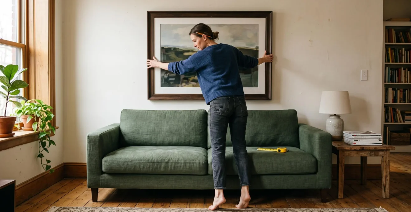
A framed print can look perfectly proportioned in a shop yet appear strangely disconnected once hung above a sofa. Often, the problem is neither the artwork nor the wall. It is the relationship between the picture’s position, the furniture beneath it, and the surrounding empty space.
For artwork above furniture, a useful starting point is to position the frame’s bottom edge approximately 6–10 inches (15–25 cm) above the furniture. This is a flexible styling guideline, not a fixed installation standard. The appropriate gap changes with furniture height, frame dimensions, decorative objects, and the space people need to sit or move comfortably.
Width matters just as much as height. A picture that relates to the sofa or console below generally produces a more coherent composition than one sized to fill the entire wall.
The most reliable approach is to **measure the furniture, preview the artwork at full size, and assess the arrangement from normal viewing positions** before making holes.
Artwork height and proportion at a glance
- Start with approximately 6–10 inches of clearance above furniture, adjusting for comfort, headroom, and nearby objects.
- Consider artwork around two-thirds to three-quarters of the furniture’s width as an initial proportion check, not an absolute requirement.
- Position a gallery wall as one complete composition, and test all frame outlines before installing hanging hardware.
- Why Does Artwork Look Wrong When It Is Hung Too High?
- How Can You Position Artwork Above a Sofa or Console Without Guessing?
- One Large Artwork or a Gallery Wall: Which Better Suits a Wide Empty Wall?
- Which Artwork Sizing Mistakes Make a Room Feel Out of Proportion?
- When Should You Hang Artwork During a Room Redesign?
- Large Statement Pieces or Small Accessories: Which Look More Balanced?
- How Can You Correct Visual Imbalance Without Moving Every Major Piece?
- How Can Decorative Accessories Add Personality Without Making a Room Look Cluttered?
Why Does Artwork Look Wrong When It Is Hung Too High?
Artwork looks wrong when hung too high because it loses its visual connection with the furniture below. Instead of forming one balanced composition, the furniture and picture appear as separate elements. The familiar 57–60-inch eye-level guideline can contribute to this problem when applied without considering a sofa, bed, or console beneath the artwork.
### The difference between eye level and furniture level
The eye-level convention usually refers to placing the center of an artwork around 57–60 inches (145–152 cm) above the floor. It can provide a useful reference for pictures on relatively empty walls, particularly where people stand to view them.
Furniture changes the composition.
Above a sofa, the important relationship is often the space between the top of the backrest and the bottom of the frame. A picture positioned according to a universal center height may not form a convincing visual group with unusually low or tall furniture.
As explained in The Spruce’s expert advice on hanging art above furniture, interior designer Erin Greene recommends approximately 6–12 inches of separation between artwork and furniture, while art advisor Kelly Cahn offers a center-based guideline around 60 inches. These are alternative starting points that require judgment, not interchangeable rules.
### Why excessive height changes the room’s balance
When a picture floats well above a sofa, the gap between them becomes a prominent strip of empty wall. The frame appears to belong to the upper portion of the room rather than the seating arrangement.
This changes how the eye reads the space. The sofa forms one horizontal anchor, while the picture creates a competing focal point above it. The result can make a carefully furnished room feel unfinished.
To diagnose the problem, stand at the room’s entrance and look at the arrangement as a whole. Ask whether the artwork appears visually attached to the sofa or whether it seems to occupy the wall independently.
A photograph can make that separation easier to notice.
### When a higher position makes sense
A slightly larger gap may be appropriate above a deep sofa, a bed with substantial pillows, or furniture where occupants could otherwise make contact with the frame.
Comfort and safe clearance matter more than achieving a precise number.
Lowering a frame by a few inches can improve the composition, but the final position should be judged from both seated and standing viewpoints rather than from a measurement alone.
How Can You Position Artwork Above a Sofa or Console Without Guessing?
You can position artwork above a sofa or console by measuring the furniture, the frame, and the intended clearance before marking the wall. Begin with a bottom-edge gap of roughly 6–10 inches, then preview the placement using a full-size template. Center the arrangement over the furniture rather than automatically centering it on the wall.
### Calculate the frame position
The simplest method uses the furniture’s top edge as the reference point.
- Measure from the floor to the top of the sofa back or console.
- Measure the complete framed artwork, including its outer edges.
- Choose a preliminary gap, considering headroom, decorations, and surrounding architectural features.
- Add the furniture height, intended gap, and frame height to determine the proposed top edge.
- Check the frame’s hanging hardware before marking the actual fixing points.
For a hypothetical example, suppose a console is 32 inches high and a framed print is 30 inches tall. With an 8-inch gap, the picture’s bottom edge would be 40 inches above the floor and its top edge 70 inches above the floor.
These measurements define the proposed frame position, not the location of the nail or wall hook. The actual fixing point depends on the frame’s wire, brackets, or other mounting hardware.
In Architectural Digest’s picture-hanging tutorial, designer Tyson Ness suggests around 6–8 inches above a sideboard or console, with more space potentially needed above a sofa.
### Test the arrangement without making holes
For a low-risk preview, trace the outside of each frame onto kraft paper, cut out the outlines, and attach them with removable painter’s tape.
Leave the templates in place for a day if possible. View them in daylight, under evening lighting, and from the places where people normally sit.
This test reveals whether the artwork feels crowded, too distant, or incorrectly scaled.
### Align the art with the furniture, not necessarily the wall
A long sofa may sit off-center because of a doorway, window, or circulation route. Centering artwork on the entire wall in this situation can make it appear displaced relative to the seating.
Instead, identify the sofa’s visual midpoint and use that as the starting axis. A wide frame, pair of prints, or triptych can all follow this reference.
A sloped ceiling requires similar judgment. Prioritize the relationship with the furniture while checking that the composition has enough breathing room around its upper edge.
Above very tall furniture, such as a bookcase, additional wall art may contribute little. Leaving the space clear can be the stronger choice.
A placement is ready for installation only when its height, horizontal alignment, practical clearance, and mounting requirements all make sense together.
One Large Artwork or a Gallery Wall: Which Better Suits a Wide Empty Wall?
One large artwork generally suits a wide, low piece of furniture when the goal is a calm, continuous focal point. A gallery wall can work better when the room needs rhythm, variety, or a display of several meaningful pieces. Neither choice is automatically superior: the key is to treat the artwork as one composition related to the furniture beneath it.
### Compare the two arrangements
| Decision factor | One large artwork | Gallery wall |
|---|---|---|
| Visual effect | Calm, focused, and continuous | Layered, varied, and rhythmic |
| Furniture below | Particularly effective above a long sofa or sideboard | Useful above shorter or segmented furniture arrangements |
| Planning | One frame to size and align | Multiple frame sizes and gaps to coordinate |
| Height reference | Measure from the artwork’s bottom edge | Measure from the bottom of the complete arrangement |
| Common problem | A piece that looks undersized or overwhelming | Frames scattered too widely across the wall |
### Size a single statement piece to the furniture
A useful starting range is approximately two-thirds to three-quarters of the furniture’s width.
Consider a hypothetical 90-inch sofa. Applying this range suggests a framed piece roughly 60–67.5 inches wide. It is a proportion test rather than a requirement: an unusually bold painting, asymmetrical furniture layout, or nearby window may justify a different size.
The measurement should include the full frame, not just the printed image or canvas visible inside it.
Architectural Digest’s living-room decorating guidance includes a professional example of artwork spanning approximately 60–75 inches above a 100-inch sofa, illustrating the principle of sizing art to furniture.
### Treat a gallery wall as one large shape
A successful gallery wall has an overall boundary, even when its frames vary in size and orientation.
Arrange the pictures on the floor first. Establish the outer edges, decide which artwork acts as the visual center, and then transfer the composition to the wall.
Approximately 2–3 inches between neighboring frames is a useful initial spacing reference. Slight variations can work if the grouping still feels deliberate.
Most importantly, measure the gap between the **lowest frame in the arrangement** and the furniture below. Do not apply the furniture clearance to every individual picture.
For wide furniture, an irregular gallery wall can still be balanced if its overall width and center align convincingly with the sofa or console.
### Avoid using the entire wall as the template
A gallery wall often becomes fragmented when every available patch of wall is treated as space to fill.
The result may have pictures creeping toward the ceiling while others drift toward side tables, leaving no discernible focal point.
Instead, outline the proposed composition as a single rectangle and assess that rectangle against the furniture.
The better arrangement is the one that gives the furniture a clear visual counterpart without making the surrounding wall feel crowded or abandoned.
Which Artwork Sizing Mistakes Make a Room Feel Out of Proportion?
Artwork makes a room feel out of proportion when its width, height, or orientation conflicts with the scale of the furniture beneath it. Small pictures can appear lost above large sofas, while oversized frames may crowd lamps or architectural details. Correct sizing starts with furniture dimensions and the available negative space, not the wall’s total area alone.
### Recognize the four most common sizing errors
- Artwork too small: The picture looks isolated over substantial furniture, drawing attention to empty wall space rather than completing the composition.
- Artwork too wide: The frame extends too close to the furniture’s outer edges or visually competes with lamps and side tables.
- Artwork too tall: Its upper edge approaches ceiling details, windows, or moldings in a way that makes the arrangement feel compressed.
- Incorrect orientation: A narrow vertical piece may look stranded over a long sideboard, while an exceptionally wide print may overwhelm a compact hallway dresser.
None of these conditions is automatically a design failure. A narrow artwork over a long sofa might be effective when balanced by another piece, or when deliberately aligned with an offset architectural feature.
The question is whether the final composition appears intentional.
### Match the format to the furniture’s proportions
Horizontal and square artwork often works naturally above sofas and long sideboards because the frame echoes the furniture’s width.
Vertical artwork can be effective above narrower dressers and compact consoles, particularly when a room has tall wall sections.
However, furniture width is only one variable. Window shape, ceiling lines, adjacent doors, and the visual weight of the artwork also affect the result.
As discussed in House Beautiful’s professional artwork-placement advice, artwork should be considered in relation to architecture and furnishings rather than the empty wall alone.
### Verify the dimensions before purchasing
An artwork can seem large in a showroom because its surroundings offer little familiar scale. The same piece may appear much smaller above a substantial sofa.
Before buying, record the proposed frame’s outer dimensions and reproduce its outline using painter’s tape or paper.
Compare the outline with the furniture from across the room. Notice how much visible wall remains on either side and whether the height competes with architectural features.
An augmented-reality preview can provide another perspective, but it should not replace checking the actual dimensions.
Five checks before choosing and hanging artwork
- Measure the furniture’s full width and top-edge height. Record both measurements.
- Measure the artwork’s outside width and height, including the frame. Create a dimension note.
- Mark the proposed frame boundary with removable tape or a paper template. Leave a full-size outline on the wall.
- Photograph the arrangement from the room’s usual viewing positions. Save a front-facing and a seated-view photograph.
- Check the clearance, alignment, frame hardware, and wall type. Record the final intended position and mounting requirements before installation.
Correct proportion is not necessarily about choosing bigger artwork. It is about giving every piece enough presence to relate to its surroundings without overpowering them.
When Should You Hang Artwork During a Room Redesign?
Artwork is usually best positioned after the room’s major furniture, rugs, window treatments, and lighting locations have been established. These elements determine where the artwork should sit, how large it can be, and what surrounds it. Planning the art collection can begin earlier, but permanent hanging should follow the confirmed furniture arrangement.
### Finalize the room’s major visual anchors first
A sofa that moves several inches during a redesign changes the centerline for the artwork above it.
Replacing a narrow console with a wider sideboard may also change which frame format feels appropriate. Similarly, adjusting a rug’s orientation can alter the apparent balance of the seating area.
For these reasons, the most practical sequence is to settle the furniture layout, confirm major lighting and window treatments, and then assess artwork positions against the completed arrangement.
There is one important exception: when a valuable or particularly large artwork is the central design feature, it may make sense to plan the room around it. Even then, final hanging measurements should reflect the installed furniture.
### Resolve wall finishes and lighting decisions
Wall color affects how a frame and its contents are perceived. A dark wall can reduce contrast around a dark frame, while a pale wall may make the same frame more visually prominent.
Lighting also influences placement.
A wall sconce or picture light can occupy space that otherwise appears available for artwork. Fixtures requiring electrical work should be planned before the wall is finished and the frame installed.
Check the location of switches, outlets, and any known electrical or plumbing routes before drilling. Choose wall fixings suitable for the substrate and artwork’s weight.
Direct sunlight is another consideration, particularly for works on paper and other light-sensitive materials.
### Know when the room is ready
Before making permanent holes, confirm that the following decisions are settled:
- The sofa, bed, console, or other principal furniture is in its final position.
- Rug dimensions and orientation have been established.
- Curtain heights and the space occupied by window treatments are known.
- Wall lights, switches, outlets, and planned electrical work have been accounted for.
- The intended lighting temperature and typical viewing conditions have been checked.
Buying artwork early is not inherently wrong. However, retaining flexibility over frame size, orientation, or final display location can prevent awkward compromises during the finishing stage.
When the large elements are stable, artwork becomes a finishing decision informed by the room’s actual proportions rather than a guess based on an unfinished layout.
Large Statement Pieces or Small Accessories: Which Look More Balanced?
A balanced room usually benefits from a few substantial visual anchors supported by smaller accessories. Large artwork, mirrors, or sculptural objects establish the composition, while smaller frames and decorative details add personality. The choice is not between large and small objects, but between a clear hierarchy and many competing elements of similar visual importance.
### Let larger elements establish the structure
A substantial artwork over a sofa creates an identifiable focal point. Its dimensions relate directly to the seating, giving the eye one coherent arrangement to understand.
Several small pictures can achieve the same effect when grouped closely enough to read as one composition.
Problems arise when small frames are dispersed across a large wall at unrelated heights. Each piece demands separate attention, and the furniture loses its connection with the display.
The solution is not always to remove the smaller pictures. Reorganizing them into a compact grouping can provide a stronger focal point while preserving their individual character.
### Use accessories to support the main composition
On a long console, a large vase can establish a dominant vertical element. A smaller bowl or stack of books may then provide contrast without competing for attention.
On a compact side table, three objects of different heights can form a cohesive grouping, provided their combined footprint leaves the surface functional.
These are composition techniques rather than mandatory object counts.
Look at the relationship between the accessories and the furniture supporting them. A cluster that looks balanced on a large sideboard may overwhelm a narrow shelf.
### Watch for competing focal points
Visual imbalance often develops through accumulation rather than a single incorrect purchase.
A brightly colored painting, patterned cushions, several tabletop sculptures, and numerous small wall frames may all be appealing individually. Together, they can create too many points of emphasis.
Choose which element should dominate. Reduce the apparent weight of surrounding accessories through smaller scale, quieter colors, simpler frames, or additional empty space.
The most effective arrangement gives larger objects enough presence to organize the room while allowing meaningful smaller pieces to enrich it.
How Can You Correct Visual Imbalance Without Moving Every Major Piece?
You can correct visual imbalance without rearranging heavy furniture by adjusting artwork height, redistributing accessories, changing lighting emphasis, or modifying the placement of smaller textiles. Begin by identifying the element creating the strongest imbalance, then make one targeted change. Reassessing after each adjustment prevents unnecessary alterations and helps reveal which correction actually improves the room.
### Diagnose the dominant problem
Take a photograph from the position where the room is most often viewed.
A photograph can make visual relationships easier to recognize because the entire space appears within one frame.
Look for three common patterns:
- One side contains noticeably more dark, large, or visually busy objects than the other.
- Small decorations are scattered across one wall while another wall has a much stronger focal point.
- A picture or mirror sits noticeably higher than nearby furnishing lines, drawing attention away from the main arrangement.
Choose the most obvious issue first. Attempting to correct every small imperfection at once can make it difficult to understand what works.
### Adjust artwork before moving furniture
If a painting appears disconnected from its sofa, test a slightly lower position. Even a change of 2–3 inches may affect the relationship.
Use a paper template first when possible. This provides a visual test without immediately creating additional holes.
If the composition looks heavier on one side, consider exchanging the positions of two accessories rather than moving the sofa or sideboard.
A dark ceramic vase, for example, may provide enough visual presence to balance a framed print elsewhere in the room.
These are practical experiments, not guaranteed corrections.
### Use lighting and textiles strategically
A floor lamp can emphasize an underrepresented corner. Adjusting the direction of an existing light may draw attention toward a display that currently receives little visual emphasis.
Consistent light color can also help a composition feel more coherent, although the effect depends on the room’s materials and existing lighting.
If a rug appears to pull attention toward one side, test whether a different orientation provides a clearer relationship with the seating.
Make only one adjustment at a time, then return to the original viewpoint.
Small corrections are particularly valuable when the basic layout already functions well. The goal is to improve the composition without disturbing the parts of the room that are working.
Key takeaways for a more intentional display
- Choose a dominant visual anchor before deciding which smaller decorative objects deserve attention.
- Preserve visible wall and tabletop space so individual pieces remain distinguishable.
- Treat accessories as editable groupings rather than permanent arrangements that must all be displayed simultaneously.
How Can Decorative Accessories Add Personality Without Making a Room Look Cluttered?
Decorative accessories add personality without clutter when each object has a clear purpose within the composition and enough space to be appreciated. Meaningful ceramics, books, photographs, and collected objects can coexist with a calm interior when they are grouped intentionally. The aim is not minimalism, but a readable arrangement with recognizable focal points and breathing room.
### Distinguish a collection from visual clutter
A room can contain numerous personal objects without appearing disorganized. The difference often lies in how those objects are displayed.
A group of travel photographs arranged within a defined gallery wall can tell a coherent story. The same photographs scattered at unrelated heights across several surfaces may appear visually fragmented.
Ask a practical question about each visible accessory: why is it in this particular position?
The answer might involve personal meaning, color, texture, scale, or its relationship with a nearby object.
If an item has no convincing role in the arrangement, consider giving it another location rather than automatically removing it from the home.
### Make negative space part of the design
**Negative space is the empty area that allows an object or grouping to stand out.**
A console does not need decorations spread from end to end. Leaving part of the surface visible helps establish a distinction between the main vignette and the supporting furniture.
The same principle applies to walls. A gallery wall often looks stronger when it has a deliberate outer boundary rather than extending toward every corner.
Architectural Digest’s living-room decorating examples discuss the value of leaving some walls visually quiet, supporting the idea that not every available surface needs decoration.
### Build coherent decorative vignettes
For a tabletop grouping, begin with one object that establishes height or shape. Add a contrasting secondary item, then decide whether a third contributes enough to justify its space.
A tall vase, a small sculptural object, and a low stack of books can create variation in height and texture without requiring a large collection.
Odd-numbered groupings are a common styling technique, but two well-chosen objects may work better than three crowded ones.
Keep each arrangement connected to the furniture beneath it, just as artwork should relate to the sofa or console below.
### Rotate meaningful objects instead of displaying everything
If a collection is extensive, store some pieces safely and change the display periodically.
This approach allows seasonal objects, photographs, ceramics, and souvenirs to receive attention without competing with one another.
It also provides a useful opportunity to reassess the room’s visual balance as tastes and furnishings change.
Choose one surface or wall arrangement to refine first. Remove anything temporarily unnecessary, reorganize the remaining pieces into a clear composition, and assess the result from across the room. A few deliberate decisions can make personal objects more visible without making the room feel crowded.
Should artwork above a bed be centered over the mattress or the headboard?
Center artwork on the visual axis of the bed, which usually corresponds to the headboard’s midpoint. If the headboard has an unusual asymmetrical design, judge the complete arrangement rather than relying only on its geometric center. Allow sufficient clearance for pillows, occupants, and any movement near the frame.
Can artwork be hung lower than the usual 57-inch eye-level guideline?
Yes. The 57-inch convention refers to a general center-of-artwork position and is not mandatory. Artwork above furniture may need a different height to maintain a visual relationship with the furniture. Check that the lower placement still provides safe, comfortable clearance.
Should all frames in a gallery wall have the same spacing?
No. Consistent spacing can establish rhythm, and approximately 2–3 inches between frames is a useful starting point, but small variations can also work. The important consideration is whether the arrangement reads as one coherent composition rather than unrelated pictures scattered across the wall.
How do you hang artwork when a console has tall lamps or decorative objects?
Consider the height of the objects as well as the console itself. Position the artwork to avoid crowding or overlapping the tallest accessories. Depending on the arrangement, a larger gap, different artwork width, or repositioned accessories may provide a more balanced result. Clearance recommendations for an undecorated console should not be applied mechanically when tall objects are present.
Is it better to leave a wall empty than hang artwork that is too small?
Sometimes. An empty wall can provide visual rest, especially when other parts of the room already contain strong focal points. If a small piece has personal importance, consider giving it a narrower location or incorporating it into a coordinated grouping instead of stretching the display across a wide wall.