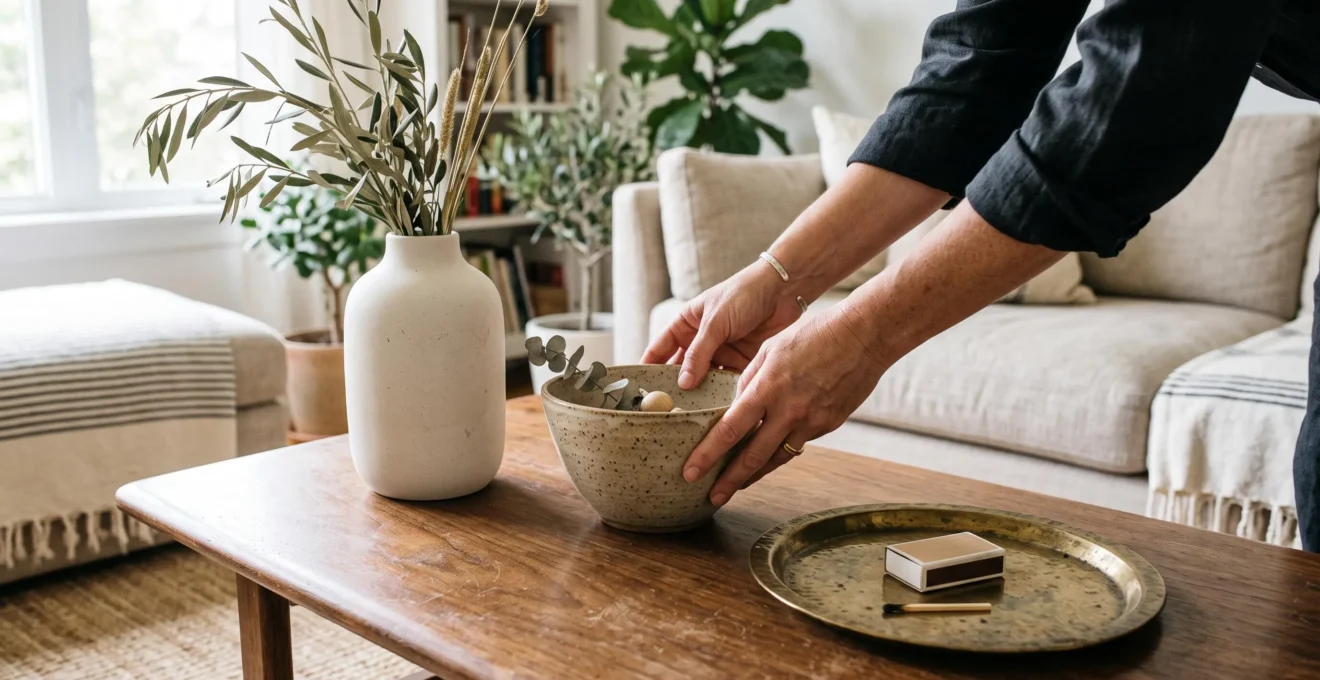
Three objects can make a shelf, coffee table or console feel thoughtfully styled without looking overly arranged. The secret is not simply counting accessories. It is giving each piece a different role, allowing their heights and shapes to create movement while leaving enough open space for the composition to breathe.
The rule of three in interior styling offers a useful starting point: combine three elements that relate to one another without matching perfectly. A tall vase, a textured bowl and a low tray, for example, can form a relaxed visual triangle. Their different proportions make the arrangement more interesting than three identical objects lined up in a row.
Yet a successful display also depends on scale, placement and restraint. Some surfaces benefit from a single statement piece; others need no decoration at all. Understanding when to use three objects—and when to stop at one or two—helps create rooms that feel personal rather than staged.
The rule of three at a glance
- Vary height and shape: combine tall, medium and low elements into a loose triangular arrangement rather than a straight line.
- Connect without matching: repeat a color, material or finish while allowing one object to introduce contrast.
- Protect negative space: leave enough surface clear for each accessory to stand out, and ignore the rule when three pieces would feel crowded.
- Why Do Groups of Three Often Look More Dynamic Than Pairs in Interior Styling?
- How Can You Apply the Rule of Three to a Coffee Table or Shelf?
- Matching or Mixed Objects: Which Works Better for a Group of Three?
- When Does the Rule of Three Start to Make a Room Feel Formulaic?
- When Should You Ignore the Rule of Three and Leave a Display Simpler?
- How Can You Style Decorative Accessories Without Filling Every Surface?
- One Large Artwork or a Gallery Wall: Which Better Suits a Wide Empty Wall?
- How Can Decorative Accessories Add Personality Without Making a Room Look Cluttered?
Why Do Groups of Three Often Look More Dynamic Than Pairs in Interior Styling?
Groups of three often look more dynamic than pairs because they introduce asymmetry without making the arrangement feel disconnected. Instead of presenting two objects for direct comparison, a trio gives the eye several points of interest. Different heights, shapes and positions create a loose visual triangle that can feel balanced without looking perfectly symmetrical.
Imagine two identical ceramic vases standing side by side. Their matching proportions establish a straightforward rhythm, and attention tends to settle on the relationship between them. Add a third object of a different height and the composition gains another point of interest. The eye can move between the taller, shorter and wider forms rather than concentrating on a single comparison.
This is an optical styling principle rather than a scientifically established law about eye movement. The effect depends as much on differences in height, silhouette and spacing as on the number of objects.
The psychological impression matters too. A matching pair can suggest formality or deliberate symmetry, whereas three related but distinct objects may feel more collected over time. That association is a design interpretation, not a universal response shared by every viewer.
In Architectural Digest’s bookshelf styling recommendations, interior designer Karen B. Wolf suggests grouping accessories in threes while varying their sizes. Three vases with different heights, widths and materials illustrate how a grouping can feel cohesive without being identical.
A practical way to judge a trio is to step back, squint or photograph the display in black and white. Look for a recognizable silhouette with one clear high point and two supporting elements. If the arrangement feels flat, change an object’s height or position before replacing it.
Remember that three is a compositional convention, not an obligation. Two substantial sculptural objects may create a stronger display than three accessories competing for attention.
Once the relationship between the objects feels convincing, the next consideration is how to position the grouping on a real surface without sacrificing useful space.
How Can You Apply the Rule of Three to a Coffee Table or Shelf?
To apply the rule of three, choose one tall anchor, one medium-height object and one low element. Arrange them at slightly different depths so their outlines form a loose triangle rather than a straight line. Position the grouping off-center and leave some of the surface empty, adjusting the scale to suit the furniture.
On a coffee table, a ceramic vase can provide height, a textured bowl can add a middle layer, and a low brass tray can establish a horizontal base. On a shelf, the same structure might use an upright ornament, a small framed photograph and a stack of books.
Build the arrangement in this order:
- Establish the tallest point. Place the vase, sculpture or vertical stack of books where it can anchor the grouping without blocking the view or crowding the shelf above.
- Add a contrasting middle element. Choose a bowl, rounded object or smaller sculpture whose texture or silhouette differs from the anchor.
- Introduce a low visual base. Position a shallow dish, tray or horizontally stacked book slightly forward or to the side.
- Adjust the distances. Move the pieces closer until they read as one composition, while preserving enough separation for their shapes to remain visible.
A helpful starting experiment is to let the grouping occupy roughly two-thirds of one side of a tabletop rather than placing all three objects directly in the center. This is a flexible styling exercise, not a measured design standard. The remaining space can support everyday use and provide visual contrast.
Scale matters more than the object count. On shelving, an accessory taller than approximately half the available clearance can begin to feel cramped, especially if it is also wide. Treat that proportion as a visual checkpoint and adjust it to the actual shelf dimensions and surrounding objects.
Interior designer Sophie Clemson recommends odd-numbered arrangements, complementary heights and triangular compositions in Homes & Gardens’ recommendations for less cluttered shelves. The same guidance emphasizes leaving enough empty space to prevent overcrowding.
A five-step styling check for your next display
- Clear one shelf or tabletop completely. Check: the full usable surface is visible before styling.
- Select three objects with different visual heights. Check: one clear high point appears in their combined silhouette.
- Position the objects at staggered depths. Check: a photograph shows a loose triangle rather than a straight row.
- Remove anything that makes the surface difficult to use. Check: everyday items still have an accessible place.
- Photograph the arrangement from across the room. Check: the trio reads as one grouping, with visible empty space around it.
A common mistake is placing three objects of similar height, similar material and equal spacing in a straight line. Although the display contains three pieces, its repeated shapes can make it look as rigid as a matched pair.
The positioning creates the structure; the objects’ relationship to one another determines whether the final composition feels harmonious or unnecessarily coordinated.
Matching or Mixed Objects: Which Works Better for a Group of Three?
Mixed objects usually create a more relaxed trio, while matching sets provide a cleaner, more formal appearance. The most adaptable option lies between those extremes: select two pieces with a shared characteristic and introduce one contrasting object. This creates visual variety without losing the connection that makes three separate accessories feel like one display.
There are three useful approaches to combining decorative objects, each suited to a different interior atmosphere.
| Approach | Visual effect | Best suited to |
|---|---|---|
| Identical objects | Orderly, repetitive and deliberately coordinated | Formal, symmetrical or minimalist interiors |
| Related objects | Cohesive but varied through shape or scale | Contemporary, transitional and understated rooms |
| Mixed objects | Layered, collected and visually expressive | Eclectic, casual and personality-led spaces |
The two-plus-one approach provides an especially approachable middle ground. Pair two objects that share a visible quality—a warm terracotta finish, for example—then add a darker sculptural piece to interrupt the repetition. The shared material establishes continuity while the contrasting form becomes a focal point.
Color and finish can provide a connecting thread even when the shapes differ considerably. A curved ceramic vase, a rectangular wooden box and a small stone sculpture may belong together if their colors have a similarly warm or muted character. Shape and color both matter; neither is automatically more important in every setting.
Mixing becomes less convincing when each object communicates a different and unrelated decorative direction. An ornate metallic figurine, an industrial concrete ornament and a brightly patterned ceramic piece can compete rather than collaborate if nothing connects them to one another or to the room.
Ask whether at least two pieces could plausibly have been selected together. If the answer is no, look for a common material, tonal relationship or repeated detail elsewhere in the room before adding the third.
Matching can still be effective when repetition is intentional. Three identical candlesticks, for example, can gain movement through different heights or staggered positions. A coordinated set does not have to look rigid, just as a varied selection does not automatically look natural.
The most convincing combination is the one that complements its surroundings. But even a beautifully composed trio can lose its effect if every other surface repeats the same arrangement.
When Does the Rule of Three Start to Make a Room Feel Formulaic?
The rule of three starts to look formulaic when the same tall-medium-low arrangement appears on nearly every surface. A coffee table, console, bookshelf and bedside table can each look attractive individually, yet collectively create a predictable pattern. Varying the number, scale and placement of accessories across the room restores a more natural visual rhythm.
Consider a living room where every styled surface contains a vase, a small sculpture and a horizontal stack of books. Even if their colors and materials differ, the repeated triangular silhouette can make the space resemble a coordinated showroom rather than a home assembled over time.
Look for three warning signs:
- Every shelf compartment contains a neat triangle of accessories.
- Multiple tabletops repeat the same hierarchy of one tall, one medium and one low object.
- Decorative arrangements occupy similar proportions of every surface, leaving little variation between busy and quiet areas.
The issue is that the rule of three organizes individual groupings, not the entire room. A method that works well in isolation can become monotonous when repeated without interruption.
To correct the pattern, give different surfaces different roles. A coffee table might feature three related pieces, while a console holds one large ceramic vessel and a side table supports only a lamp. An open shelf might alternate a pair of ornaments with a compartment containing books alone.
Varying scale is important, but changing size alone is not always enough. A miniature triangle on a side table and an oversized version on a console still share the same recognizable structure. Switching between singles, pairs, trios and deliberately empty surfaces creates a more noticeable change in rhythm.
View the room from its entrance or main seating position. Rather than judging whether each vignette is perfectly composed, assess whether attention can move between focal points and quieter areas without encountering the same arrangement repeatedly.
Once the room has enough variety, the next step is recognizing when a particular surface would look and function better with fewer objects.
When Should You Ignore the Rule of Three and Leave a Display Simpler?
Ignore the rule of three when one object already provides a strong focal point, the surrounding room is visually busy, or the surface needs to remain functional. Adding accessories purely to reach a count of three can weaken a display. A single meaningful piece, a carefully chosen pair or even an empty surface may be more effective.
A substantial sculptural vase on a narrow console may need no companions. Its proportions, texture and silhouette already give the eye something to appreciate. Two smaller accessories placed beside it could compete with that presence rather than improve the composition.
Similarly, in a room with patterned wallpaper, colorful upholstery or detailed architectural features, a minimal display can help calm the overall impression. Decorative objects do not need to provide visual complexity when the room already has plenty.
Function should also influence the decision. A bedside table may need space for a lamp, drinking glass and book. A frequently used coffee table may need to accommodate drinks, remote controls or a laptop. These practical requirements take priority over completing a decorative triangle.
There is a useful distinction between surfaces primarily intended for display and those used throughout the day. Console tops and selected open shelves often have more freedom to hold composed arrangements. Nightstands, desks and everyday tables generally benefit from restraint.
Negative space is not decoration that has been forgotten. An empty section of a table makes the objects beside it easier to notice. A clear shelf compartment can also provide a visual pause between more elaborate groupings.
Try this decision test: before adding a third object, explain what it contributes. Does it introduce a needed height, color, texture or meaningful detail? If its only purpose is to fill a gap, leave the space open instead.
Restraint becomes particularly useful when styling an entire room, where selective decoration can offer more impact than attempting to complete every available surface.
How Can You Style Decorative Accessories Without Filling Every Surface?
Style decorative accessories selectively by choosing a few surfaces to carry the strongest arrangements and leaving others relatively clear. Begin with the room’s natural focal points, remove unnecessary pieces and build each display around objects that deserve attention. Wall art, vertical accents and grouped small accessories can add personality without occupying every tabletop.
The challenge with clutter is that individual additions often seem harmless. A candle on a console, a figurine on a shelf and a small bowl on a side table may each look reasonable. Repeated across a room, however, these additions can make the space feel visually crowded.
A practical approach is to give decorative groupings to a minority of available surfaces as an initial exercise. This is not a universal percentage or a requirement to keep most furniture bare. It is simply a way to identify where accessories will make the greatest difference.
In Architectural Digest’s expert advice on styling surfaces, designers recommend varied object heights and scales, coordinated colors and intentional negative space. The guidance also encourages selecting meaningful decorative pieces rather than filling a room with accessories purchased all at once.
One effective editing method begins by removing everything from a surface. Add back the most important piece first, followed by only the accessories that strengthen its relationship to the room. Pause after each addition and consider whether the composition would lose anything meaningful if that item were absent.
When horizontal space is limited, consider decorating vertically. Artwork, wall-mounted objects and a single tall floor piece can contribute color, texture and character without occupying additional table space. These alternatives are particularly useful in compact living rooms and entryways.
Small objects also benefit from consolidation. Three miniature ornaments scattered across a shelf may read as several points of clutter. Arranged together on a tray, they can become one clearer visual unit, especially when their colors or materials relate.
The goal is not to remove every sign of daily life. Books, useful containers and personal belongings can contribute to the room’s character when they have appropriate places and do not overwhelm the main decorative features.
With tabletops under control, walls become another opportunity to establish visual interest without adding more objects to the furniture below.
One Large Artwork or a Gallery Wall: Which Better Suits a Wide Empty Wall?
One large artwork generally works well when a wide wall needs a calm, recognizable focal point, especially above substantial furniture. A gallery wall is better suited to displaying a collection of photographs, prints or meaningful objects. The choice depends on the wall’s position, the furniture beneath it and whether the room needs simplicity or layered visual interest.
A single statement piece concentrates attention. Its color, scale and composition can establish the visual character of an entire seating area without requiring several separate objects. It is often particularly effective above a sofa, sideboard or bed where a strong horizontal relationship already exists.
A gallery wall creates a different experience. Rather than giving attention to one dominant image, it invites viewers to explore connections between multiple works. Family photographs, travel prints, illustrations and inherited pieces can become a personal collection that reveals more detail over time.
The decision becomes easier when considering the wall’s role.
| Wall context | One large artwork | Gallery wall |
|---|---|---|
| Above a wide sofa | Creates one clear focal point and a calmer composition | Works when individual pieces form a unified arrangement |
| Hallway or stairwell | Provides a simple statement in an otherwise busy passage | Allows a personal collection to unfold along the wall |
| Minimalist living room | Maintains simplicity while adding visual impact | Introduces more detail and multiple points of interest |
| Room with many personal photographs | Highlights one particularly meaningful image | Allows several memories or subjects to share attention |
The rule of three can also inform a gallery wall. Begin with one dominant frame and place two supporting pieces around it. If additional artworks are included, retain a clear visual hierarchy rather than forcing every frame into an equal-sized grid.
Three, five or seven frames can be useful starting counts, but a successful gallery wall does not require an odd number. Frame relationships, spacing, scale and subject matter matter more than achieving a particular total.
For a large statement piece, avoid choosing artwork so small that it appears disconnected from the furniture beneath it. As a practical proportion check, try a work spanning a substantial portion of the sofa or sideboard’s width. The appropriate dimensions will depend on the artwork, room and surrounding space rather than on a universal formula.
Even when the wall is wide, leaving some surrounding space undecorated can make the final arrangement more coherent. The goal is to give the artwork enough presence without filling the wall simply because space is available.
Whether the display uses one painting or several photographs, the most satisfying choice often comes from what those objects mean to the people who live with them.
Key takeaways before choosing your accessories
- Start with what matters: choose objects for their usefulness, beauty or personal significance before arranging them.
- Let every surface play a different role: a meaningful trio stands out more when nearby areas are simpler.
- Make room for change: storing and rotating a few accessories can keep a room fresh without increasing the number on display.
How Can Decorative Accessories Add Personality Without Making a Room Look Cluttered?
Decorative accessories add personality when they reflect specific experiences, tastes or meaningful details rather than simply increasing the number of objects on display. Choose pieces that are beautiful, useful or personally significant, then arrange them with enough space to be appreciated individually. A small, carefully edited collection can express more character than a crowded selection of generic ornaments.
A handmade bowl from a memorable trip, a photograph in an inherited frame or a sculptural object chosen for its unusual texture can make a room feel distinctive. Their significance comes from their particular qualities and associations, not from how many other accessories surround them.
Before styling, apply a simple beautiful, useful or meaningful filter. An accessory only needs to meet one of those criteria to deserve consideration. Pieces that satisfy none can be removed first, making it easier to edit a collection without arbitrarily limiting objects that genuinely matter.
The rule of three becomes more effective after this selection process. It helps organize the objects that deserve display, but it cannot turn a collection of unrelated or unnecessary accessories into a personal interior merely by grouping them neatly.
Consider a hypothetical living-room shelf holding a family photograph, a handmade ceramic vase and a small wooden keepsake. Their shapes, colors and origins may differ, yet their personal connections give the grouping a clear purpose. Moving the photograph slightly behind the vase and placing the smaller object forward can establish depth without changing what makes the collection meaningful.
Not every treasured object needs to remain visible throughout the year. A rotation system allows favorite accessories to take turns. Store some pieces safely, revisit them seasonally or whenever the room needs a change, and build new combinations from objects already owned.
This practice also makes displays easier to edit. A decorative piece removed from a crowded shelf has not lost its value; it simply has another opportunity to stand out later.
For the room as a whole, focus on specificity rather than quantity. One distinctive object surrounded by open space can communicate more about a person’s taste than several accessories chosen only to match a color scheme.
Choose one surface in your home and remove its accessories. Select only the pieces that are useful, beautiful or meaningful, then experiment with a grouping of one, two or three. Stop when every object contributes something visible or personal, rather than when the surface looks full.
Do three decorative objects need to be different sizes?
No. Different heights make it easier to establish a visual hierarchy, but similar-sized objects can work when their spacing, shapes or placement create enough variation. A set of three matching vessels, for example, may look intentional when positioned at different depths or arranged along a shelf with sufficient open space.
Can books count as one object in a group of three?
Yes. A compact stack of books can function as one visual element alongside a vase and a bowl. The important distinction is how the arrangement reads from a normal viewing distance. When several small items form one clear shape, they can be treated as a single component rather than counted individually.
Should the tallest object always go at the back?
Not necessarily. Placing a taller item behind shorter ones often keeps the smaller pieces visible, but an off-center or slightly forward position can also work. Choose the arrangement that preserves each object’s silhouette, supports a clear focal point and suits the depth of the shelf or table.
Does the rule of three work in a minimalist room?
Yes, provided the grouping suits the room’s restrained character. Three simple objects with compatible finishes and varied proportions can create subtle interest. However, a minimalist interior may benefit more from one substantial sculpture or an empty surface, particularly when nearby furniture or architecture already provides a focal point.
How can you tell whether a decorative grouping feels too crowded?
Step back and check whether the objects remain individually recognizable, whether the grouping has a clear focal point and whether the surface is still practical to use. If the silhouettes overlap awkwardly or every empty gap invites another accessory, remove one piece and compare the result. A successful display does not need to occupy all available space.