A room can look beautifully balanced and still be frustrating to live in. A sofa might sit perfectly beneath a window but block a radiator. A dining table might complete an attractive arrangement while making it difficult to open a cupboard. Even a generous-looking walkway may become awkward when someone carries laundry through it.
The solution is to plan furniture around what people actually do in the room, not just how the furniture looks from the doorway. Start by identifying everyday activities, observing natural walking routes and recording fixed architectural constraints. Then assign space to the functions that matter most and test furniture positions before committing to them.
This approach works whether you are reorganising a narrow living room, combining a home office with a dining area or trying to make an awkwardly shaped bedroom easier to use. It also helps distinguish problems that can be solved by moving existing furniture from those that genuinely require different pieces.
Room layout essentials for everyday living
- Plan around activities: Give priority to the tasks, routes and furniture you use most often, rather than copying an inspirational photograph.
- Measure the real room: Record doors, windows, radiators, outlets and furniture dimensions before choosing positions.
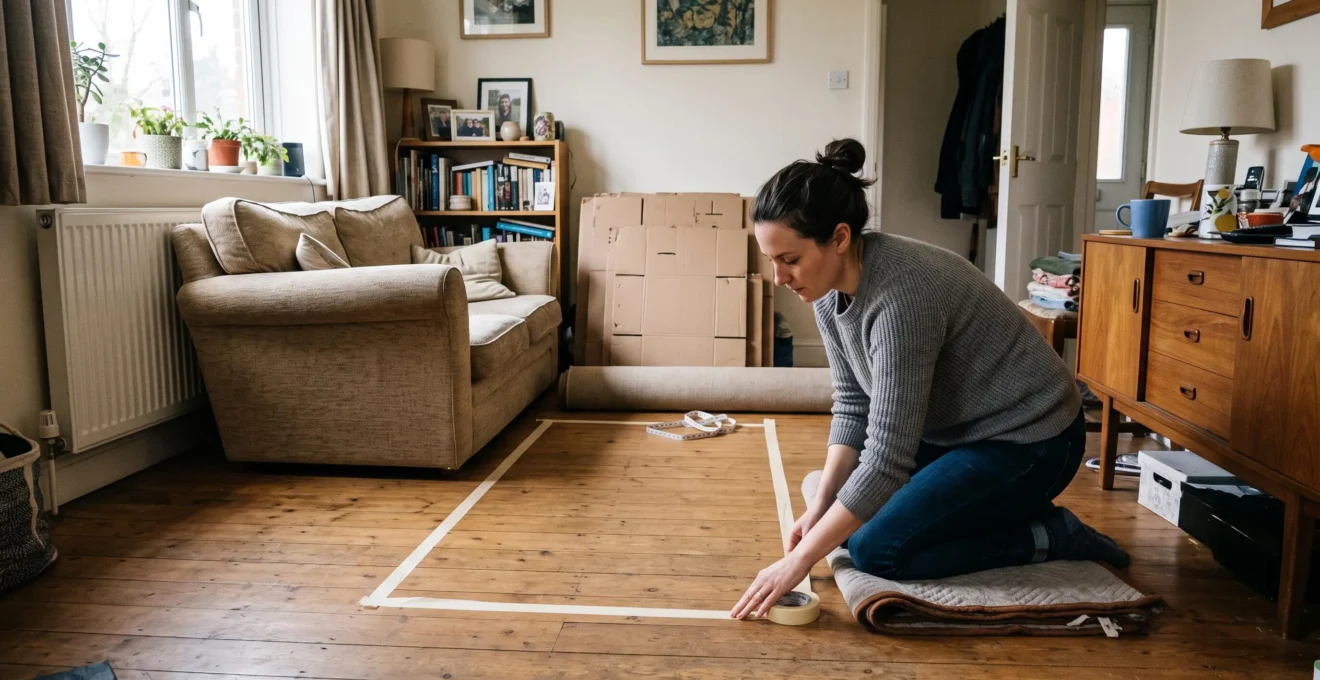
- Test before committing: Compare arrangements on a floor plan, mark furniture footprints with tape and reproduce everyday movements in the actual space.
- Why Does a Furniture Layout That Works Online Fail in Your Own Room?
- How Can You Divide One Room Into Seating, Dining and Working Zones?
- Furniture Against the Walls or Floating: Which Layout Works Better in a Narrow Room?
- Which Layout Mistakes Make Doors and Walkways Difficult to Use?
- When Should You Test a Room Layout Before Buying New Furniture?
- How Can You Draw a Simple Floor Plan Before Rearranging Furniture?
- How Can You Map Natural Walking Routes Before Rearranging a Room?
- How Can You Use a Floor Plan to Spot Layout Problems Before Changing a Room?
Why Does a Furniture Layout That Works Online Fail in Your Own Room?
A furniture layout that looks successful online often fails in another home because the original room has different proportions, architectural constraints and daily uses. Photographs rarely reveal the full circulation pattern, available storage or space required to operate doors and furniture. A layout needs to fit the actual room and its occupants, not simply resemble an attractive reference image.
Consider a photograph showing two sofas facing each other across a large coffee table. The arrangement may depend on a wide room, uninterrupted walls and an entrance located away from the seating area. In a narrower room with an off-centre doorway, the same furniture positions could force people to walk between the sofas every time they enter.
Before copying an inspirational layout, compare three structural characteristics:
- Usable width: Does your room have enough space for the same furniture and the routes around it?
- Door and window positions: Are openings located in similar places, and do they interrupt the same walls?
- Fixed obstacles: Would a radiator, fireplace, column, built-in unit or electrical connection interfere with the proposed arrangement?
There is also a difference between a photogenic composition and a functional room. A low table placed far from every seat may look elegant from a particular camera angle but be inconvenient for someone setting down a drink. Deliberate asymmetry can make a photograph interesting while leaving an everyday activity without enough usable space.
Online inspiration usually presents a room as a finished visual object. Actual households use rooms for reading, entertaining, working, eating, storing belongings and moving between spaces. Write down the activities that occur on an ordinary weekday before deciding whether an attractive layout deserves to be reproduced.
For instance, a household that regularly works from home may benefit more from a properly positioned desk than a second occasional armchair. A family that plays on the floor might need an open area that would appear empty in a styled photograph.
The practical question is not whether the photograph looks good. It is whether its arrangement allows your most frequent activities to happen without constant adjustments, blocked routes or improvised storage.
Once the unsuitable features are removed, the remaining inspiration can still guide furniture proportions, visual balance and atmosphere. The next step is to allocate space according to how the room is actually used.
How Can You Divide One Room Into Seating, Dining and Working Zones?
Divide a multipurpose room by ranking seating, dining and working according to how frequently and for how long each activity takes place. Give the most demanding daily function a suitable location first, then organise secondary uses around it. Furniture orientation, rugs and lighting can define zones without requiring walls or permanent partitions, provided circulation remains clear.
A room used for remote work every weekday and dining only occasionally should not automatically devote equal floor area to both functions. The workspace may need a stable desk surface, accessible outlets and controlled screen glare. Dining might require only a flexible table and chairs that can be stored or repositioned.
Start with an activity inventory. For each function, note its frequency, usual duration, number of people involved and essential equipment. Consider which activities can share furniture and which require a dedicated area.
The next decision is how strongly each zone needs to be separated.
| Room condition | Suggested zoning method | Practical consideration |
|---|---|---|
| Small room with limited circulation | Use furniture direction, a rug or local lighting | Avoid adding barriers to already restricted routes. |
| Medium room with several regular functions | Combine visual cues with a low console or shelving unit | Check that the divider remains accessible and does not obstruct movement. |
| Larger room with activities requiring separation | Consider freestanding furniture or a more substantial divider | Maintain suitable light, access and usable space on both sides. |
| Studio with overlapping activities | Use adaptable furniture and movable accessories | Prioritise smooth changes between activities rather than forcing three separate zones. |
As discussed in Homes & Gardens’ article on living-room zoning, designers use furniture orientation, rugs and local lighting to distinguish activities within an open room. These techniques are practical design approaches rather than scientifically established rules for every interior.
In a combined living and dining room, a sofa facing away from the dining table can establish a seating area. A pendant above the table identifies the eating space, while a task lamp gives a compact desk its own working identity.
However, visual boundaries do not solve every functional conflict. A desk placed immediately beside a dining table may be difficult to use if people regularly interrupt the workspace. Where activities compete, introduce a modest buffer, such as a clear passage or a low storage unit, without sacrificing necessary circulation.
In a studio, separation may be less useful than adaptability. One table could support working, eating and hobbies at different times. A rolling cart might hold work supplies, while lightweight stools accommodate occasional guests.
Trying to create three permanent zones in insufficient space can leave all three uncomfortable. A shared surface with convenient storage may perform better than several undersized areas.
The most useful zoning arrangement is one that reduces friction between everyday activities. Where space is narrow, that decision also depends on whether furniture should remain against the walls or move into the room.
Furniture Against the Walls or Floating: Which Layout Works Better in a Narrow Room?
Furniture against the walls often works well in a narrow room when it preserves comfortable routes and leaves enough space for the main activity. Floating furniture can work better when it separates functions, improves conversation or redirects movement around an awkward layout. Neither arrangement is automatically superior: compare usable clearances and daily routes before deciding.
Placing a sofa against the longest wall may keep the centre open and make the room feel less crowded. But an open centre is not necessarily useful if the seating sits too far from a table or if people still have to cross the conversation area to reach another door.
Floating the sofa slightly away from the wall can create a defined seating zone. In some rooms, this establishes a more logical route behind the sofa. In others, it consumes the only available walking space and makes the room function worse.
Measure the narrowest usable passage in each arrangement, not just the distance between opposite walls. Include the depth of furniture, projecting handles and the position of movable chairs.
For context, the U.S. Access Board guidance on accessible routes identifies a minimum continuous clear width of 36 inches (approximately 91 cm) for accessible routes covered by the relevant ADA provisions, subject to specified exceptions. This is an accessibility reference, not a universal legal minimum for walkways in private homes or in other countries.
36 inches (approximately 91 cm)
The minimum continuous clear width specified for accessible routes covered by the relevant U.S. ADA requirements, with defined exceptions. It is not a blanket residential furniture-layout rule.
U.S. Access Board, Chapter 4: Accessible Routes.
For an ordinary household layout, the required clearance also depends on how the route is used. A route to a regularly used doorway has different demands from the space beside an occasional reading chair. Mobility equipment, assistance needs and applicable local accessibility requirements may impose additional constraints.
There is another trap: pushing everything against the walls can create an awkward arrangement in which people circulate around the perimeter while the centre becomes an underused island. Conversely, gathering furniture around the centre can leave a long, straight passage that feels more practical despite the apparent loss of floor space.
Test both configurations with masking tape marking the actual furniture footprints. Walk between doors, reach storage areas, pull out chairs and simulate how people sit together. A plan that looks slightly tighter may still prove more functional if its routes are better positioned.
Low consoles, backless benches and visually lightweight storage can also help an elongated room retain useful surfaces without introducing bulky obstacles at eye level.
Whichever option you choose, door swings and access to everyday furniture must remain workable. Those details often explain why a seemingly spacious layout feels inconvenient.
Which Layout Mistakes Make Doors and Walkways Difficult to Use?
Doors and walkways become difficult to use when furniture blocks a door’s opening arc, narrows a frequently used route or leaves insufficient space to operate cupboards, drawers and appliances. These problems often go unnoticed because people assess the room while standing still. Checking circulation, furniture access and operating clearance separately reveals conflicts that a simple visual inspection misses.
Not every empty strip of floor serves the same purpose. A useful layout distinguishes three types of movement:
- Through-route: The path used to travel between rooms or major destinations.
- Access route: The space needed to approach and use a sofa, bed, desk or other furniture.
- Operating clearance: The space needed to open a cupboard, pull out a drawer, move a dining chair or operate an appliance.
For example, a bedside passage may appear wide enough until the wardrobe doors open. Similarly, a dining table might leave a clear route when its chairs are pushed in but obstruct the doorway once someone sits down.
Start by checking every hinged door. On a floor plan, draw the door leaf and its opening arc. Do the same for wardrobes and cupboards. Sliding doors and pull-out fittings require their own clearance checks, even though they do not have the same swing pattern.
A door that strikes a piece of furniture may still allow someone to enter, making the problem easy to tolerate. Yet the resulting restriction can complicate cleaning, carrying objects and reaching storage. Do not assume that partial opening is acceptable where full opening, safe access or an unobstructed exit is needed.
The next check is behavioural. Mark the intended routes using removable painter’s tape and walk along them while carrying objects you normally transport through the room. A laundry basket, serving tray or shopping bag reveals turning difficulties that may not be obvious when walking empty-handed.
Finally, distinguish actual paths from imagined ones. A plan may show a neat route around a coffee table, while occupants naturally cut diagonally across the room. Repeated detours or furniture corners that people regularly avoid suggest a mismatch between the proposed layout and everyday movement.
Observing the room over an ordinary day can reveal these patterns before another piece of furniture is moved.
Once these basic movements work, it becomes easier to decide whether a proposed new furniture purchase needs a full physical test or only a straightforward dimensional check.
When Should You Test a Room Layout Before Buying New Furniture?
Test a room layout before buying furniture whenever the new piece could change circulation, block access or substantially alter how the room is used. Testing is particularly valuable when choosing between sizes, furnishing an unusually shaped room or combining several activities. A simple measurement check may be sufficient when replacing a similarly sized item without changing its position or function.
The level of testing should match the uncertainty involved. Replacing an existing side table with another of comparable dimensions usually requires less investigation than introducing a large sectional sofa into a room with multiple doorways.
There is a practical sequence, from low-effort comparison to realistic physical evaluation:
- Scaled paper plan: Use furniture cutouts to compare positions and identify obvious overlaps or blocked routes.
- Full-size floor markings: Outline the furniture with removable tape to see how much floor area it occupies.
- Cardboard mock-up: Represent the furniture’s height and depth with boxes to assess bulk, sightlines and accessibility.
- Temporary use of the proposed arrangement: Where feasible, reposition existing furniture or use a suitable return or rental arrangement to evaluate the piece in daily life.
Each test reveals something the previous one cannot. A paper drawing is useful for comparing alternative arrangements, but it cannot fully communicate the visual weight of a tall cabinet. Tape reveals the footprint but not the effect of a high backrest or a deep armchair.
A documented example appears in Houzz‘s furniture-layout tape demonstration. The designer used a floor plan and tape markings to evaluate a family-room arrangement, then adjusted the planned media-centre position by approximately six inches following the in-room assessment.
A real furniture-placement adjustment identified through floor testing
In the Houzz project published in October 2011, the designer marked the intended positions of seating, a rug and entertainment furniture with painter’s tape. Existing architectural features, including a fireplace hearth and built-in cabinet, affected the available space.
Checking the dimensions in the actual room led to an approximately six-inch adjustment of the media-centre position. The example illustrates the value of physical verification in that specific project; it does not establish a typical adjustment amount for other homes.
A successful test should reproduce real activities, not simply confirm that the furniture fits. Pull a chair away from the proposed table position, open the nearby doors, reach for a lamp and move between seats while someone else occupies the room.
If testing a desk or dining table, simulate the working or sitting height as well as its footprint. A surface can fit neatly against a wall while still leaving an uncomfortable position for the person using it.
Keep as much existing furniture in place as practical during the test. An empty room can give a misleading impression of spaciousness, particularly when the eventual arrangement includes rugs, storage, lighting and other everyday objects.
Before relying on a retailer’s return policy, check its actual conditions, including handling, assembly and return requirements. A return option is a potential way to manage uncertainty, not a substitute for careful measurements.
Most of these tests become easier when they begin with an accurate floor plan. Even a simple hand-drawn version provides a useful foundation.
How Can You Draw a Simple Floor Plan Before Rearranging Furniture?
Draw a simple floor plan by measuring the room, marking permanent architectural features and transferring the dimensions onto graph paper at a consistent scale. Include doors and their opening directions, windows, radiators, outlets and furniture that will remain. Then create scaled paper cutouts of movable pieces so you can compare arrangements without physically shifting heavy furniture.
Specialist software is not necessary. A tape measure, pencil, ruler and sheet of graph paper are enough for an initial layout assessment. Measure the room rather than estimating its proportions from memory; pacing can provide an initial approximation, but furniture decisions need actual dimensions.
IKEA‘s room measurement instructions provide illustrated guidance for documenting wall lengths, ceiling heights, openings, fixtures, radiators, electrical outlets and other relevant features. The document also recommends recording existing furniture intended to remain in the room.
Choose a scale you can use consistently. For a metric example, one graph-paper square might represent 25 cm or 50 cm, depending on the room size and available paper. These are convenient drawing choices, not prescribed industry standards. Use a ruler or scale calculation rather than relying on the physical size of a printed square to remain constant across different paper formats.
Mark fixed constraints differently from movable objects. The distinction prevents you from spending time on arrangements that depend on relocating something that cannot realistically be moved.
For an accurate plan, check more than the floor-level dimensions. A skirting board or projecting handle may affect furniture placement. Tall furniture also needs clearance at its actual height, particularly near sloping ceilings, wall projections or unusual recesses.
Measure irregular corners rather than assuming every wall meets at a perfect right angle. Note window heights and nearby heating elements when considering furniture that might interrupt access, light or airflow.
Create a usable room plan in five actions
- Measure the room perimeter and height. Record wall lengths, relevant ceiling heights and irregular corners; produce a labelled room outline with dimensions.
- Mark fixed features. Add doors, swing directions, windows, radiators, vents and built-ins; produce a drawing that distinguishes permanent obstacles.
- Record service locations. Mark power outlets, switches, lighting positions and relevant water connections; produce a plan showing where equipment can realistically operate.
- Create scaled furniture cutouts. Measure items that will remain and potential replacements; produce movable paper templates showing their actual footprints.
- Compare candidate arrangements. Position the cutouts, mark access and circulation conflicts, and retain at least two labelled layout variants for further testing.
The cutouts make experimentation straightforward. Rotating a sofa, moving a desk or exchanging the positions of two storage units becomes a small change on paper rather than a demanding physical task.
Keep the original measurements available while making revisions. A floor plan should remain a reliable record of the room, not merely a drawing of the arrangement you happen to prefer.
Accurate dimensions establish the available space, but they cannot show which routes people prefer. Observing movement patterns adds the behavioural information missing from the drawing.
How Can You Map Natural Walking Routes Before Rearranging a Room?
Map natural walking routes by observing how household members move through the room during ordinary activities and recording the paths they repeatedly follow. Look at routes between doors, seating, storage and other destinations, including morning and evening routines. Frequent paths and points where people cross each other should influence furniture placement before decorative considerations.
A floor plan can suggest a direct route that people rarely use. Someone entering a living room may walk diagonally toward the kitchen rather than follow a carefully arranged passage around the seating area. If furniture interrupts that natural route, occupants may continually detour around it.
As a practical observation exercise, watch the room over two or three ordinary days. This period is a planning suggestion, not a scientifically validated minimum. Note the origin and destination of repeated trips and whether someone must slow down, turn sideways or move an object.
Use different lines or symbols on a copy of the floor plan to distinguish major routes. A thicker line can represent a frequently used path, while a thinner one indicates occasional movement. This simple map shows where circulation needs priority.
Pay particular attention to crossing points, where two activities compete for the same area. Examples include someone walking in front of a television while another person watches it, or family members passing beside a desk during a video call.
These intersections are not always problematic. They become important when the crossing is frequent, disruptive or difficult to negotiate. Moving the desk, changing the orientation of seating or reserving a separate passage may reduce the conflict.
Morning and evening movement should be considered separately. In the morning, people may move frequently between storage, seating and the kitchen. At night, a safe route to a bathroom or hallway may be more important than keeping a central floor area visually open.
Different household members can also have different needs. A child carrying toys, an adult transporting laundry and a person using a mobility aid may not experience the same route in the same way. The layout should account for the people who regularly use the space rather than assuming one ideal walking pattern.
When a living room connects two other rooms and must be crossed to travel between them, circulation is a function in its own right. Reserve an appropriate, continuous route rather than treating the entire room as space available for furniture.
Sometimes observation reveals a shortcut that should be preserved. In other cases, it identifies an unsafe or disruptive path that furniture placement should deliberately redirect. The objective is to make those decisions consciously instead of ignoring established habits.
With the measured plan and observed routes combined, it becomes possible to evaluate alternative layouts systematically rather than relying on visual intuition alone.
Key takeaways before choosing a final layout
- Keep permanent constraints, movable furniture and real walking routes identifiable as separate layers on the same plan.
- Compare alternative arrangements using observable conflicts and access needs, not simply which version leaves the largest empty area.
- Use the drawing to reject impractical layouts, then assess the most promising arrangement physically in the actual room.
How Can You Use a Floor Plan to Spot Layout Problems Before Changing a Room?
Use a floor plan as a diagnostic tool by examining fixed constraints, walking routes, activity zones and furniture clearances in separate passes. This layered review helps reveal overlapping doors, blocked storage, awkward circulation and competing uses before anything moves. Compare several arrangements against the same practical criteria, then test the strongest option in the real room.
Instead of judging the finished drawing at a glance, evaluate it in four stages.
- Fixed constraints: Check that furniture avoids permanent fixtures and leaves appropriate access to doors, windows, heating equipment and necessary connections.
- Circulation: Trace the main routes through the room and check their narrowest points, turns and intersections.
- Activity zones: Confirm that the most important activities have appropriate space, light and access to the equipment they require.
- Furniture operation: Add the space occupied by open drawers, doors, extended chairs and other moving components.
Examine each layer before adding the next. A proposed layout may appear balanced until its door swings are shown, or a dining arrangement may look generous until chairs are represented in their occupied positions.
The following checks can be completed on a sufficiently accurate plan before moving furniture:
- Do any furniture footprints overlap with door-opening arcs or essential access areas?
- Does a frequent walking route become unusually narrow or require an awkward turn?
- Can storage doors and drawers open without colliding with nearby furniture?
- Does a large piece obstruct access to a window, radiator or regularly used outlet?
- Is there a convenient surface for keys, bags or other frequently handled objects near the appropriate entry point?
- Can the most important activities take place without requiring another piece of furniture to be moved first?
Draw more than one version if the first appears workable. A layout with fewer blocked routes may be more useful than one offering slightly more open floor area, particularly when the room connects several destinations.
For a disciplined comparison, score each candidate against the same criteria rather than changing the criteria to favour the preferred option.
| Criterion | What to record | What the comparison reveals |
|---|---|---|
| Circulation conflicts | Number and location of obstructed or awkward routes | Which layout interferes least with frequent movement |
| Furniture access | Doors, drawers and seating positions that cannot operate comfortably | Which arrangement better supports ordinary use |
| Usable activity space | Area available for the priority activities after circulation is considered | Whether apparent openness translates into functional space |
| Distance between related functions | Practical routes between frequently connected activities | Whether the arrangement introduces unnecessary detours |
| Fixed-feature conflicts | Interference with windows, heating, outlets and built-ins | Which layout respects the room’s physical constraints |
These criteria make trade-offs visible. One arrangement might offer more uninterrupted floor space, while another keeps the main route away from the seating area. The appropriate choice depends on how the household uses the room.
A floor plan still has limits. It cannot fully represent vertical bulk, changing daylight, acoustics, reflections or the experience of walking past a tall piece of furniture. It may also understate how crowded a room feels when its existing belongings are present.
Use the drawing to eliminate clearly unsuitable arrangements, then validate the remaining candidate with tape, furniture mock-ups and ordinary movement. Recheck any dimensions that become important during the physical test.
Choose one everyday activity that currently feels awkward, draw the room around it, and test whether a different furniture position makes that activity easier. A successful room layout is one that continues to work when the room is being lived in, not just when it is photographed.
What should you measure before ordering a large piece of furniture?
Measure the furniture’s full width, depth and height, then compare those dimensions with the available space and nearby openings. Include projecting handles, skirting boards and the clearance required for doors, drawers or chairs. Also check the delivery route, including relevant doorways, corridors and stairs. A piece that fits its final position may still be difficult to bring into the room.
Can one room support both working from home and relaxing?
Yes, provided the arrangement supports both activities without persistent conflicts. Position the workspace according to practical needs such as power access, light and interruptions. Use furniture orientation, local lighting or a small storage element to distinguish it from the relaxation area. In very small rooms, a shared surface and convenient storage may be more effective than attempting two permanent zones.
Do you need room-planning software to test furniture arrangements?
No. A measured sketch on graph paper and movable furniture cutouts can show footprints, door conflicts and alternative positions. Removable tape provides an additional check in the actual room. Digital tools may help with complex geometry or visualisation, but they are optional for many everyday rearrangements.
What if the room is too small for every activity you want to include?
Prioritise the activities that happen most frequently or have the greatest space requirements. Look for furniture that can serve more than one purpose, such as a table used for both dining and working. Movable accessories and compact storage may help. Avoid adding separate zones when doing so compromises essential circulation or makes every activity difficult.
How can you tell whether a room layout works after rearranging it?
Evaluate it during normal household routines rather than immediately after moving furniture. Notice whether doors open freely, everyday objects are accessible, seating is convenient and the main walking routes feel natural. Repeated detours, blocked access and the need to move furniture before ordinary tasks are signs that the arrangement needs refinement.