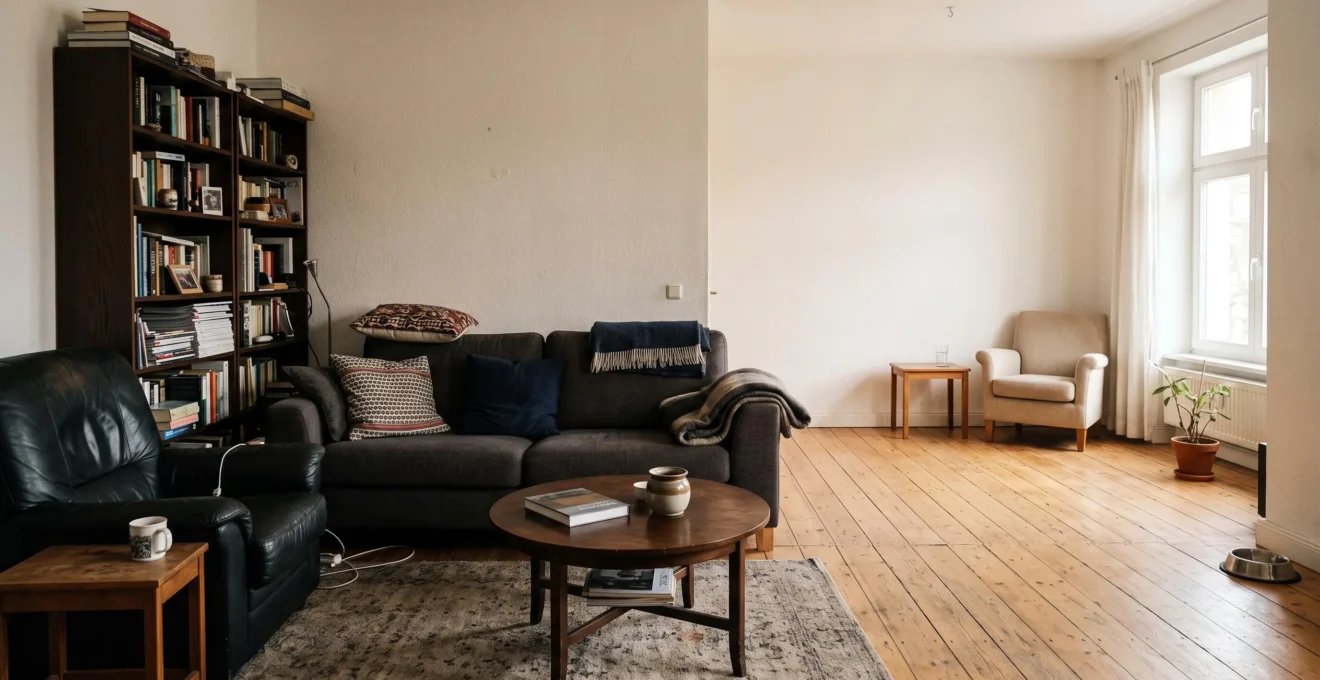
A living room can contain all the right furniture and still feel strangely unbalanced. Perhaps a sectional sofa dominates one wall, an off-center fireplace pulls attention away from the seating area, or a large patch of empty floor makes the opposite side appear unfinished. The problem is not necessarily how much furniture the room contains. It is how that furniture distributes visual weight.
Balancing furniture and empty space in an uneven room means arranging objects so that size, color, height, contrast and position work together without obstructing everyday activities. A large sofa does not always need another large object opposite it. Several lighter furnishings, a well-positioned artwork or an intentionally open area can create a more convincing composition.
The most effective approach starts with identifying the room’s dominant elements, protecting its natural walking routes and making small, measurable changes before relocating major furniture. The goal is not perfect symmetry. It is a room that looks stable, feels comfortable and functions naturally.
How to balance an uneven room at a glance
- Assess visual weight rather than furniture count: dark, tall, bulky and high-contrast objects often attract more attention.
- Balance dominant pieces with thoughtfully distributed counterweights while preserving useful empty space and walking routes.
- Start with lighting, artwork, color and smaller furnishings; rearrange large pieces only when the underlying layout requires it.
- Why Can a Furnished Room Still Feel Visually Lopsided?
- How Can You Balance a Room Around a Large Sofa, Fireplace or Window?
- Symmetrical or Asymmetrical Layouts: Which Work Better in Everyday Living Rooms?
- What Goes Wrong When You Fix an Empty Corner by Adding Too Much Furniture?
- How Can You Correct Visual Imbalance Without Moving Every Major Piece?
- Why Can Correctly Measured Furniture Still Look Too Large in a Room?
- How Can You Map Natural Walking Routes Before Rearranging a Room?
- How Can You Plan a Room Layout Around Real Daily Activities Instead of Appearance Alone?
Why Can a Furnished Room Still Feel Visually Lopsided?
A furnished room can feel visually lopsided because the eye responds to the apparent mass, contrast and position of objects rather than their number. Several light pieces may carry less visual weight than one dark sectional or tall cabinet. Architectural features can intensify the imbalance, even when furniture occupies both sides of the room.
Imagine a living room with a dark sofa, bookcase and substantial coffee table grouped along the left wall. Across from them are two pale chairs and a small side table. Although both sides contain several furnishings, the darker and taller grouping may dominate the composition.
This distinction between physical fullness and visual weight is central to understanding balance. According to Oklahoma State University‘s explanation of visual balance, size, tonal value, contrast and positioning influence how strongly elements attract attention. Balanced compositions do not require identical objects.
Architecture adds another layer. An off-center window can concentrate daylight on one side. A sloping ceiling changes the apparent volume above furniture. A doorway interrupts the continuity of a wall, while a fireplace establishes a fixed visual anchor. These elements influence how furniture is perceived, regardless of whether the floor plan looks evenly populated.
A practical starting point is to photograph the room from its main entrance. View the image at a small size, squint at it or apply a gentle blur. This informal visual check can make dominant dark and light areas easier to recognize. It is a design assessment technique, not a scientifically validated measurement of balance.
Look for the part of the photograph that attracts attention first, then ask whether that concentration is intentional. If all the visually substantial objects already occupy one side, placing another piece beside them will usually reinforce the grouping rather than counterbalance it.
The correction might involve transferring one small item, lightening the dominant area or giving the opposite wall a stronger visual presence. It does not automatically require more furniture.
Once the room’s visual center of gravity is recognizable, the next decision is which dominant feature should guide the arrangement.
How Can You Balance a Room Around a Large Sofa, Fireplace or Window?
Balance a room around a dominant sofa, fireplace or window by treating that element as a visual anchor and distributing complementary weight elsewhere. Fixed architectural features generally need to be accommodated, while movable furniture can be repositioned. The opposite side does not need an identical object; several smaller pieces can provide an effective counterweight.
Begin by separating anchors into two categories. A fireplace, built-in bookcase or large window is fixed. Its position influences the room even when no furniture is present. A freestanding sofa or sectional is a chosen anchor, meaning it can potentially move to improve relationships with architecture and circulation.
Consider a hypothetical living room where a large sofa occupies one side and the opposite wall appears underweight. Instead of purchasing a second sofa, try arranging two upholstered chairs with a floor lamp and substantial framed artwork. Their combined height, color and visual presence may balance the sofa without duplicating its physical volume.
The same principle works with a fireplace that sits off-center on its wall. Rather than forcing all furniture to align with the wall’s mathematical midpoint, arrange the main seating group around the fireplace’s actual position. Allow some of the remaining wall to stay open, then use artwork, lighting or smaller furnishings where additional visual weight is beneficial.
A large window calls for a slightly different approach. Because the opening already creates a strong architectural feature and a source of light, covering it with tall furniture can make the wall feel crowded and reduce its usefulness. A low console, restrained seating arrangement or appropriately positioned artwork on an adjacent wall may establish balance without competing with the view.
Choosing the main focal point also requires a practical decision. A fireplace may be architecturally dominant, but a household that primarily uses the living room to watch television may need seating oriented toward the screen. Where possible, allow one feature to organize the visual composition while the other determines comfortable viewing positions.
If the two compete, prioritize the feature that best supports the room’s principal activity without obstructing important architectural elements.
Balancing a focal point establishes the room’s basic structure, but the arrangement can still be either symmetrical or asymmetrical depending on its everyday demands.
Symmetrical or Asymmetrical Layouts: Which Work Better in Everyday Living Rooms?
Symmetrical layouts are often effective in living rooms with centered focal points and formal seating arrangements, while asymmetrical layouts offer more flexibility in spaces with uneven walls, multiple activities or irregular traffic routes. Neither approach is inherently superior. The more functional choice depends on architecture, household routines and how furniture needs to be accessed.
Symmetry creates a recognizable structure: two chairs facing a sofa, matching lamps on either side of a fireplace or comparable furniture groupings arranged around a central axis. It can make a formal conversation area feel ordered, particularly when the architecture already supports that arrangement.
Asymmetry balances unlike objects through position, scale and visual intensity. A substantial sofa might be counterweighted by a chair, a bookcase and a floor lamp rather than a second sofa. This allows furniture to respond to doors, windows, storage requirements and changing household needs.
The following comparison provides a practical decision framework rather than a universal design rule.
| Room consideration | Symmetrical arrangement | Asymmetrical arrangement |
|---|---|---|
| Architecture | Well suited to centered openings and balanced wall features | Accommodates off-center windows, doors and irregular walls |
| Main activity | Useful for defined conversation or formal seating | Useful for mixed seating, work, play and storage |
| Household use | Works when furniture positions remain relatively consistent | Adapts to changing users and daily activities |
| Focal point | Especially effective around a central architectural feature | Can accommodate a focal point located away from the room’s center |
| Circulation | Requires adequate clearance on both sides of the arrangement | Allows wider routes where door placement makes them necessary |
A useful middle ground is quiet symmetry: matching the overall impression of furniture groups without matching every object. For example, a tall floor lamp beside a single chair might balance the height of a cabinet across the room. Two different side tables can still form a coherent arrangement when their scale and placement relate to nearby seating.
Problems arise when symmetry becomes a rigid instruction. Centering a sofa beneath a wall feature may look orderly in a drawing but leave too little space beside a doorway or radiator. Similarly, positioning chairs as identical mirror images can interfere with the path people naturally take through the room.
Use symmetry when it reinforces existing architecture and supports the room’s activities. Use asymmetry when it resolves real constraints without making the arrangement look accidental.
In either arrangement, negative space is part of the composition. Trying to furnish every apparent gap can undermine the balance you are attempting to create.
What Goes Wrong When You Fix an Empty Corner by Adding Too Much Furniture?
Adding too much furniture to an empty corner can make a room feel smaller, interrupt walking routes and create a new concentration of visual weight. An unoccupied corner is not automatically a design problem. It may provide necessary negative space, improve access to surrounding furniture or give the eye a place to rest.
Corner overcrowding often develops gradually. A spare chair is added because the corner looks bare. The chair then appears to need a side table, followed by a lamp. The rug is shifted to connect these pieces, and suddenly the entrance to the seating area feels narrow.
Each addition may seem reasonable on its own. The difficulty comes from their cumulative effect on floor space, vertical density and circulation.
Before adding anything, evaluate the corner from the doorway and from the room’s most frequently used seats. Ask whether the empty space genuinely creates a distracting imbalance or simply provides useful contrast to nearby furniture. Then walk through the area along your normal route. If the corner already supports movement and the room feels comfortable, leaving it empty may be the better solution.
If the area would benefit from more visual interest, consider progressively lighter interventions:
- Lighting: A wall-mounted light or carefully placed floor lamp can introduce height without requiring an additional seating group.
- Wall art: One appropriately scaled piece can give the wall greater presence while leaving the floor clear.
- Plants: A plant with an open silhouette may soften the corner, provided its container and foliage do not obstruct circulation.
- Floor texture: A rug that belongs to the existing seating group can visually connect the area without introducing another object to walk around.
- Mirrors: A mirror can add reflected light and visual interest, although its placement should avoid uncomfortable glare or distracting reflections.
These options differ in their visual impact and physical footprint; their suitability depends on the room rather than a fixed decorating hierarchy.
Watch for signs of overcrowding: walking requires sidestepping, furniture blocks a drawer or doorway, a tall decorative element competes with a more important feature, or every available surface is occupied. An item that adds no useful function and makes access harder is a strong candidate for removal.
Professional guidance in Houzz‘s recommendations for furniture clearances and circulation similarly recognizes that unoccupied floor space can be necessary for a functioning room, and that smaller movable tables may be preferable to bulky permanent pieces.
Preserving a deliberate open area can improve both balance and movement. Where the room still feels uneven, the next step is to adjust perceived weight without expanding the furniture footprint.
How Can You Correct Visual Imbalance Without Moving Every Major Piece?
Correct visual imbalance with low-effort adjustments before moving large furniture. Start by changing color, contrast or vertical emphasis on the lighter-looking side of the room. Next, reposition small furnishings or wall décor. Reassess after each change, because decorative adjustments can improve perceived balance but cannot solve blocked circulation or genuinely oversized furniture.
The order of intervention matters. Moving a sectional or heavy cabinet is disruptive, while changing a lamp, artwork or accessory is comparatively easy to reverse. Small changes also help reveal which visual feature was creating the imbalance.
For example, a pale wall opposite a dark sofa may benefit from a substantial framed artwork with stronger contrast. A tall lamp can introduce vertical presence beside a low chair. Adjusting curtains may also change how the wall is perceived, especially when their color, length and fullness relate to the surrounding furniture.
Lighting can provide another counterweight. Illuminating a previously dim wall can attract attention toward that side, although additional brightness will not necessarily make it appear physically heavier. The result depends on the wall finish, nearby objects and the direction of existing daylight.
After making one adjustment, take another photograph from the same position and compare it with the original. Keep the camera angle and lighting conditions reasonably consistent. A quick squint test may help reveal whether the perceived visual mass has shifted too far in the opposite direction.
A five-step room-balance adjustment checklist
- Photograph the room from its main entrance and save one clearly labeled baseline image.
- Identify the visually heaviest and lightest areas, then mark both on a simple room sketch.
- Choose one reversible adjustment, such as moving a lamp or swapping artwork, and record the change.
- Take a second photograph from the same viewpoint and compare the two images for visual weight and open space.
- Walk the normal routes through the room and keep or reverse the adjustment based on both appearance and usability; record the decision on the sketch.
The most important limitation is structural. If a sofa blocks the main route through the room, taller artwork will not restore access. If a sectional overwhelms the available floor area, moving decorative objects may make the composition more attractive without resolving its scale problem.
Similarly, a fixed architectural feature may require accepting an intentionally asymmetrical arrangement rather than attempting to hide its position.
When low-effort changes fail, examining the physical and perceived scale of the largest furniture pieces is the logical next step.
Why Can Correctly Measured Furniture Still Look Too Large in a Room?
Furniture can fit within a room’s measured dimensions and still look oversized because physical footprint is only one component of scale. Height, depth, upholstery bulk, exposed floor and surrounding clearance affect perceived volume. A sofa that technically fits may dominate the room if its high back, thick arms or dark upholstery leave little visual breathing space.
Consider two hypothetical sofas with identical overall widths. One has a tall back, broad arms and upholstery extending close to the floor. The other has a lower profile, slimmer arms and visible legs. Although both occupy similar horizontal space, the first may appear substantially heavier because it presents a larger uninterrupted mass.
Color and contrast reinforce these differences. Dark upholstery against pale walls can create a stronger visual boundary than a lighter-toned sofa. Textured fabrics, large cushions and broad armrests may add apparent density even where the external dimensions remain acceptable.
Clearance also influences perceived size. When the gap between a sofa and adjacent furniture is narrow, the sofa may seem larger than it would in a room with more surrounding space. A floor plan that confirms an object fits does not necessarily show how crowded the arrangement will feel in use.
Before purchasing a major item, compare more than its width and depth. Check the overall height against doorframes, windowsills and nearby furniture. Mark the proposed footprint on the floor and consider using cardboard or another simple temporary reference to visualize its height and depth.
Existing architecture provides useful scale references, although the comparison is a visual judgment rather than a mathematical rule. A sofa back that nearly reaches a windowsill may interact differently with the wall than a lower-backed model. Deep seating can also protrude farther into circulation than its width initially suggests.
As discussed in Better Homes & Gardens‘ advice on furniture scale and proportion, room dimensions, furniture depth, architecture and relationships between furnishings should be considered together. The article also describes photography and scaled planning methods as practical ways to assess arrangements.
Replacing furniture is not always necessary. Removing a bulky nearby table, increasing visible floor around the sofa or reducing competing accessories may improve its perceived scale. In a constrained room, a visually open table with exposed legs can also be worth considering in place of a solid, block-like design.
However, if a major piece prevents doors from opening comfortably or restricts essential movement, its physical dimensions remain the deciding factor.
Furniture scale cannot be judged independently from the routes people take through a room. Understanding those routes provides the practical boundary for any balanced arrangement.
How Can You Map Natural Walking Routes Before Rearranging a Room?
Map natural walking routes by observing how people actually move through the room, then marking those paths on a simple floor plan before repositioning furniture. Include entrances, seating, adjoining rooms, storage and frequently used controls. A visually balanced layout is unsuccessful if its counterweights occupy the routes people need every day.
Begin with the main paths connecting doorways and major destinations. In a typical living room, these might include the entrance to the sofa, the sofa to the kitchen or hallway, and access to windows, shelves or storage. Secondary routes include movement around side tables, between chairs and toward light switches.
For a few days, notice where household members naturally walk. People may cross a room diagonally rather than follow the walls. They may approach the sofa from one end, regularly reach behind a chair to access a cabinet or move around the coffee table along a route that is absent from a conventional floor-plan sketch.
These frequently chosen routes are often called desire paths. Drawing them as arrows on a room sketch reveals where additional furniture is likely to interfere with everyday movement.
Next, overlay the furniture arrangement. Mark the sofa, chairs, tables and fixed features, then compare their positions with the paths. Identify crossings where someone must squeeze through a gap, walk around an unnecessary obstacle or pass directly between people who are seated and talking.
General design guidance offers useful starting points for evaluating circulation. For example, Houzz’s furniture-arrangement advice suggests approximately 30–48 inches (76–122 cm) for major traffic routes and at least 24 inches (61 cm) for minor routes. These are editorial planning recommendations, not universal building-code or accessibility requirements. Actual needs vary with occupants, furniture geometry and mobility requirements.
When a room lacks sufficient clearance, a narrower side table, movable stool or alternative coffee-table arrangement may preserve the walking path without eliminating useful seating.
The difficult decision arises when the most visually balanced layout blocks a major route. In that situation, functional circulation should take priority over perfect visual balance. A slightly uneven arrangement that allows comfortable movement is generally more practical than a symmetrical layout that forces repeated detours.
Review these paths with doors open and furniture in its normal position. Allow space for cabinet access, reclining furniture and any mobility equipment used in the household rather than relying solely on the appearance of a static plan.
With circulation accounted for, furniture can be organized around the actual activities the room must support, rather than appearance alone.
Key takeaways before finalizing your layout
- Give visually dominant pieces deliberate counterweights, but do not fill useful empty space merely to create matching sides.
- Treat furniture scale and walking routes as practical constraints that decorative adjustments cannot override.
- Evaluate every arrangement against the household’s most frequent activities before deciding that it is finished.
How Can You Plan a Room Layout Around Real Daily Activities Instead of Appearance Alone?
Plan a room around daily activities by listing what people actually do there, ranking those activities by frequency and assigning furniture to the functions that matter most. Establish usable activity zones and walking routes first, then balance their visual weight. This produces a room that supports everyday routines instead of looking organized only when nobody is using it.
A living room might accommodate television viewing, reading, occasional work, children’s play and entertaining guests. These activities do not require equal amounts of space, and they may not happen with equal frequency.
Start with an activity inventory. Record the people who use the room, what they do and which furnishings they rely on. A sofa used every evening may deserve the strongest position, while an armchair used occasionally can occupy a secondary zone.
For a household that frequently watches television and sometimes hosts friends, the primary arrangement might prioritize comfortable screen visibility while keeping enough flexible seating for conversation. A reading area can then occupy a quieter corner with suitable lighting, provided it does not compete with a major walking route.
Each zone creates its own visual presence. A work corner with a desk, chair and storage may become visually heavy, particularly if the desk is dark or backed by tall shelves. A light seating area, lower storage or a more open furniture grouping elsewhere can balance the composition without making the zones identical.
Activities also compete for floor space. Children’s play may require temporarily clear floor near the main seating area. A permanent central coffee table could conflict with that need, while a lightweight movable table offers greater adaptability. Reading and television viewing can coexist when seating and lighting are arranged to reduce competing demands on the same position.
Consider the following hypothetical layout decisions:
| Activity pairing | Potential conflict | Practical layout response |
|---|---|---|
| Television viewing and conversation | All seating faces the screen | Angle a secondary chair toward both the sofa and the screen |
| Reading and television viewing | Task lighting or noise disturbs the other activity | Place the reading seat near suitable light and allow some separation |
| Children’s play and coffee-table use | The table occupies the flexible floor area | Consider movable tables and preserve a clear central zone |
| Home working and entertaining | Desk equipment dominates the shared space | Use a compact work zone with accessible, contained storage |
After arranging the zones, track how the room is used over a normal week. Notice whether an armchair remains untouched, a desk chair consistently blocks a route or people repeatedly move a table out of the way. These observations indicate mismatches between the planned layout and actual behavior.
Do not automatically remove a rarely used piece: occasional guest seating may still have a legitimate purpose. Instead, decide whether its position and visual footprint are proportionate to its function.
The final composition may legitimately give more space to one activity than another. If family seating is the room’s primary purpose, there is little reason to force a work desk and reading corner into equally prominent positions.
Start by recording the three activities that happen most often, then sketch a layout that supports them while keeping natural routes open. Test it in daily use, photograph it and make one adjustment at a time until the room feels both functional and visually settled.
Does every piece of furniture need something opposite it?
No. Visual balance concerns the overall distribution of apparent weight, not one-to-one matching. A substantial sofa can be balanced by smaller furnishings, artwork and architectural features together. Some open space may also be necessary for circulation and visual contrast.
Should furniture be centered on the wall or within the usable space?
Furniture should generally be positioned in relation to the usable area, focal point and walking routes rather than centered automatically on the wall. A doorway or off-center fireplace may make an asymmetrical arrangement more practical. Test both visual alignment and clearance before deciding.
Can a rug make an uneven furniture arrangement feel more balanced?
A rug can help connect separate seating pieces into a recognizable group, making their relationship more coherent. Its dimensions and placement should suit the furniture rather than attempt to cover every empty area. It cannot compensate for obstructed routes or furniture that is physically too large.
How can you balance a room without buying anything new?
Try exchanging lamps or small tables between sides of the room, repositioning existing artwork, removing unnecessary accessories or adjusting the placement of smaller chairs. Photograph the arrangement after each change to assess whether the perceived balance and daily usability have improved.
When is leaving a large area of floor empty the right choice?
Keep an area open when it supports a regular walking route, provides flexible activity space or offers useful visual relief from surrounding furniture. Empty floor is not inherently a decorating mistake. Add furniture only when it serves a clear purpose and does not compromise the room’s overall function.